Actions layout menus
In the current page users will find the description of the INPUT and LAYOUT tabs, as well as the description of the filter operations performed by each Action.
Note
In the INPUT tab, the options cannot be parametrized.
In each section, tables with the description of all the available options are provided, along with their corresponding GOLD references.
The Filter button
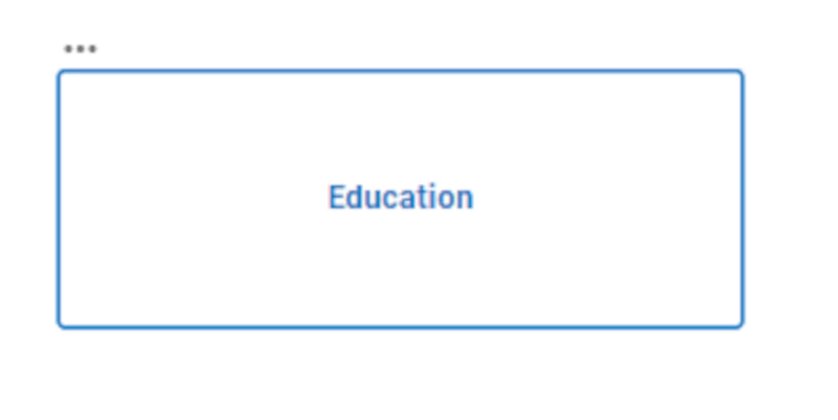
The Filter button action has the graphical aspect of a button. It can be divided into multiple sections, applying different filters to the same attribute which has been dragged on it. This way, it is possible not only to apply a single filter at a time, but also multiple filters at the same time.
By clicking on it, the corresponding filter is applied, and the button changes color.
This button can be divided into multiple sections, applying different filters to the same attribute which has been dragged on it. It is possible to create filters on all the available attribute types.
To do so, click on the ADD NEW FILTER button in the INPUT tab: the button will be equally divided into sections, each one of them applying a single filter.
The size of the button label(s) can also be changed by selecting the widget on the slide and clicking on the three-dotted button located in the top-left corner of the widget itself. Then, select the size among the available ones, which are standardized as S, M, L. Using these size shortcuts will overwrite the options set in the LAYOUT tab.
Subsection |
Option |
Description |
GOLD ref |
|---|---|---|---|
Input Options |
Table |
The table which contains the attribute to be filtered. It is possible to change it from the drop-down menu and choosing one of the tables which have been imported in the Datasets tab. |
input |
Attribute |
The attribute which has been dragged onto the widget, which will be filtered by the rules which will be set in the Filter area. It is possible to change it from the attribute drop-down list by typing its name or by scrolling in the list. |
input |
|
Action type |
Select whether the operation performed by the widget is Selection or Filter. To know more about the difference between these two configurations, go to the corresponding page. |
||
Scope Options |
Scope |
Here, users will select the widgets to which the filter will be applied. More information on the Scope field can be found in the corresponding page. |
input |
Filter Options |
Label |
Here users can insert the label of the portion of the button which will apply the corresponding filter specified in the Filter field. |
input |
Filter |
By clicking the SET FILTER button, the filter window will appear. Check the instructions to set filters for the attribute type which has been dragged onto the action here. |
input |
|
Code |
Here the filter code in GOLD will be shown. To know more about GOLD, go to the corresponding page. |
Subsection |
Option |
Description |
GOLD ref |
|---|---|---|---|
Buttons |
Buttons orientation |
Select from the drop-down list the way the sections of the button will be displayed on the slide. The possible values are: Horizontal or Vertical. |
|
Buttons color value selection |
Here, the way the buttons colors are defined can be set: it is possible to choose Auto, so all the color shades present in the button will be retrieved from the one specified in the Buttons color field. Otherwise, it is possible to choose Custom, so that the color of every part of the widget can be set manually. By clicking on it, additional options will appear in the LAYOUT tab. |
||
Buttons color |
It defines the buttons color. By clicking on the color, which is blue by default, a popup opens, where Standard colors can be used, as well as Rgb, Hex, Hsl and Hsv colors. An Eye dropper is also available to work as a color picker. |
||
Title |
Font style |
It defines the font style of the button name, which can be bold, italic or underlined. |
|
Font family |
Here users can define the text font of the button name in the drop-down menu. |
||
Font size (px) |
It defines the title font size. |
||
Text transform |
It defines the letter case. The possible values are: Capitalize, Uppercase, Lowercase. |
||
Border |
Border radius (px) |
It defines the action border radius, which is the rounding of the widget corners. |
|
Border size (px) |
It defines the size of the border of the widget. |
||
Label |
Font style |
It defines the font style and alignment of the button label, which can be bold, italic or underlined, and text left, text center, text right. |
|
Label text |
The text of the label. |
||
Font family |
Here users can define the text font of the label in the drop-down menu. |
||
Font size (px) |
It defines the label font size. |
||
Text transform |
It defines the letter case. The possible values are: Capitalize, Uppercase, Lowercase. |
||
Label placement |
The placement of the label. The possible values are: Top, End, Bottom, Start. |
||
Label color |
It defines the color of the label. By clicking it, users can select Standard colors, otherwise they can use the color picker or choose the color code, which can be: Hex, Rgb, Hsl, Hsv. The default color is blue. An Eye dropper is also available to work as a color picker. |
The Filter form field
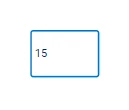
The Filter form field allows users to type a specific value of the attribute which has been dragged onto it.
It is possible to set filters to all attribute types, but the type of the attribute must be specified in the Form type field of the LAYOUT tab.
Note
The event triggers available for the Filter form field widget are:
onMouseEnter
onMouseLeave
onFocus
onChange
See also
If a value has been set as a default value, the widgets specified in the Scope will automatically be filtered according to the default value.
Subsection |
Option |
Description |
GOLD ref |
|---|---|---|---|
Input Options |
Table |
The table which contains the attribute to be filtered. It is possible to change it from the drop-down menu and choosing one of the tables which have been imported in the Datasets tab. |
input |
Attribute |
The attribute which has been dragged onto the widget, which will be filtered by the rules which will be set in the Filter area. It is possible to change it from the attribute drop-down list by typing its name or by scrolling in the list. |
input |
|
Action type |
Select whether the operation performed by the widget is Selection or Filter. To know more about the difference between these two configurations, go to the corresponding page. |
||
Scope Options |
Scope |
Here, users will select the widgets to which the filter will be applied. More information on the Scope field can be found in the corresponding page. |
input |
Default Settings |
Set a default value |
Here, users can choose whether the filter will be automatically filled with a specific value or not. If selected, users can type the default value in the text box located next to the checkbox. |
Subsection |
Option |
Description |
GOLD ref |
|---|---|---|---|
Form field |
Form variant |
Select from the drop-down list the way the form will be displayed on the slide: Outlined (default), Standard, Filled. |
|
Form type |
Specify the value type which will be inserted in the form: Number (default), or Text. |
||
Number format (only if Number has been chosen as the Form type) |
Choose the format of the number value of the attribute which has been dragged onto the action. The possible values are: Integer, Float (1-digit), Float (3-digits), Float (6-digits). |
||
Minimum value (only if Number has been chosen as the Form type) |
Type the minimum allowed value in the filter. |
||
Maximum value (only if Number has been chosen as the Form type) |
Type the maximum allowed value in the filter. |
||
Text |
Font style |
It defines the font style of the value which will be inserted in the filter, which can be bold, italic or underlined. |
|
Font family |
Choose from the drop-down list the font family of the value which will be inserted in the filter. |
||
Font size (px) |
It defines the font size of the value which will be inserted in the filter. |
||
Text transform |
It defines the letter case. The possible values are: Capitalize, Uppercase, Lowercase. |
||
Text color |
It defines the color of the text. By clicking it, users can select Standard colors, otherwise they can use the color picker or choose the color code, which can be: Hex, Rgb, Hsl, Hsv. The default color is dark blue. An Eye dropper is also available to work as a color picker. |
||
Background color |
It defines the color of the background of the field. By clicking it, users can select Standard colors, otherwise they can use the color picker or choose the color code, which can be: Hex, Rgb, Hsl, Hsv. The default color is white. An Eye dropper is also available to work as a color picker. |
||
Border |
Border radius (px) |
It defines the action border radius, which is the rounding of the widget corners. |
|
Border size (px) |
It defines the size of the border of the widget. |
||
Border color |
It defines the color of the border of the field. By clicking it, users can select Standard colors, otherwise they can use the color picker or choose the color code, which can be: Hex, Rgb, Hsl, Hsv. The default color is dark blue. An Eye dropper is also available to work as a color picker. |
||
Border color hover |
It defines the color of the border when it is hovered with the pointer. By clicking it, users can select Standard colors, otherwise they can use the color picker or choose the color code, which can be: Hex, Rgb, Hsl, Hsv. The default color is black. An Eye dropper is also available to work as a color picker. |
||
Border color focus |
It defines the color of the border when it is selected. By clicking it, users can select Standard colors, otherwise they can use the color picker or choose the color code, which can be: Hex, Rgb, Hsl, Hsv. The default color is dark blue. An Eye dropper is also available to work as a color picker. |
||
Label |
Label style |
It defines the font style and alignment of the widget label, which can be bold, italic or underlined, and text left, text center, text right. |
|
Label text |
The text of the label. |
||
Font family |
Choose from the drop-down list the font family of the label. |
||
Font size (px) |
It defines the font size of the label. |
||
Text transform |
It defines the letter case. The possible values are: Capitalize, Uppercase, Lowercase. |
||
Label placement |
The placement of the label. The possible values are: Top, End, Bottom, Start. |
||
Label color |
It defines the color of the label. By clicking it, users can select Standard colors, otherwise they can use the color picker or choose the color code, which can be: Hex, Rgb, Hsl, Hsv. The default color is dark blue. An Eye dropper is also available to work as a color picker. |
The Filter drop down menu
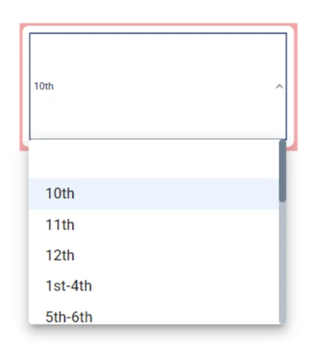
The Filter drop down menu action has the graphical aspect of a drop-down list.
It is possible to set filters to all the attribute types: this widget automatically creates a drop-down menu containing the possible values to filter if a nominal attribute is dragged on it, while it provides an additional section if the attribute which has been dragged onto the widget is numeral.
In the table below users can find the detailed description of the Filter drop down menu configuration options their corresponding GOLD references. The possible values, when they have a different name from the interface, are written in italic next to the corresponding path.
Subsection |
Option |
Description |
GOLD ref |
|---|---|---|---|
Input Options |
Table |
In the drop-down menu users can select from which table to import the data from. |
input |
Attribute |
In the drop-down menu users can select the attribute to work on. |
input |
|
Scope Options |
Scope |
Here, users will select the widgets to apply the filter to. It is possible to type the widgets name in the Scope box or select them directly from the widgets list, that appears when clicking the button next to the box. |
input |
Default settings |
Set a default value |
If checked, users can select the value to visualize on the slide by default. |
input |
Filter options |
Auto |
If selected, all possible values will be shown in the drop-down menu. It is also possible to make the missing values visible, by checking the Include missing values box. |
input |
Custom |
If selected, users will be required to set one or more filters. Once the filter has been set, only the filtered data will be shown. To know more about the filter setting click here. |
input |
Subsection |
Option |
Description |
GOLD ref |
|---|---|---|---|
Label Options |
Text style options |
Here users can define the label text style, which can be: bold, italic or underlined and the text alignment, which can be: text left, text center or text right. |
layout |
Font family |
Here users can define the label font in the drop-down menu. |
layout |
|
Font size (px) |
It defines the label font size. |
layout |
|
Text transform |
It defines the label letter case. The possible values are: Capitalize, Uppercase, Lowercase. |
layout |
|
Label |
Here users can type the action label. |
layout |
|
Label color |
It defines the color of the label. By clicking it, users can select Standard colors, otherwise they can use the color picker or choose the color code, which can be: Hex, Rgb, Hsl, Hsv. The default color is dark blue. |
layout |
|
Label placement |
It defines the label placement. The possible options are: Top (by default), End, Bottom, Start. |
layout |
|
Border Options |
Border radius (px) |
It defines the action border radius. |
layout |
Border width (px) |
It defines the action border width. |
layout |
|
Border color |
It defines the color of the action border. By clicking it, users can select Standard colors, otherwise they can use the color picker or choose the color code, which can be: Hex, Rgb, Hsl, Hsv. The default color is white. |
layout |
|
Border color hover |
It defines the color of the action border when hovering over it with the cursor. By clicking it, users can select Standard colors, otherwise they can use the color picker or choose the color code, which can be: Hex, Rgb, Hsl, Hsv. The default color is white. |
layout |
|
Border color focus |
It defines the color of the action border when selecting it. By clicking it, users can select Standard colors, otherwise they can use the color picker or choose the color code, which can be: Hex, Rgb, Hsl, Hsv. The default color is dark blue. |
layout |
|
Text Options |
Text style options |
Here users can define the text style of the selected value in the drop-down menu, which can be: bold, italic or underlined. |
layout |
Font family |
Here users can define the text font of the selected value in the drop-down menu. |
layout |
|
Font size (px) |
It defines the font size of the selected value in the drop-down menu. |
layout |
|
Text transform |
It defines the letter case. The possible values are: Capitalize, Uppercase, Lowercase. |
layout |
|
Label color |
It defines the color of the selected value in the drop-down menu. By clicking it, users can select Standard colors, otherwise they can use the color picker or choose the color code, which can be: Hex, Rgb, Hsl, Hsv. The default color is dark blue. |
layout |
|
Menu Options |
Text style options |
Here users can define the text style of the possible values in the drop-down menu, which can be: bold, italic or underlined. |
layout |
Font family |
Here users can define the font of the possible values in the drop-down menu. |
layout |
|
Font size (px) |
It defines the font size of the possible values in the drop-down menu. |
layout |
|
Text transform |
It defines the letter case. The possible values are: Capitalize, Uppercase, Lowercase. |
layout |
|
Label color |
It defines the color of possible values in the drop-down menu, when hovering over them with the cursor. By clicking it, users can select Standard colors, otherwise they can use the color picker or choose the color code, which can be: Hex, Rgb, Hsl, Hsv. The default color is dark blue. |
layout |
|
Dropdown Options |
Variant |
Here users can define the dropdown menu graphical style. The possible values are: Outlined (by default), Standard, Filled. |
layout |
The Filter autocomplete
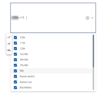
Sample configuration with the nominal attribute Education.
The Filter autocomplete action has the graphical aspect of a checkbox drop-down menu.
By pressing it, a list of the possible values will appear. Users can select one or more than one value and the linked Widgets specified in the Scope box will show the filtered data accordingly.
In the table below users can find the detailed description of the Filter autocomplete configuration options their corresponding GOLD references. The possible values, when they have a different name from the interface, are written in italic next to the corresponding path.
Subsection |
Option |
Description |
GOLD ref |
|---|---|---|---|
Input Options |
Table |
In the drop-down menu users can select from which table to import the data from. |
input |
Attribute |
In the drop-down menu users can select the attribute to work on. |
input |
|
Scope Options |
Scope |
Here, users will select the widgets to apply the filter to. It is possible to type the widgets name in the Scope box or select them directly from the widgets list, that appears when clicking the button next to the box. |
input |
Subsection |
Option |
Description |
GOLD ref |
|---|---|---|---|
Label Options |
Text style options |
Here users can define the label text style, which can be: bold, italic or underlined, and the text alignment, which can be: text left, text center or text right. |
layout |
Font family |
Here users can define the label font in the drop-down menu. |
layout |
|
Font size (px) |
It defines the label font size. |
layout |
|
Text transform |
It defines the letter case. The possible values are: Capitalize, Uppercase, Lowercase. |
layout |
|
Label |
Here users can type the action label. |
layout |
|
Label color |
It defines the color of the label. By clicking it, users can select Standard colors, otherwise they can use the color picker or choose the color code, which can be: Hex, Rgb, Hsl, Hsv. The default color is dark blue. |
layout |
|
Label placement |
It defines the label placement. The possible options are: Top (by default), End, Bottom, Start. |
layout |
|
Border Options |
Border radius (px) |
It defines the action border radius. |
layout |
Border width (px) |
It defines the action border width. |
layout |
|
Border color |
It defines the color of the action border. By clicking it, users can select Standard colors, otherwise they can use the color picker or choose the color code, which can be: Hex, Rgb, Hsl, Hsv. The default color is white. |
layout |
|
Border color hover |
It defines the color of the action border when hovering over it with the cursor. By clicking it, users can select Standard colors, otherwise they can use the color picker or choose the color code, which can be: Hex, Rgb, Hsl, Hsv. The default color is white. |
layout |
|
Border color focus |
It defines the color of the action border when selecting it. By clicking it, users can select Standard colors, otherwise they can use the color picker or choose the color code, which can be: Hex, Rgb, Hsl, Hsv. The default color is dark blue. |
layout |
|
Text Options |
Text style options |
Here users can define the text style of the selected value in the drop-down menu, which can be: bold, italic or underlined. |
layout |
Font family |
Here users can define the text font of the selected value in the drop-down menu. |
layout |
|
Font size (px) |
It defines the font size of the selected value in the drop-down menu. |
layout |
|
Text transform |
It defines the letter case. The possible values are: Capitalize, Uppercase, Lowercase. |
layout |
|
Text color |
It defines the color of the selected value in the drop-down menu. By clicking it, users can select Standard colors, otherwise they can use the color picker or choose the color code, which can be: Hex, Rgb, Hsl, Hsv. The default color is dark blue. |
layout |
|
Menu Options |
Text style options |
Here users can define the text style of the values in the drop-down menu, which can be: bold, italic or underlined. |
layout |
Font family |
Here users can define the text font of the values in the drop-down menu. |
layout |
|
Font size (px) |
It defines the font size. |
layout |
|
Text transform |
It defines the letter case. The possible values are: Capitalize, Uppercase, Lowercase. |
layout |
|
Menu color |
It defines the color of the possible values in the drop-down menu, when hovering over them with the cursor. By clicking it, users can select Standard colors, otherwise they can use the color picker or choose the color code, which can be: Hex, Rgb, Hsl, Hsv. The default color is dark blue. |
layout |
|
Dropdown Options |
Variant |
Here users can define the dropdown menu style. The possible values are: Outlined (by default), Standard, Filled. |
layout |
Tip
When opening the value drop-down list of the Filter autocomplete, a context menu on the left allows users to speed up some values selection operations. The possible operations are: Check All, Uncheck All and Revert.
The Filter radio button
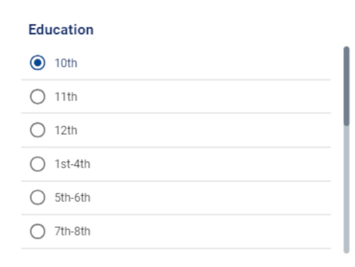
Sample configuration with the nominal attribute Education.
The Filter radio button action has the graphical aspect of a checklist, where users can select a single value to visualize in the linked Widgets specified in the Scope.
In the table below users can find the detailed description of the Filter autocomplete configuration options their corresponding GOLD references. The possible values, when they have a different name from the interface, are written in italic next to the corresponding path. The possible values, when they have a different name from the interface, are written in italic next to the corresponding path.
Subsection |
Option |
Description |
GOLD ref |
|---|---|---|---|
Input Options |
Table |
In the drop-down menu users can select from which table to import the data from. |
input |
Attribute |
In the drop-down menu users can select the attribute to work on. |
input |
|
Scope Options |
Scope |
Here, users will select the widgets to apply the filter to. It is possible to type the widgets name in the Scope box or select them directly from the widgets list, that appears when clicking the button next to the box. |
input |
Default settings |
Value box |
If checked, users can select the value to visualize on the slide by default. |
input |
Filter options |
Auto |
If selected, all possible values will be shown in the drop-down menu. It is also possible to make the missing values visible, by checking the Include missing values box. |
input |
Custom |
If selected, users will be required to set one or more filters. Once the filter has been set, only the filtered data will be shown. To know more about the filter setting click here. |
input |
Subsection |
Option |
Description |
GOLD ref |
|---|---|---|---|
Label Options |
Text style options |
Here users can define the label text style, which can be: bold, italic or underlined and the text alignment, which can be: text left, text center or text right. |
layout |
Font family |
Here users can define the label font in the drop-down menu. |
layout |
|
Font size (px) |
It defines the font size of the label. |
layout |
|
Text transform |
It defines the letter case. The possible values are: Capitalize, Uppercase, Lowercase. |
layout |
|
Label |
Here users can type the action label. |
layout |
|
Label color |
It defines the color of the label. By clicking it, users can select Standard colors, otherwise they can use the color picker or choose the color code, which can be: Hex, Rgb, Hsl, Hsv. The default color is dark blue. |
layout |
|
Label placement |
It defines the label placement. The possible options are: Top, End, Bottom, Start. |
layout |
|
Icon Options |
Icon size (px) |
It defines the size of the checkbox. |
layout |
Unchecked color |
It defines the color of the unselected values. By clicking it, users can select Standard colors, otherwise they can use the color picker or choose the color code, which can be: Hex, Rgb, Hsl, Hsv. The default color is white. |
layout |
|
Checked color |
It defines the color of the selected value. By clicking it, users can select Standard colors, otherwise they can use the color picker or choose the color code, which can be: Hex, Rgb, Hsl, Hsv. The default color is dark blue. |
layout |
|
Text Options |
Text style options |
Here users can define the text style of the values, when they have been selected: bold, italic or underlined. |
layout |
Font family |
Here users can define the font of the values in the drop-down menu. |
layout |
|
Font size (px) |
It defines the font size of the values. |
layout |
|
Text transform |
It defines the letter case. The possible values are: Capitalize, Uppercase, Lowercase. |
layout |
|
Text placement |
It defines the checkbox placement. The possible values are: Top, Start, Bottom, End (by default). |
layout |
|
Text color |
It defines the color of text values, when they have been selected. By clicking it, users can select Standard colors, otherwise they can use the color picker or choose the color code, which can be: Hex, Rgb, Hsl, Hsv. The default color is white. |
layout |
|
Radio Options |
Orientation |
It defines the checkbox orientation. The possible values are: Vertical (by default) and Horizontal. |
layout |
The Filter values
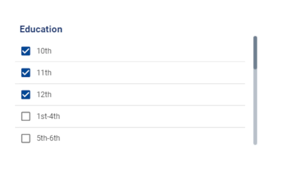
Sample configuration with the nominal attribute Education.
The Filter values action has the graphical aspect of a checklist, where users can select one or more than one value to visualize in the linked Widgets specified in the Scope.
In the table below users can find the detailed description of the Filter values configuration options their corresponding GOLD references. The possible values, when they have a different name from the interface, are written in italic next to the corresponding path.
Subsection |
Option |
Description |
GOLDref |
|---|---|---|---|
Input Options |
Table |
In the drop-down menu users can select from which table to import the data from. |
input |
Attribute |
In the drop-down menu users can select the attribute to work on. |
input |
|
Scope Options |
Scope |
Here, users will select the widgets to apply the filter to. It is possible to type the widgets name in the Scope box or select them directly from the widgets list, that appears when clicking the button next to the box. |
input |
Filter options |
Auto |
If selected, all possible values will be shown in the checklist. It is also possible to make the missing values visible, by checking the Include missing values box. |
input |
Custom |
If selected, users will be required to set one or more filters. Once the filter has been set, only the filtered data will be shown in the checklist. To know more about the filter setting click here. |
input |
Subsection |
Option |
Description |
GOLDref |
|---|---|---|---|
Label Options |
Text style options |
Here users can define the text style, which can be: bold, italic or underlined and the text alignment, which can be: text left, text center or text right. |
layout |
Font family |
Here users can define the label font in the drop-down menu. |
layout |
|
Font size (px) |
It defines the font size of the label. |
layout |
|
Text transform |
It defines the letter case. The possible values are: Capitalize, Uppercase, Lowercase. |
layout |
|
Label |
Here users can type the action label. |
layout |
|
Label color |
It defines the color of the label. By clicking it, users can select Standard colors, otherwise they can use the color picker or choose the color code, which can be: Hex, Rgb, Hsl, Hsv. The default color is dark blue. |
layout |
|
Label placement |
It defines the label placement. The possible options are: Top, End (by default), Bottom, Start. |
layout |
|
Icon Options |
Icon size (px) |
It defines the size of the checkbox. |
layout |
Unchecked color |
It defines the color of the unselected checkbox. By clicking it, users can select Standard colors, otherwise they can use the color picker or choose the color code, which can be: Hex, Rgb, Hsl, Hsv. The default color is white. |
layout |
|
Checked color |
It defines the color of the selected checkbox. By clicking it, users can select Standard colors, otherwise they can use the color picker or choose the color code, which can be: Hex, Rgb, Hsl, Hsv. The default color is dark blue. |
layout |
|
Text Options |
Text style options |
Here users can define the text style of the values, which can be: bold, italic or underlined. |
layout |
Font family |
Here users can define the font of the values. |
layout |
|
Font size (px) |
It defines the font size of the values. |
layout |
|
Text transform |
It defines the letter case. The possible values are: Capitalize, Uppercase, Lowercase. |
layout |
|
Text placement |
It defines the checkbox placement. The possible values are: Top, Start, Bottom, End (by default). |
layout |
|
Text color |
It defines the color of values. By clicking it, users can select Standard colors, otherwise they can use the color picker or choose the color code, which can be: Hex, Rgb, Hsl, Hsv. The default color is white. |
layout |
|
Checkbox Options |
Orientation |
It defines the checkbox orientation. The possible values are: Vertical (by default) and Horizontal. |
layout |
The Filter slider

Sample configuration with the integer attribute Age.
The Filter slider action has the graphical aspect of range slider.
When users interact with the range slider by moving its pointer, the linked Widgets specified in the Scope will visualize the data accordingly.
In the table below users can find the detailed description of the Filter slider configuration options their corresponding GOLD references. The possible values, when they have a different name from the interface, are written in italic next to the corresponding path.
Subsection |
Option |
Description |
GOLDref |
|---|---|---|---|
Input Options |
Table |
In the drop-down menu users can select from which table to import the data from. |
input |
Attribute |
In the drop-down menu users can select the attribute to work on. |
input |
|
Scope Options |
Scope |
Here, users will select the widgets to apply the filter to. It is possible to type the widgets name in the Scope box or select them directly from the widgets list, that appears when clicking the button next to the box. |
input |
Domain settings |
Auto |
If selected, all values will be shown on the range slider. It is also possible to make the none values visible, by checking the Include none values box. |
input |
Custom |
If selected, users will be required to set one or more filters. Once the filter has been set, only the filtered range values will be shown. The entries are: Min, which defines the minimum value to visualize and Max, which defines the maximum value to visualize. |
options |
Subsection |
Option |
Description |
GOLDref |
|---|---|---|---|
Color Options |
Track color |
It defines the track color. By clicking it, users can select Standard colors, otherwise they can use the color picker or choose the color code, which can be: Hex, Rgb, Hsl, Hsv. The default color is white. |
layout |
Label Options |
Text style options |
Here users can define the label text style, which can be: bold, italic or underlined and the text alignment, which can be: text left, text center or text right. |
layout |
Font family |
Here users can define the label font in the drop-down menu. |
layout |
|
Font size (px) |
It defines the label font size. |
layout |
|
Text transform |
It defines the letter case. The possible values are: Capitalize, Uppercase, Lowercase. |
layout |
|
Label |
Here users can type the action label. |
layout |
|
Label color |
It defines the color of the label. By clicking it, users can select Standard colors, otherwise they can use the color picker or choose the color code, which can be: Hex, Rgb, Hsl, Hsv. The default color is white. |
layout |
|
Label placement |
It defines the label placement. The possible options are: Top (by default), End, Bottom, Start. |
layout |
The Filter Calendar
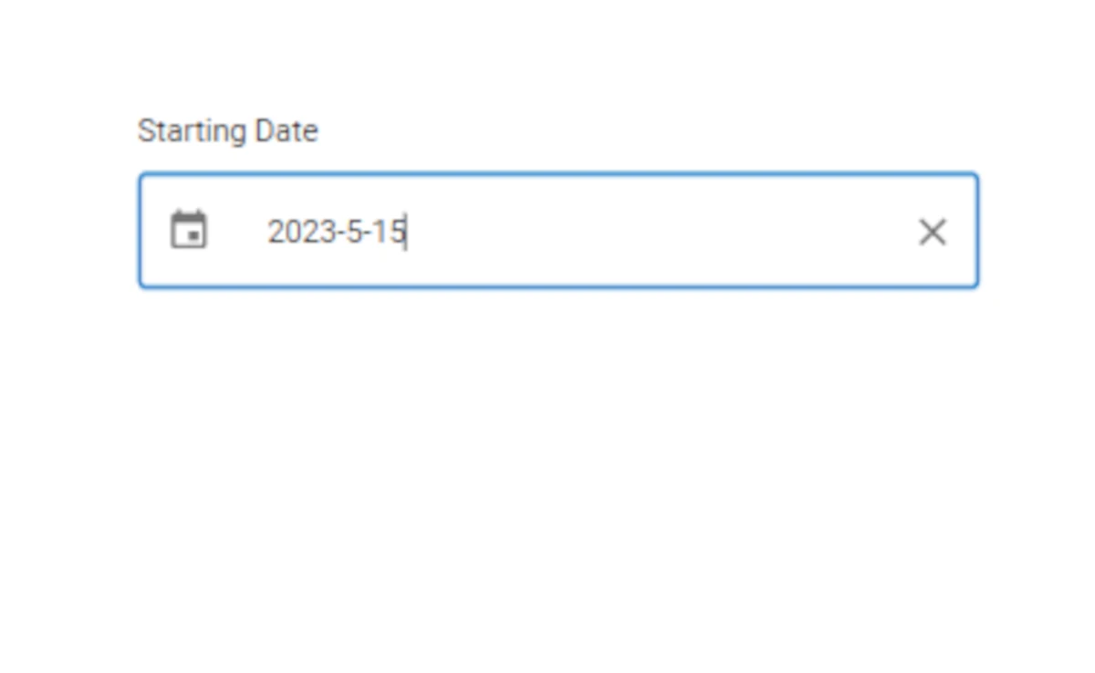
Sample configuration with the date attribute Starting date.
The Filter Calendar action has the graphical aspect of calendar.
When users set a filter in the calendar, the linked Widgets specified in the Scope will visualize the filtered data accordingly.
In the table below users can find the detailed description of the Filter values configuration options their corresponding GOLD references. The possible values, when they have a different name from the interface, are written in italic next to the corresponding path.
Subsection |
Option |
Description |
GOLDref |
|---|---|---|---|
Input Options |
Table |
In the drop-down menu users can select from which table to import the data from. |
input |
Attribute |
In the drop-down menu users can select the attribute to work on. |
input |
|
Function |
It defines the time settings. The possible values are: Year (by default), Quarter, Month, Week, Day. |
input |
|
Scope Options |
Scope |
Here, users will select the widgets to apply the filter to. It is possible to type the widgets name in the Scope box or select them directly from the widgets list, that appears when clicking the button next to the box. |
input |
Filter options |
Add starting date |
If checked, users can insert a starting date in the Label box. (By default) |
input |
Add ending date |
If checked, users can insert a ending date in the Label box. |
input |
|
Orientation |
It defines the values box orientation. The possible options are: Horizontal and Vertical (by default). |
layout |
Subsection |
Option |
Description |
GOLDref |
|---|---|---|---|
Calendar Options |
Outer background color |
It defines the action background color. By clicking it, users can select Standard colors, otherwise they can use the color picker or choose the color code, which can be: Hex, Rgb, Hsl, Hsv. The default color is white. |
layout |
Inner background color |
It defines the values box background color. By clicking it, users can select Standard colors, otherwise they can use the color picker or choose the color code, which can be: Hex, Rgb, Hsl, Hsv. The default color is white. |
layout |
|
Label Options |
Text style options |
Here users can define the label text style, which can be: bold, italic or underlined. |
layout |
Font family |
Here users can define the label font in the drop-down menu. |
layout |
|
Font size (px) |
It defines the label font size. |
layout |
|
Font color |
It defines the color of the label. By clicking it, users can select Standard colors, otherwise they can use the color picker or choose the color code, which can be: Hex, Rgb, Hsl, Hsv. The default color is black. |
layout |
|
Label placement |
It defines the label placement. The possible options are: Top (by default), End, Bottom, Start. |
layout |
|
Icon Style |
Icon color |
It defines the color of calendar icon in the value box. By clicking it, users can select Standard colors, otherwise they can use the color picker or choose the color code, which can be: Hex, Rgb, Hsl, Hsv. The default color is black. |
layout |
Border Style |
Border size (px) |
It defines the size of the value box border. |
layout |
Style |
It defines the value box border style. The possible values are: Dotted, Dashed, Solid (by default), Double, 3D Ridge, 3D Inset, 3D Outset, None, Hidden. |
layout |
|
Border color |
It defines the action border color. By clicking it, users can select Standard colors, otherwise they can use the color picker or choose the color code, which can be: Hex, Rgb, Hsl, Hsv. The default color is white. |
layout |
|
Date Style |
Text style options |
Here users can define the date text style, which can be: bold, italic or underlined. |
layout |
Font family |
Here users can define the date font in the drop-down menu. |
layout |
|
Font size (px) |
It defines the date font size. |
layout |
|
Font color |
It defines the date color. By clicking it, users can select Standard colors, otherwise they can use the color picker or choose the color code, which can be: Hex, Rgb, Hsl, Hsv. The default color is black. |
layout |
Note
Only Date/Time attributes can be dragged onto the Filter Calendar.