Pie and Doughnut Plots
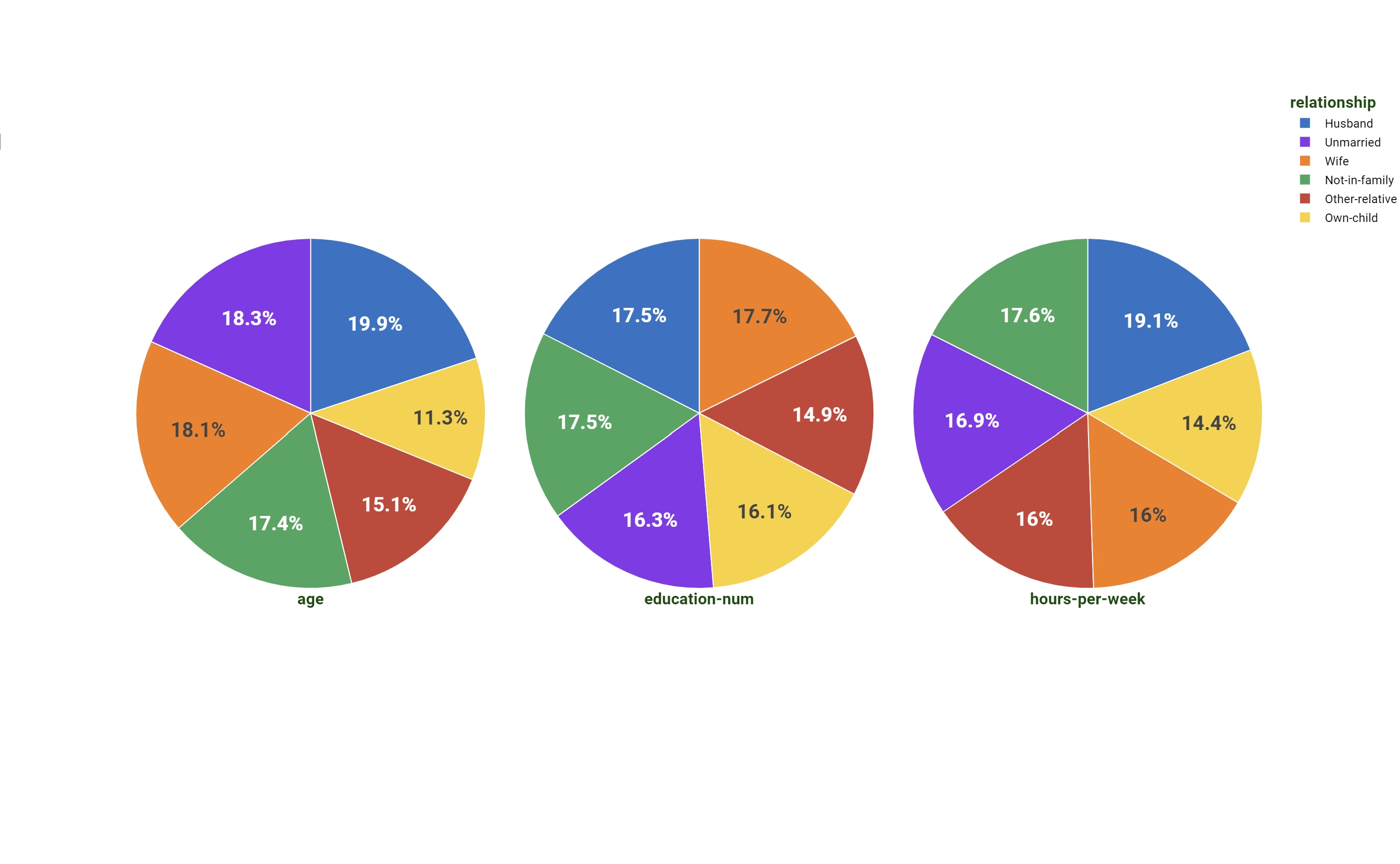
A Pie Plot is a circular chart divided into sectors, illustrating numerical proportion. The size of each slice is proportional to the frequency of the values in the dataset or to the output value used as a weight operator.
Doughnut Plot is a modification of the Pie Plot presenting an extra hole in the middle with a configurable central value. To its peculiar properties is dedicated the last section.
Dimension |
Type |
Description |
|---|---|---|
Y |
output |
Attributes on this dimension are used as weight operator. |
Color |
axis/grid |
It controls the labels and the sectors’ division of the pie. |
Note
Since no target dimension are present in Heat map plot, maximum one attribute per group can be dropped at any time on the output dimension.
Doughnut Plot
In the Doughnut Plot, the main difference is the presence of the central hole and the possibility to place a configurable value in the middle of the same.
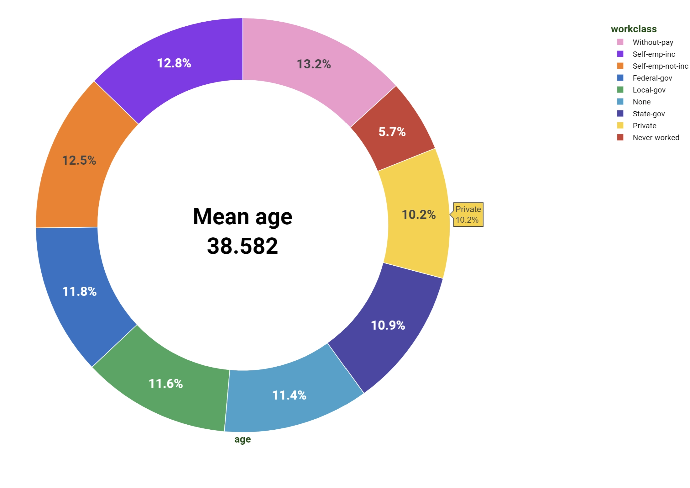
The dimensions are:
Dimension (mandatory field are bold) |
Type |
Description |
|---|---|---|
Y |
output |
Attributes on this dimension are used as weight operator. |
Color |
axis/grid |
It controls the labels and the sectors’ division of the pie. |
Note
Since no target dimension are present in Heat map plot, maximum one attribute per group can be dropped at any time on the output dimension.
To configure the central value you have to open the Plot option menu and fill the Doughnut Text field. If you want to fill the hole with a value evaluated from the data you need to provide it in Parametric form by using the formula icon located at the right end of the Doughnut Text field. Text in Parametric form should be filled following the same rules of a general GOLD code or of option parametric visualization.