Table Widget
The Table is a widget located in the Widgets panel of the stage window, and it displays in a grid table specific attributes or the entire dataset, which have been previously imported in the Datasets left panel. A Rulex Studio Table does not merely display data in a tabular format, but also allows data interaction such as: selecting data (rows or columns) and propagate the selection from the table to plots, or filtering data to visualize only a subset of data, and editing all or a series of columns.
To use a Table widget follow the instructions below.
Prerequisites
Procedure
To delete an attribute dragged onto the Table widget, right-click on the header and select Delete attributes. To delete the whole dataset dragged onto the Table widget, select all the attributes to be deleted by keeping the Shift key pressed, right-clicking on the header and selecting Delete attributes.
Once they have been dragged onto the Table widget, attributes are positioned onto the rightmost side of the Table by default. If the attribute is dragged onto the header of another attribute already present in the Table widget, by default the newly dragged attribute is positioned on the left of the already present attribute.
When right-clicking on the Table widget, the widget context menu opens.
Table Header Context Menu
When right-clicking on a single header in a Table, or a series of headers by keeping the Shift or Ctrl key pressed, a context menu opens up, and the following options are available:
Delete attributes: deletes the corresponding attribute.
Go to row: opens a window where you can insert the row number you wish to visualize, then click APPLY to go to the defined row, or CANCEL to discard the operation.
Query action: opens a side menu where users can select one among the following values:
Sort ascending, it changes the sorting order of all the selected attributes to ascending, as explained here.
Sort descending, it changes the sorting order of all the selected attributes to descending, as explained here.
No sort, it removes any previously set sorting order.
Filter, it allows to define a filter to all the selected attributes, as explained here. (Not available when multiple headers are selected).
Apply, it allows to apply an aggregator operator to all the selected attributes, as explained here. (Not available when multiple headers are selected).
Group, it groups all the selected attributes, as explained here.
Delete queries: it deletes all previously defined queries.
Disable/Enable expand: it disables or enables the expanded mode where only the first row of each group is displayed.
Set column style: it changes the style of the whole column. To configure the style, a dedicated panel opens, and it is divided into two tabs, STYLE and SPANNING. The STYLE tab is described in this dedicated page. While, the SPANNING tab is described here.
Set conditional formatting: it changes the formatting rules for the whole column. The defined rules can change the style of different column cells according to their values. To configure the formatting rules a dedicated panel is opened; its content is described in a separated section, it functions similarly to Rulex Factory.
Set editing options: it allows defining table editing options as described here.
Make default column width: it sets the current column width as the default width for the considered column. This implies a change in the column style for the property width.
When right-clicking on a single row in a Table, or a series of rows by keeping the Shift key pressed, a context menu opens up, and the following options are available:
Copy to clipboard: it copies the selected row value to the clipboard. Only available if the Select entire row option in the Table tab has been unchecked.
Set value: it allows changing all the values in the selected column by defining a new value in the Set Value menu. If the data type of the selected column is nominal, a drop-down menu displays the list of all values in the column, select one and click APPLY to change all the row values. If the data type of the selected column is ordered, continuous or date, define the desired value in the Set Value menu and click APPLY to change all the row values. Only available if the Select entire row option in the Table tab has been unchecked and column has been previously selected.
Go to row: it opens a window where you can insert the row number you wish to visualize, and click APPLY to go to the defined row.
Set row style: it changes the style of a series of rows according to a defined rule. To configure the style, a dedicated panel opens, and it is divided into two tabs, STYLE and SPANNING. In the STYLE tab, click ADD NEW FILTER to define a new style rule, and this is divided into three areas:
An attribute selection area, clicking on the Select an attribute drop-down area, allows visualizing all the available attributes and index to which the style rule will be applied.
A condition filter, once the SET FILTER button is selected the condition panel associated with the chosen attribute is shown. A more detailed description of these panels is presented in the subsection: Condition panels.
An associated style, once the SET STYLE button is selected a panel equal to the column style panel is shown.
To delete a row style rule, click on the X icon at the right-end of the defined style rule. Finally, click APPLY to confirm your changes, or CANCEL to discard them.
The metadata columns available for column style rules are: rowindex, it allows to define a spanning rule based on the row index number; #data, it allows to define a style rule based on the number of data.
Merging Datasets in a Table
When dragging onto a Table two attributes belonging to two different datasets, a Join Configuration window opens allowing the user to perform an inner join operation.
In the Join Configuration window, the join operation is simplified and users are only allowed to perform an Inner join, so no other types of join can be selected.
To initiate a join operation, simply click on the plus icon to Insert a new key condition, a connection line appears, and at both ends of the connection line there’s a drop-down menu. Select from the corresponding drop-down menus the key attributes from both datasets. At the left-hand of the connection line, users can open the drop-down menu and visualize the dataset attribute list of the attribute already present in the Table widget. While, at the right-hand of the connection line, users can open the drop-down menu and visualize the dataset attribute list of the newly dragged attribute in the Table widget. These key attributes control the comparison process essential for the join operation.
The connection yields two properties: the Operator and the Weight, to know more click on this link. These two properties establish which type of comparison will be performed between the two attributes connected by the line.
Finally, click APPLY to complete the join operation, or click CANCEL to discard all your previous changes.
Table Layout Options
Once the widget has been dragged onto the slide and the required attributes/table have been dragged on it, users can double-click its frame or use the widgets context menu to open the Layout options pane.
The Layout options pane is made of five sections. Some options are only available if the attributes in the Table widget come from the same dataset.
Most of the options available in the Layout options pane can be customized in parametric mode.
Users can find all the available options and the corresponding GOLD references in the table below.
To know more about GOLD, go to the corresponding page.
Subsection |
Option |
Description |
GOLDref |
|---|---|---|---|
Title |
Text style and alignment |
Here, users can define the title style, which can be bold, italic or underlined, as well as the title horizontal alignment, which can be right, center, left. |
|
Title text |
The text string of the table title. |
||
Font family |
Here, users can choose from the drop-down list the font of the title itself. |
||
Font size (px) |
Here, users can type the desired size of the title. |
||
Background color |
It defines the background color of the widget. By clicking on the color, which is white by default, a popup opens, where Standard colors and generated custom color palettes can be used, as well as Rgb, Hex, Hsl and Hsv colors. An Eye dropper is also available to work as a color picker. |
||
Title color |
It defines the title’s color. By clicking on the color, which is blue by default, a popup opens, where Standard colors and generated custom color palettes can be used, as well as Rgb, Hex, Hsl and Hsv colors. An Eye dropper is also available to work as a color picker. |
||
Caption |
Text style and alignment |
Here, users can define the caption style, which can be bold, italic or underlined, as well as the caption’s horizontal alignment, which can be right, center, left. |
|
Font family |
Here, users can choose from the drop-down list the font of the caption. |
||
Font size (px) |
Here, users can type the desired size of the caption. |
||
Background color |
It defines the background color of the widget. By clicking on the color, which is white by default, a popup opens, where Standard colors and generated custom color palettes can be used, as well as Rgb, Hex, Hsl and Hsv colors. An Eye dropper is also available to work as a color picker. |
||
Caption color |
It defines the caption’s color. By clicking on the color, which is dark gray by default, a popup opens, where Standard colors and generated custom color palettes can be used, as well as Rgb, Hex, Hsl and Hsv colors. An Eye dropper is also available to work as a color picker. |
Subsection |
Option |
Description |
GOLDref |
|---|---|---|---|
Table Border |
table |
When selecting a table border, users can define the following options: |
|
Grid Selection |
Select entire row |
If selected, the entire row will be selected when a cell is clicked. If it is not selected, only the corresponding cell will be selected in the table by clicking on it. If unselected, the Copy to clipboard and Set value options are available in the Table row context menu. |
|
Text style and alignment |
Here, users can select the table text style when hovering over the values and when they are selected, which can be bold, italic or underlined, as well as the values horizontal alignment, which can be right, center, left, and the vertical alignment, which can be center, top, bottom. |
||
Font family |
Select from the drop-down list the grid values’ font when hovering over the values and when they are selected. |
||
Font size (px) |
Here, users can define the grid values font size when hovering over the values and when they are selected. |
||
Background color |
Define the grid’s background color when hovering over the values and when they are selected. By clicking on the color, which is light blue by default, a popup opens, where Standard colors and generated custom color palettes can be used, as well as Rgb, Hex, Hsl and Hsv colors. An Eye dropper is also available to work as a color picker. |
||
Color |
Define the grid value color. By clicking on the color, which is dark gray by default, a popup opens, where Standard colors and generated custom color palettes can be used, as well as Rgb, Hex, Hsl and Hsv colors. An Eye dropper is also available to work as a color picker. |
||
Border style |
Define the grid border style by selecting one from the drop-down list. It will be available only when hovering or selecting parts of the grid. The available styles are: Dotted, Dashed, Solid, Double, 3D Ridge, 3D Inset, 3D Outset, None, Hidden. |
||
Border size (px) |
The size of the grid’s border. |
||
Border color |
The color of the grid’s border. By clicking on the color, which is dark gray by default, a popup opens, where Standard colors and generated custom color palettes can be used, as well as Rgb, Hex, Hsl and Hsv colors. An Eye dropper is also available to work as a color picker. |
||
Additional style |
Define the custom CSS code to be added as it is to any cell style for the grid. |
||
Cell |
Text style and alignment |
Here, users can select the table text style when hovering over the values and when they are selected, which can be bold, italic or underlined, as well as the values horizontal alignment, which can be right, center, left, and the vertical alignment, which can be center, top, bottom. |
|
Font family |
Select from the drop-down list the cell font of the values when they are visualized with no interaction (click or hover) on them. |
||
Font size (px) |
Here, users can define the size of the values in the cells when they are visualized with no interaction (click or hover) on them. |
||
Cell background color |
Define the cell background color when it is visualized with no interaction (click or hover) on it. |
||
Cell text color |
Define the cell text color when it is visualized with no interaction (click or hover) on it. |
||
Additional style |
Define the custom CSS code to be added as it is to any cell style for the grid. |
||
Row |
Row height (px) |
The height of the row in the table. |
|
Border style |
The style of the row border, which can be Dotted, Dashed, Solid (default value), Double, 3D Ridge, 3D Inset, 3D Outset, None, Hidden. |
||
Border size (px) |
The size of the row border. |
||
Border color |
The color of the row border. By clicking on the color, which is gray by default, a popup opens, where Standard colors and generated custom color palettes can be used, as well as Rgb, Hex, Hsl and Hsv colors. An Eye dropper is also available to work as a color picker. |
||
Column |
Column width (px) |
The width of each column. |
|
Border style |
The style of the columns’ border, which can be Dotted, Dashed, Solid (default value), Double, 3D Ridge, 3D Inset, 3D Outset, None, Hidden. |
||
Border size (px) |
The size of the columns’ border. |
||
Border color |
The color of the columns’ border. By clicking on the color, which is gray by default, a popup opens, where Standard colors and generated custom color palettes can be used, as well as Rgb, Hex, Hsl and Hsv colors. An Eye dropper is also available to work as a color picker. |
Subsection |
Option |
Description |
GOLDref |
|---|---|---|---|
Show header |
If selected, the columns’ headers are displayed in the Table. |
||
Separator |
The headers’ separator. If specified, the headers of the attributes will be split following the specified separator, creating more header levels. Headers located in the first row have the same hierarchy over the headers located right below it. |
||
Header border |
Border |
When selecting a header border, users can define the following options: |
|
Header Selection |
text style and alignment |
Here, users can select the headers’ text style when selecting the header, which can be bold, italic or underlined, as well as their horizontal alignment, which can be right, center, left, and the vertical alignment, which can be center, top, bottom. |
|
Font family |
Select from the drop-down list the cell font of the headers. |
||
Font size (px) |
The size of the headers’ font. |
||
Background color |
The color of the headers background when hovering the mouse. By clicking on the color, which is light blue by default, a popup opens, where Standard colors and generated custom color palettes can be used, as well as Rgb, Hex, Hsl and Hsv colors. An Eye dropper is also available to work as a color picker. |
||
Color |
Define the headers text color when hovering the mouse. By clicking on the color, which is dark blue by default, a popup opens, where Standard colors and generated custom color palettes can be used, as well as Rgb, Hex, Hsl and Hsv colors. An Eye dropper is also available to work as a color picker. |
||
Border style |
Define the header border style by selecting one from the drop-down list. It will be visible only when hovering or selecting parts of the header. The available styles are: Dotted, Dashed, Solid, Double, 3D Ridge, 3D Inset, 3D Outset, None, Hidden. |
||
Border size (px) |
The size of the headers border. |
||
Border color |
The color of the header border. By clicking on the color, which is dark gray by default, a popup opens, where Standard colors and generated custom color palettes can be used, as well as Rgb, Hex, Hsl and Hsv colors. An Eye dropper is also available to work as a color picker. |
||
Additional style |
Define the custom CSS code to be added as it is to any cell style for the header. |
||
Cell |
Text style and alignment |
Here, users can select the header text style when hovering over the values and when they are selected, which can be bold, italic or underlined, as well as the values horizontal alignment, which can be right, center, left, and the vertical alignment, which can be center, top, bottom. |
|
Font family |
Select from the drop-down list the header cell font of the values when they are visualized with no interaction (click or hover) on them. |
||
Font size (px) |
Here, users can define the size of the values in the header cells when they are visualized with no interaction (click or hover) on them. |
||
Cell background color |
Define the header cell background color when it is visualized with no interaction (click or hover) on it. |
||
Cell text color |
Define the header cell text color when it is visualized with no interaction (click or hover) on it. |
||
Additional style |
Define the custom CSS code to be added as it is to any cell style for the grid. |
||
Row |
Row height (px) |
The height of the row in the table. |
|
Border style |
The style of the row border, which can be Dotted, Dashed, Solid (default value), Double, 3D Ridge, 3D Inset, 3D Outset, None, Hidden. |
||
Border size (px) |
The size of the row border. |
||
Border color |
The color of the row border. By clicking on the color, which is blue by default, a popup opens, where Standard colors and generated custom color palettes can be used, as well as Rgb, Hex, Hsl and Hsv colors. An Eye dropper is also available to work as a color picker. |
||
Column |
Border style |
The style of the columns’ border, which can be Dotted, Dashed, Solid (default value), Double, 3D Ridge, 3D Inset, 3D Outset, None, Hidden. |
|
Border size (px) |
The size of the columns’ border. |
||
Border color |
The color of the columns’ border. By clicking on the color, which is gray by default, a popup opens, where Standard colors and generated custom color palettes can be used, as well as Rgb, Hex, Hsl and Hsv colors. An Eye dropper is also available to work as a color picker. |
Subsection |
Option |
Description |
GOLDref |
|---|---|---|---|
Show index |
If selected, the column index is displayed in the Table. |
||
Index Selection |
Text style and alignment |
Here, users can select the index text style when hovering over the values and when they are selected, which can be bold, italic or underlined, as well as the values horizontal alignment, which can be right, center, left, and the vertical alignment, which can be center, top, bottom. |
|
Font family |
Select from the drop-down list the index values’ font when hovering over the values and when they are selected. |
||
Font size (px) |
Here, users can define the index values font size when hovering over the values and when they are selected. |
||
Background color |
Define the index’s background color when hovering over the values and when they are selected. By clicking on the color, which is light blue by default, a popup opens, where Standard colors and generated custom color palettes can be used, as well as Rgb, Hex, Hsl and Hsv colors. An Eye dropper is also available to work as a color picker. |
||
Color |
Define the index value color. By clicking on the color, which is white by default, a popup opens, where Standard colors and generated custom color palettes can be used, as well as Rgb, Hex, Hsl and Hsv colors. An Eye dropper is also available to work as a color picker. |
||
Border style |
Define the index border style by selecting one from the drop-down list. It will be available only when hovering or selecting parts of the grid. The available styles are: Dotted, Dashed, Solid, Double, 3D Ridge, 3D Inset, 3D Outset, None, Hidden. |
||
Border size (px) |
The size of the index border. |
||
Border color |
The color of the grid’s border. By clicking on the color, which is white by default, a popup opens, where Standard colors and generated custom color palettes can be used, as well as Rgb, Hex, Hsl and Hsv colors. An Eye dropper is also available to work as a color picker. |
||
Additional style |
Define the custom CSS code to be added as it is to any cell style for the grid. |
||
Blank |
Border right style |
The style of the index right border, which can be Dotted, Dashed, Solid (default value), Double, 3D Ridge, 3D Inset, 3D Outset, None, Hidden. |
|
Border right width (px) |
The size of the index right border. |
||
Border right color |
The color of the index right border. By clicking on the color, which is white by default, a popup opens, where Standard colors and generated custom color palettes can be used, as well as Rgb, Hex, Hsl and Hsv colors. An Eye dropper is also available to work as a color picker. |
||
Border bottom style |
The style of the index bottom border, which can be Dotted, Dashed, Solid (default value), Double, 3D Ridge, 3D Inset, 3D Outset, None, Hidden. |
||
Border bottom width (px) |
The size of the index bottom border. |
||
Border bottom color |
The color of the index bottom border. By clicking on the color, which is blue by default, a popup opens, where Standard colors and generated custom color palettes can be used, as well as Rgb, Hex, Hsl and Hsv colors. An Eye dropper is also available to work as a color picker. |
||
Blank bottom color |
The color of the row border. By clicking on the color, which is white by default, a popup opens, where Standard colors and generated custom color palettes can be used, as well as Rgb, Hex, Hsl and Hsv colors. An Eye dropper is also available to work as a color picker. |
||
Blank background color |
Define the index background color of the area above the index. By clicking on the color, which is white by default, a popup opens, where Standard colors and generated custom color palettes can be used, as well as Rgb, Hex, Hsl and Hsv colors. An Eye dropper is also available to work as a color picker. |
||
Additional style |
Define the custom CSS code to be added as it is to any cell style for the grid. |
||
Cell |
Text style and alignment |
Here, users can select the index cell text style, which can be bold, italic or underlined, as well as the values horizontal alignment, which can be right, center, left, and the vertical alignment, which can be center, top, bottom. |
|
Font family |
Select from the drop-down list the index cell font of the values when they are visualized with no interaction (click or hover) on them. |
||
Font size (px) |
Here, users can define the size of the values in the index cells when they are visualized with no interaction (click or hover) on them. |
||
Cell background color |
Define the index cells background color when it is visualized with no interaction (click or hover) on it. |
||
Cell text color |
Define the index cell text color when it is visualized with no interaction (click or hover) on it. |
||
Additional style |
Define the custom CSS code to be added as it is to any cell style for the grid. |
||
Row |
Border style |
Define the style of the index row border, which can be Dotted, Dashed, Solid (default value), Double, 3D Ridge, 3D Inset, 3D Outset, None, Hidden. |
|
Border size (px) |
Define the size of the index row border. |
||
Border color |
The color of the index row border. By clicking on the color, which is white by default, a popup opens, where Standard colors and generated custom color palettes can be used, as well as Rgb, Hex, Hsl and Hsv colors. An Eye dropper is also available to work as a color picker. |
||
Column |
Column width |
Define the width of the index column. |
|
Border style |
The style of the index columns’ border, which can be Dotted, Dashed, Solid (default value), Double, 3D Ridge, 3D Inset, 3D Outset, None, Hidden. |
||
Border size (px) |
The size of the index columns’ border. |
||
Border color |
The color of the index columns’ border. By clicking on the color, a popup opens, where Standard colors and generated custom color palettes can be used, as well as Rgb, Hex, Hsl and Hsv colors. An Eye dropper is also available to work as a color picker. |
Subsection |
Option |
Description |
GOLDref |
|---|---|---|---|
Selection Option |
Gridtable selection |
The options available are Enabled and Disabled. To know more about how the selection works, click here. |
|
Action type |
The options available are Filter and Selection. To know more about how the filter and selection work, click here. |
||
Scope |
To know more about how the Scope works, click here. |
||
Editable Columns |
This area displays the list of attributes to be selected to enable table editing features. Once an attribute has been selected from this list, click APPLY and manually edit the selected columns. Attributes can also be selected from the buttons at the right end of the selection panel performing bulk operations: |
Delving into Table Borders
The Table widget is a HTML5 table which means it doesn’t have double borders for columns and cells, but the border is shared, and you cannot change, for example, the left border of a single cell in the table.
Below you’ll find an image graphically summing up the different type of borders that can be customized in a Table widget:
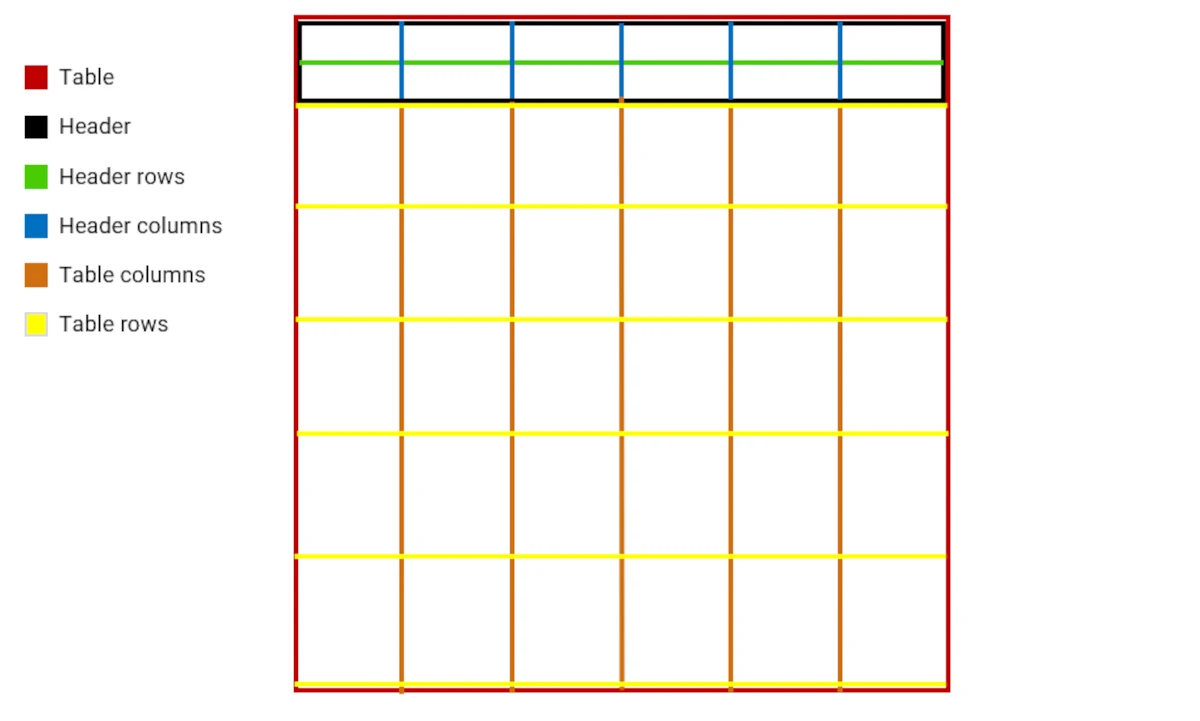
As you can see from the picture, some borders overlap and below you’ll find a list of the priorities when defining the border style:
The top and side header borders overlap with the table borders, when defining the header border style, it has a priority on the table border style.
The external borders of the table overlap with the leftmost and rightmost column borders. Users cannot define the left border of a column, so what is defined for the external borders of the table has a priority over the left border of the leftmost column (and vice versa for the right side).
The bottom border of the table overlaps with the bottom rows. The bottom borders of the table have a priority over the bottom border of the last row.
The bottom border of the header overlaps with the top border of a row. If defined, the bottom border of the header has a priority over the top border of a row.
Note
Users cannot define different widths for columns and headers. If both column and header widths have been defined, the column width value has the priority over the header width value.
Table Spanning
The spanning defines the size of the cells in the Table widget.
To merge rows containing the same values, right-click on the corresponding column header, choose Set column style from the context menu, and go to the SPANNING tab.
Most of the options available in both SPANNING tabs can be customized in parametric mode.
The SPANNING tab that activates the spanning effect on rows is divided into three areas:
Attribute list: it displays the list of attributes to which the spanning will be applied. This list cannot be modified as it’s based on the selected column headers.
Enable row spanning checkbox: if this checkbox is selected, rows, in the previously selected attributes, containing the same values are merged into one.
Fill none checkbox: by default it’s greyed out, but it is activated only if the Enable row spanning checkbox is selected. If checked, empty value cells are considered as filled by the highest value close by.
Finally, click APPLY to confirm your changes, or CANCEL to discard them.
To merge parts of columns containing the same values, right-click on any row, choose Set row style from the context menu, and go to the SPANNING tab.
In the SPANNING tab that activates the spanning effect on columns, click ADD NEW FILTER to start defining a new spanning rule. Each rule is divided into five areas:
An attribute selection area: clicking on the Select an attribute drop-down menu, allows visualizing all the available attributes and metadata to which the spanning rule will be applied.
A spanning condition filter: once the SET FILTER button is selected the condition panel associated with the chosen attribute is shown. A more detailed description of these panels is presented in the subsection: Condition panels.
A starting point for the filter: it defines where to start applying the previously defined spanning rule. By default, the Start area is filled with the same attribute defined in the Attribute drop-down menu. Users can define a different starting point for the spanning rule by opening the Start drop-down menu and selecting a different attribute.
An attribute selection area defining values to be displayed: it defines which values should be displayed in the merged rows according to the previously selected spanning rule.
A column number edit box: it defines the number of columns to be merged from Start area according to the previously defined spanning rule.
To delete a row spanning rule, click on the X icon at the right-end of the defined rule. Finally, click APPLY to confirm your changes, or CANCEL to discard them.
The metadata columns available for column spanning are the following:
RowIndex: it allows to define a spanning rule based on the row index number.
#data: it allows to define a spanning rule based on the number of data.
Table Editing Options
Table columns can be set as editable by right-clicking on a table header. Users can set editing options for the selected column by clicking on the Set editing options entry.
Once clicked on the Set editing options entry, the Editing options menu opens. This menu is divided into four areas:
Input options: in this area you can enable editing for the selected columns, by checking the Enable editing box.
Formula options: here you can insert a formula using the GOLD language. Once you’ve clicked APPLY saving the formula, an fx icon will appear in the column header, indicating a formula has been applied onto that column. Formula can be inserted only on not editable column. Formula are executed any time another column is edited.
Insert/Reset options: if auto-insert is not enabled, you can associate two General button widgets to the operation of INSERT or RESET the new edited value. In this case if the column is modified but not inserted already a * will be placed next to the header name.
Check options: by clicking on the SET CHECK button, you can define a compliance rule and the panel opened looks like a filter panel. The Check code field displays the previously defined compliance rule from the SET CHECK button. To delete the check code, click on the Remove check X icon. Select the Check value before inserting box, if you want to perform the check just after typing operation rather than at insertion time. Not available when multiple columns have been selected.
Finally, once you have defined the editing options, click APPLY to confirm your changes, or CANCEL to discard them.
Table Layout Schema
A table is completely described through a JSON object composed by 4 different areas:
input, retaining the information about the linked attributes.
options, retaining all the graphical and functional options which requires a re-evaluation of the underlying gridtable object.
layout, the rest of the graphical options which do not require a re-evaluation of the gridtable.
data, the information about the inner dataset.
The whole JSON object is saved as a GOLD dictionary in the layout field of the Gridtable class.
The schema of the JSON object is presented in YAML format commented.
input:
  - table: # table of the attribute used
    attr: # name of the attribute used
    type: # type of the attribute used
options:
  type: #the widget type
  query:
  apply:
    <attrName>: #function applied to attribute attrName
  filter: #list of queries
  group: #list of grouped attributes
  sort:
    <attrName>: #true if attrName is sorted ascending, false if descending
  join: #object controlling eventual join operation to create the gridtable
    - tables: #pair of bookmark table involved in the preliminary join operation
      lkeynames: #left key attributes of the join
      rkeynames: #right key attributes of the join
      lkeepnames: #left keep attributes of the join
      rkeepnames: #right keep attributes of the join
      oplist: #list of operator to be used between key attributes
      parlist: #list of weights to be used between key attributes
layout:
  selection:
    active: #if the selection is activated
    isFilter: #the selection type (filter/selection)
    scope: #the selection scope
  title:
    text: #the text of the title
    backgroundColor: #the background color for the title box
    fontFamily: #the font family for the title
    color: #the font color for the title
    textAlign: #the horizontal alignment of the title
    verticalAlign: #the vertical alignment of the title
    fontSize: #the size of the font for the title
    fontStyle: #italic structure of the title font
    fontWeight: #bold structure of the title font
    textDecoration: #underline structure of the cell font
  caption:
    text: #the text of the caption
    backgroundColor: #the background color for the caption box
    fontFamily: #the font family for the caption
    color: #the font color for the caption
    textAlign: #the horizontal alignment of the caption
    verticalAlign: #the vertical alignment of the caption
    fontSize: #the size of the font for the caption
    fontStyle: #italic structure of the caption font
    fontWeight: #bold structure of the caption font
    textDecoration: #underline structure of the cell font
  table:
    showScrollButtons: #boolean to define if buttons around scrollbar are shown
    borderTopColor: #color of the top border of the table
    borderTopStyle: #style of the top border of the table
    borderTopWidth: #width of the top border of the table
    borderBottomColor: #color of the bottom border of the table
    borderBottomStyle: #style of the bottom border of the table
    borderBottomWidth: #width of the bottom border of the table
    borderRightColor: #color of the right border of the table
    borderRightStyle: #style of the right border of the table
    borderRightWidth: #width of the right border of the table
    borderLeftColor: #color of the left border of the table
    borderLeftStyle: #style of the left border of the table
    borderLeftWidth: #width of the left border of the table
    cell:
      fontSize: #base fontSize of the cell
      textAlign: #horizontal align of the cell
      verticalAlign: #vertical align of the cell
      fontFamily: #base fontFamily of the cell
      fontStyle: #italic structure of the cell font
      fontWeight: #bold structure of the cell font
      textDecoration: #underline structure of the cell font
      color: #base text color of the cell
      cssGeneral: #css general addition
      backgroundColor: #background of entire table
    row:
      borderColor: #color of the top border of the rows
      borderStyle: #style of the top border of the rows
      borderWidth: #width of the top border of the rows
      height: #base height of the different rows
    column:
      borderColor: #color of the right border of the columns
      borderStyle: #style of the right border of the columns
      borderWidth: #width of the right border of the columns
      width: #base width of a cell
    selection:
      fullRow: #boolean to state if singular cell can be selected or only the entire row
      borderColor: #color of the top border of the considered rows
      borderStyle: #style of the top border of the considered rows
      borderWidth: #width of the top border of the considered rows
      backgroundColor: #background of the considered rows
      fontSize: #base fontSize of the considered rows
      fontStyle: #italic structure of the considered rows font
      fontWeight: #bold structure of the considered rows font
      textDecoration: #underline structure of the cell font
      textAlign: #horizontal align of the considered rows
      verticalAlign: #vertical align of the considered rows
      fontFamily: #base fontFamily of the considered rows
      color: #base text color of the considered rows
      cssGeneral: #css general addition
  row:
    <query>:
      borderBottomColor: #color of the top border of the considered rows
      borderBottomStyle: #style of the top border of the considered rows
      borderBottomWidth: #width of the top border of the considered rows
      height: #base height of the considered rows
      backgroundColor: #background of the considered rows
      fontSize: #base fontSize of the considered rows
      fontStyle: #italic structure of the considered rows font
      fontWeight: #bold structure of the considered rows font
      textDecoration: #underline structure of the cell font
      textAlign: #horizontal align of the considered rows
      verticalAlign: #vertical align of the considered rows
      fontFamily: #base fontFamily of the considered rows
      color: #base text color of the considered rows
      cssGeneral: #css general addition
  column:
    <columnName>:
      borderRightColor: #color of the right border of the considered column
      borderRightStyle: #style of the right border of the considered column
      borderRightWidth: #width of the right border of the considered column
      width: #base width of the considered column
      backgroundColor: #background of the considered column
      fontSize: #base fontSize of the considered column
      fontStyle: #italic structure of the considered column font
      fontWeight: #bold structure of the considered column font
      textDecoration: #underline structure of the cell font
      textAlign: #horizontal align of the considered column
      verticalAlign: #vertical align of the considered column
      fontFamily: #base fontFamily of the considered column
      color: #base text color of the considered column
      cssGeneral: #css general addition
  header:
    show: #if the header is shown
    separator: #the separator to create a multi header
    borderTopColor: #color of the top border of the header
    borderTopStyle: #style of the top border of the header
    borderTopWidth: #width of the top border of the header
    borderBottomColor: #color of the bottom border of the header
    borderBottomStyle: #style of the bottom border of the header
    borderBottomWidth: #width of the bottom border of the header
    borderRightColor: #color of the right border of the header
    borderRightStyle: #style of the right border of the header
    borderRightWidth: #width of the right border of the header
    borderLeftColor: #color of the left border of the header
    borderLeftStyle: #style of the left border of the header
    borderLeftWidth: #width of the left border of the header
    row:
      borderColor: #color of the top border of the header rows
      borderStyle: #style of the top border of the header rows
      borderWidth: #width of the top border of the header rows
      height: #base height of the header rows
    column:
      borderColor: #color of the right border of the header columns
      borderStyle: #style of the right border of the header columns
      borderWidth: #width of the right border of the header columns
    cell:
      backgroundColor: #background of the considered header rows
      fontSize: #base fontSize of the considered header rows
      fontStyle: #italic structure of the considered header rows font
      fontWeight: #bold structure of the considered header rows font
      textDecoration: #underline structure of the cell font
      textAlign: #horizontal align of the considered header rows
      verticalAlign: #vertical align of the considered header rows
      fontFamily: #base fontFamily of the considered header rows
      color: #base text color of the considered header rows
      cssGeneral: #css general addition
    selection:
      borderColor: #color of the top border of the considered rows
      borderStyle: #style of the top border of the considered rows
      borderWidth: #width of the top border of the considered rows
      height: #base height of the considered rows
      backgroundColor: #background of the considered rows
      fontSize: #base fontSize of the considered rows
      fontStyle: #italic structure of the considered rows font
      fontWeight: #bold structure of the considered rows font
      textDecoration: #underline structure of the cell font
      textAlign: #horizontal align of the considered rows
      verticalAlign: #vertical align of the considered rows
      fontFamily: #base fontFamily of the considered rows
      color: #base text color of the considered rows
      cssGeneral: #css general addition
    custom:
      <headerName>:
        borderColor: #color of the top border of the header cell
        borderStyle: #style of the top border of the header cell
        borderWidth: #width of the top border of the header cell
        height: #base height of the header cell
        backgroundColor: #background of the header cell
        fontSize: #base fontSize of the header cell
        fontStyle: #italic structure of the header cell font
        fontWeight: #bold structure of the header cell font
        textDecoration: #underline structure of the cell font
        textAlign: #horizontal align of the header cell
        verticalAlign: #vertical align of the header cell
        fontFamily: #base fontFamily of the header cell
        color: #base text color of the header cell
        cssGeneral: #css general addition
  index:
    show: #if the index is shown
    column:
      borderColor: #color of the right border of the index column
      borderStyle: #style of the right border of the index column
      borderWidth: #width of the right border of the index column
      width: #base width of the index column
    row:
      borderColor: #color of the right border of the header columns
      borderStyle: #style of the right border of the header columns
      borderWidth: #width of the right border of the header columns
    cell:
      backgroundColor: #background of the index column
      fontSize: #base fontSize of the index column
      fontStyle: #italic structure of the index column font
      fontWeight: #bold structure of the index column font
      textDecoration: #underline structure of the cell font
      textAlign: #horizontal align of the index column
      verticalAlign: #vertical align of the index column
      fontFamily: #base fontFamily of the index column
      color: #base text color of the index column
      cssGeneral: #css general addition
    selection:
      borderColor: #color of the top border of the considered rows
      borderStyle: #style of the top border of the considered rows
      borderWidth: #width of the top border of the considered rows
      height: #base height of the considered rows
      backgroundColor: #background of the considered rows
      fontSize: #base fontSize of the considered rows
      fontStyle: #italic structure of the considered rows font
      fontWeight: #bold structure of the considered rows font
      textDecoration: #underline structure of the cell font
      textAlign: #horizontal align of the considered rows
      verticalAlign: #vertical align of the considered rows
      fontFamily: #base fontFamily of the considered rows
      color: #base text color of the considered rows
      cssGeneral: #css general addition
    blank: #the style of the blank component if present
      borderBottomColor: #color of the bottom border of the considered rows
      borderBottomStyle: #style of the bottom border of the considered rows
      borderBottomWidth: #width of the bottom border of the considered rows
      borderRightColor: #color of the right border of the index column
      borderRightStyle: #style of the right border of the index column
      borderRightWidth: #width of the right border of the index column
      cell:
        backgroundColor: #background of the index column
        cssGeneral: #css general addition
  formatting:
    <columnName>:
      - type: #the type of conditional formatting rule on the selected column (one of highlight, topbottom, databar, colorscale, iconset)
        conditions: #list of query conditions in the case of highlight rules (hightlight/iconset with actiontype custonm case)
        checked: #list of boolean to state if considering true or false of the highlighted condition (highlight/iconset with actiontype custonm case)
        style: #list of styles to apply to the selected rows (hightlight/topbottom case)
          borderBottomColor: #color of the bottom border of the considered rows
          borderBottomStyle: #style of the bottom border of the considered rows
          borderBottomWidth: #width of the bottom border of the considered rows
          borderRightColor: #color of the right border of the index column
          borderRightStyle: #style of the right border of the index column
          borderRightWidth: #width of the right border of the index column
          backgroundColor: #background of the considered rows
          fontSize: #base fontSize of the considered rows
          fontStyle: #italic structure of the considered rows font
          fontWeight: #bold structure of the considered rows font
          textDecoration: #underline structure of the cell font
          textAlign: #horizontal align of the considered rows
          verticalAlign: #vertical align of the considered rows
          fontFamily: #base fontFamily of the considered rows
          color: #base text color of the considered rows
          cssGeneral: #css general addition
        from: #flag to control the order in the top bottom case. One of top or bottom.
        rank: #the number of rows or the percentage (double between 0 and 1) to be considered in the top/bottom case
        colorscale: #the string referring the colorscale to be used in the colorscale case
        color: #the color to be used in the data bar (databar case)
        solid: #a flag to control if the color of the data bar is solid or gradient (databar case). One of solid or gradient.
        icon: #a string representing the icon set to be used (iconset case)
        actiontype: #the mode to be used in the iconset rule (iconset case). One of custom or auto.
  spanning:
    row:
      <columnName>:
        fillNone: #boolean controlling if perform a fillDown before the runs operation
    column:
      <query>:
        start: #name of the attribute where to start the colSpan
        value: #name of the attribute where eventually take the single value for the entire multi cell
        ncol: #the number of columns of the span
data:
  nattr: #number of cols
  ndata: #number of rows