Toolbar
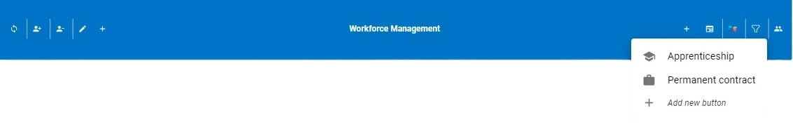
The Toolbar widget allows users to further configure their custom interface by adding a bar (either horizontal or vertical) containing a series of buttons or menus that perform several operations. Interactive buttons linked to events can be easily added to the Toolbar widget by clicking the plus icons, positioned on both the left and right sides of the central text title. The Toolbar can be dragged only onto slides or dialogs.
Hint
The plus icons will disappear in presentation mode. They can also be hidden in editing mode by clicking the eye icon located in the top-left corner of the Toolbar.
The table below provides a detailed description of the Toolbar layout options along with their corresponding GOLD references. These options can also be modified using parametric mode.
Subsection |
Option |
Description |
GOLD Ref |
|---|---|---|---|
General |
Orientation |
From this drop-down list, the orientation of the toolbar can be defined. Available orientation modes are: Horizontal and Vertical. |
|
Elevation |
From this spin box, users can specify the elevation level of the toolbar. Increasing the elevation gives the impression of the toolbar being more lifted and adds depth to the widget. |
||
Disable hover effect |
By selecting this checkbox, the Toolbar’s hover effect will be disabled. |
||
Background |
Background color |
It defines the background color of the Toolbar. By clicking it, users can select Standard colors and generated color palettes, otherwise they can use the color picker or choose the color code, which can be: Hex, Rgb, Hsl, Hsv. The default color is blue. |
|
Background color hover |
It defines the background color hover of the Toolbar. By clicking it, users can select Standard colors and generated color palettes, otherwise they can use the color picker or choose the color code, which can be: Hex, Rgb, Hsl, Hsv. The default color is blue. |
||
Border |
Border radius |
This spin-box allows users to set the Toolbar’s corner radius by specifying a value in pixels. The higher the number, the more rounded the button’s corners will appear. |
|
Icons style |
Text style |
Here, users can define the label style, which can be bold, italic or underlined. |
|
Font family |
It defines the font of the Toolbar’s text label appearing near its button events icons. Users can select the desired one in the drop-down menu. |
||
Font size (px) |
In this spin box, users can choose the desired font size in pixels of their text label. |
||
Text Transform |
From this drop-down list, users can further customize the Toolbar’s text label. Available options include: None, Capitalize, Uppercase, Lowercase. |
||
Label color |
It defines the color of the button’s text label. By clicking it, users can select Standard colors and generated color palettes, otherwise they can use the color picker or choose the color code, which can be: Hex, Rgb, Hsl, Hsv. The default color is white. |
||
Icon color |
It defines the color of the button icons of the Toolbar. By clicking it, users can select Standard colors and generated color palettes, otherwise they can use the color picker or choose the color code, which can be: Hex, Rgb, Hsl, Hsv. The default color is white. |
||
Title |
Text style |
Here, users can define the title style, which can be bold, italic or underlined. |
|
Title text |
In this text field, users can enter the text appearing onto the Toolbar widget. |
||
Font family |
It defines the font of the text appearing on the Toolbar. Users can select the desired one in the drop-down menu. |
||
Text transform |
From this drop-down list, users can further customize the button’s text label. Available options include: None, Capitalize, Uppercase, Lowercase. |
||
Font size (px) |
In this spin box, users can choose the desired font size in pixels of their Toolbar’s text. |
||
Title color |
This option defines the desired text’s title color. By clicking it, users can select Standard colors and generated color palettes, otherwise they can use the color picker or choose the color code, which can be: Hex, Rgb, Hsl, Hsv. The default color is white. |
||
Menu icons style |
Text style |
Here, users can define the text style of the button menu type, which can be bold, italic or underlined. |
|
Font family |
It defines the font of the text appearing on the button menu type. Users can select the desired one in the drop-down menu. |
||
Font size (px) |
In this spin box, users can choose the desired font size in pixels of the text appearing in the button menu. |
||
Text transform |
From this drop-down list, users can further customize the text appearing in the button menu. Available options include: None, Capitalize, Uppercase, Lowercase. |
||
Label color |
It defines the color of the label’s option appearing within the Toolbar’s button menu. By clicking it, users can select Standard colors and generated color palettes, otherwise they can use the color picker or choose the color code, which can be: Hex, Rgb, Hsl, Hsv. The default color is black. |
||
Icon color |
It controls the color of the button icons appearing within the Toolbar’s button menu. By clicking it, users can select Standard colors and generated color palettes, otherwise they can use the color picker or choose the color code, which can be: Hex, Rgb, Hsl, Hsv. The default color is gray. |
Attention
Keep in mind that Icons style options primarily affect the label next to the Toolbar’s button icons. To see these style changes, make sure the Show label checkbox is selected in the button layout window.
Toolbar Schema
An toolbar is completely described through a JSON object composed by 2 different areas:
options, retaining all the functional options of the toolbar.
layout, the rest of the graphical options of the toolbar.
The whole JSON object is saved as a GOLD dictionary in the layout field of the Control class.
The schema of the JSON object is presented in YAML format commented.
layout:
  orientation: #set the orientation of the toolbar(horizontal/vertical)
  elevation: #set the elevation increasing the shadows under the widget
  disableHoverEffect: #enable/disable hover effect
  title:
    fontWeight: #set the font thickness(bold/normal)
    fontStyle: #set the style of the font(normal/italic)
    textDecoration: #set the underlining of the font(none/underlined)
    text: #set the actual text
    fontFamily: #set the font family
    textTransform: #set the capitalization or case of the full text (none,capitalize,uppercase,lowercase)
    fontSize: #set the font size in px
    color: #set the text color
  backgroundColor: #set the background color
  hoverBackgroundColor: #set the change of the background color while the element is hovered
  borderRadius: #set the roundness of the corners
  generalIconStyle: #this dictionary allows to set all the buttons on the toolbar ALL TOOLBAR BUTTON ONLY
    label:
      fontWeight: #set the font thickness(normal/bold)
      fontStyle: #set the style of the font(normal/italic)
      textDecoration: #set the underlining of the font(none/underlined)
      fontFamily: #set the font family
      textTransform: #set the capitalization or case of the full text (none,capitalize,uppercase,lowercase)
      fontSize: #change the text font size
      color: #set the text color
    toolbarIcon:
      color: #set the icon color
  generalMenuIconStyle: #this dictionary allows to set all the buttons inside the menus ALL MENU BUTTON ONLY
    label:
      fontWeight: #set the font thickness(normal/bold)
      fontStyle: #set the style of the font(normal/italic)
      textDecoration: #set the underlining of the font(none/underlined)
      fontFamily: #set the font family
      textTransform: #set the capitalization or case of the full text (none,capitalize,uppercase,lowercase)
      menuFontSize: #change the text font size
      menuColor: #set the text color
    menuIcon:
      color: #set the icon color
  buttons: #list of buttons that may contain nested buttons and so on
      #the below dictionary contains all the keys for every button
    - id: #the toolbar id
      direction: #indicate the in which side of the toolbar the button is showed
      type: #set the functionality of the button(event/menu). Event allows to set a click evnet on that button, menu create a submenu that allows to add more button
      menuDirection: #set which direction the menu and all its submenu open TOOLBAR BUTTON TYPE MENU ONLY
      hoverBackgroundColor: #set the color change of the background when the button is hovered TOOLBAR BUTTON ONLY
      divider:
        toolbar: #set the position of the diveder between buttons(null/right/left) TOOLBAR BUTTON ONLY
        color: #set the color of the divider TOOLBAR BUTTON ONLY
        menu: #show the divider below the menu button MENU BUTTON ONLY
      tooltip: #TOOLBAR BUTTON ONLY
        show: #shows the tooltip
        placement: #set the tooltip direction(top/bottom/right/left)
        text: #set the text of the tooltip
      label:
        show:  #show the label TOOLBAR BUTTON ONLY
        menuShow:  #hide the label MENU BUTTON ONLY
        text: #set the text of the label
        position: #set the position of the label(right/left) TOOLBAR BUTTON ONLY
        color: #set the text color TOOLBAR BUTTON ONLY
        menuColor: #set the text color MENU BUTTON ONLY
        fontWeight: #set the font thickness(normal/bold) BOTH BUTTONS
        fontStyle: #set the style of the font(normal/italic) BOTH BUTTONS
        textDecoration: #set the underlining of the font(none/underlined) BOTH BUTTONS
        fontFamily: #set the font family BOTH BUTTONS
        textTransform: #set the capitalization or case of the full text (none,capitalize,uppercase,lowercase) BOTH BUTTONS
        fontSize: #change the text font size TOOLBAR BUTTON ONLY
        menuFontSize:  #change the text font size MENU BUTTON ONLY
      toolbarIcon: #object to customize the icon options managed by icon getter TOOLBAR BUTTON ONLY
        icon: #the actual icon in different format
        variant: #the 3 types of icon (mui/rulex/custom)
        color: #the color of the icon
      menuIcon: #object to customize the icon options managed by icon getter MENU BUTTON ONLY
        icon: #the actual icon in different format
        variant: #the 3 types of icon (mui/rulex/custom)
        color: #the color of the icon
      sons: #this list contain nested buttons which could contain other buttons and so on. This list is fillable only when the button is type menu
options:
  type: #the widget type