Actions
In the current page users will find the description of the INPUT and LAYOUT tabs, as well as the description of the filter operations performed by each Action.
Note
In the INPUT tab, the options cannot be parametrized.
In each section, tables with the description of all the available options are provided, along with their corresponding GOLD references.
Filter Button
The Filter button action has the graphical aspect of a button. It can be divided into multiple sections, applying different filters to the same attribute which has been dragged on it.
This way, it is possible not only to apply a single filter at a time, but also multiple filters at the same time, if it has been specified in the layout options.
By clicking on it, the corresponding filter is applied, and the button changes color, indicating whether it is selected or not.
It is possible to create filters on all the available attribute types.
To create a new filter, click on the ADD NEW FILTER button in the INPUT tab: the button will be equally divided into sections, each one of them applying the corresponding filter.
The size of the button label(s) can also be changed by selecting the widget on the slide and clicking on the three-dotted button located in the top-left corner of the widget itself. Then, select the size among the available ones, which are standardized as S, M, L. These size shortcuts overwrite the options set in the LAYOUT tab.
In the table below users can find the detailed description of the Filter button configuration options their corresponding GOLD references.
Subsection |
Option |
Description |
GOLD ref |
|---|---|---|---|
Input Options |
Table |
It displays the table containing the attribute to be filtered. It is possible to change it from the drop-down menu and choosing one of the tables which have been imported in the Datasets tab. |
input |
Attribute |
It displays the attribute dragged onto the widget, which will be filtered according to the rules set in the Filter area. It is possible to change it from the attribute drop-down list by typing its name or by scrolling in the list. |
input |
|
Action type |
Select whether the operation performed by the widget is Selection or Filter. |
||
Exclusive button |
If selected, it will be possible to apply each filter set on the button singularly. |
||
Scope Options |
Scope |
Here, users will select the widgets to which the filter will be applied. More information on the Scope field can be found in the corresponding page. |
input |
Filter Options |
Label |
Here users can insert the label of the portion of the button which will apply the corresponding filter specified in the Filter field. |
input |
Filter |
By clicking the SET FILTER button, the filter window will appear. Check the instructions to set filters for the attribute type which has been dragged onto the action here. |
input |
|
Code |
Here the filter code in GOLD will be shown. To know more about GOLD, go to the corresponding page. |
Subsection |
Option |
Description |
GOLD ref |
|---|---|---|---|
Buttons |
Buttons orientation |
Select from the drop-down list the way the sections of the button will be displayed on the slide. The possible values are: Horizontal or Vertical. |
|
Buttons color value selection |
Here, the way the buttons colors are defined can be set: it is possible to choose Auto, so all the color shades present in the button will be retrieved from the one specified in the Buttons color field. Otherwise, it is possible to choose Custom, so that the color of every part of the widget can be set manually. By clicking on it, additional options will appear in the LAYOUT tab. |
||
Buttons color |
It defines the buttons color. By clicking on the color, which is blue by default, a popup opens, where Standard colors can be used, as well as Rgb, Hex, Hsl and Hsv colors and generated color palettes. |
||
Title |
Font style |
It defines the font style of the button name, which can be bold, italic or underlined. |
|
Font family |
Here users can define the text font of the button name in the drop-down menu. |
||
Font size (px) |
It defines the title font size. |
||
Text transform |
It defines the letter case. The possible values are: Capitalize, Uppercase, Lowercase. |
||
Border |
Border radius (px) |
It defines the action border radius, which is the rounding of the widget corners. |
|
Border size (px) |
It defines the size of the border of the widget. |
||
Label |
Font style |
It defines the font style and alignment of the button label, which can be bold, italic or underlined, and text left, text center, text right. |
|
Label text |
The text of the label. |
||
Font family |
Here users can define the text font of the label in the drop-down menu. |
||
Font size (px) |
It defines the label font size. |
||
Text transform |
It defines the letter case. The possible values are: Capitalize, Uppercase, Lowercase. |
||
Label placement |
The placement of the label. The possible values are: Top, End, Bottom, Start. |
||
Label color |
It defines the color of the label. By clicking it, users can select Standard colors and generated color palettes, otherwise they can use the color picker or choose the color code, which can be: Hex, Rgb, Hsl, Hsv. The default color is blue. |
Filter Form Field
The Filter form field has the graphical aspect of a number or text field (depending on the options set in the layout menu), where an optional label can help understanding what the filter represents.
Users can type a specific value, consequently filtering the previously dragged attribute according to that value. This widget allows filtering only one value at a time.
It is possible to set filters to all attribute types.
The type of the attribute which will be filtered (ordered or nominal) must be specified in the Form type field of the LAYOUT tab.
In the table below users can find the detailed description of the Filter form field configuration options their corresponding GOLD references.
Note
The event triggers available for the Filter form field widget are:
onMouseEnter
onMouseLeave
onFocus
onChange
See also
If a value has been set as a default value, the widgets specified in the Scope will automatically be filtered according to the default value.
Subsection |
Option |
Description |
GOLD ref |
|---|---|---|---|
Input Options |
Table |
It displays the table containing the attribute to be filtered. It is possible to change it from the drop-down menu and choosing one of the tables which have been imported in the Datasets tab. |
input |
Attribute |
It displays the attribute dragged onto the widget, which will be filtered according to the rules set in the Filter area. It is possible to change it from the attribute drop-down list by typing its name or by scrolling in the list. |
input |
|
Action type |
Select whether the operation performed by the widget is Selection or Filter. |
||
Scope Options |
Scope |
Here, users will select the widgets to which the filter will be applied. More information on the Scope field can be found in the corresponding page. |
input |
Default Settings |
Set a default value |
Here, users can choose whether the filter will be automatically filled with a specific value or not. If selected, users can type the default value in the text box located next to the checkbox. |
Subsection |
Option |
Description |
GOLD ref |
|---|---|---|---|
Form field |
Form variant |
Select from the drop-down list the way the form will be displayed on the slide: Outlined (default), Standard, Filled. |
|
Form type |
Specify the value type which will be inserted in the form: Number (default), or Text. |
||
Number format (only if Number has been chosen as the Form type) |
Choose the format of the number value of the attribute which has been dragged onto the action. The possible values are: Integer, Float (1-digit), Float (3-digits), Float (6-digits). |
||
Minimum value (only if Number has been chosen as the Form type) |
Type the minimum allowed value in the filter. |
||
Maximum value (only if Number has been chosen as the Form type) |
Type the maximum allowed value in the filter. |
||
Text |
Font style |
It defines the font style of the value which will be inserted in the filter, which can be bold, italic or underlined. |
|
Font family |
Choose from the drop-down list the font family of the value which will be inserted in the filter. |
||
Font size (px) |
It defines the font size of the value which will be inserted in the filter. |
||
Text transform |
It defines the letter case. The possible values are: Capitalize, Uppercase, Lowercase. |
||
Text color |
It defines the color of the text. By clicking it, users can select Standard colors and generated color palettes, otherwise they can use the color picker or choose the color code, which can be: Hex, Rgb, Hsl, Hsv. The default color is dark blue. |
||
Background color |
It defines the color of the background of the field. By clicking it, users can select Standard colors and generated color palettes, otherwise they can use the color picker or choose the color code, which can be: Hex, Rgb, Hsl, Hsv. The default color is white. |
||
Border |
Border radius (px) |
It defines the action border radius, which is the rounding of the widget corners. |
|
Border size (px) |
It defines the size of the border of the widget. |
||
Border color |
It defines the color of the border of the field. By clicking it, users can select Standard colors and generated color palettes, otherwise they can use the color picker or choose the color code, which can be: Hex, Rgb, Hsl, Hsv. The default color is dark blue. |
||
Border color hover |
It defines the color of the border when it is hovered with the pointer. By clicking it, users can select Standard colors and generated color palettes, otherwise they can use the color picker or choose the color code, which can be: Hex, Rgb, Hsl, Hsv. The default color is black. |
||
Border color focus |
It defines the color of the border when it is selected. By clicking it, users can select Standard colors and generated color palettes, otherwise they can use the color picker or choose the color code, which can be: Hex, Rgb, Hsl, Hsv. The default color is dark blue. |
||
Label |
Label style |
It defines the font style and alignment of the widget label, which can be bold, italic or underlined, and text left, text center, text right. |
|
Label text |
The text of the label. |
||
Font family |
Choose from the drop-down list the font family of the label. |
||
Font size (px) |
It defines the font size of the label. |
||
Text transform |
It defines the letter case. The possible values are: Capitalize, Uppercase, Lowercase. |
||
Label placement |
The placement of the label. The possible values are: Top, End, Bottom, Start. |
||
Label color |
It defines the color of the label. By clicking it, users can select Standard colors and generated color palettes, otherwise they can use the color picker or choose the color code, which can be: Hex, Rgb, Hsl, Hsv. The default color is dark blue. |
Filter Drop Down Menu
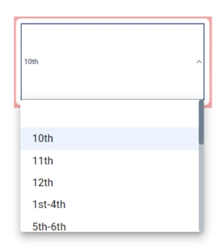
The Filter drop down menu action has the graphical aspect of a drop-down list, where an optional label can help understanding what the filter represents.
It allows filtering only one value at a time.
It is possible to set filters to all the attribute types.
If a nominal attribute is dragged on the Filter drop down menu, it automatically creates a drop-down menu containing the values to filter (a message is also displayed on the bottom part of the stage).
While if an ordered attribute has been dragged onto the widget, it provides an additional section to manually create filters. However, it is possible to customize nominal filters as well, by working in the Filter Options area.
If all values of the selected attribute cannot fit in the selection list, a scrollbar appears to help the user browse through the values. Users can also type the first letter of the desired value on the keyboard, and the list will update to show matching options.
In the table below users can find the detailed description of the Filter drop down menu configuration options, along with their corresponding GOLD references.
Note
The event triggers available for the Filter drop down menu widget are:
onMouseEnter
onMouseLeave
onFocus
onType
onChange
Subsection |
Option |
Description |
GOLD ref |
|---|---|---|---|
Input Options |
Table |
It displays the table containing the attribute to be filtered. It is possible to change it from the drop-down menu and choosing one of the tables which have been imported in the Datasets tab. |
input |
Attribute |
It displays the attribute dragged onto the widget, which will be filtered according to the rules set in the Filter area. It is possible to change it from the attribute drop-down list by typing its name or by scrolling in the list. |
input |
|
Action type |
Select whether the operation performed by the widget is Selection or Filter. |
||
Scope Options |
Scope |
Here, users will select the widgets to which the filter will be applied. More information on the Scope field can be found in the corresponding page. |
input |
Default settings |
Set a default value |
Here, users can choose whether the filter will be automatically filled with a specific value or not. If selected, users can type the default value in the text box located next to the checkbox. |
input |
Filter options |
Filter |
Here, users can choose whether the filters are created automatically (Auto, default value when nominal attributes are dragged onto the widget) or with a Custom (default value when ordered attributes are dragged onto the widget)procedure. |
|
Include missing values (only if Auto has been selected as Filter) |
If selected, rows containing missing values will be filtered. |
Subsection |
Option |
Description |
GOLD ref |
|---|---|---|---|
Dropdown |
Dropdown variant |
Here users can define the dropdown general graphical aspect, which can be Outlined (default) Standard, or Filled. |
|
Add empty value |
If selected, the empty value will be included in the available filters. So, if empty values are present in the attribute on the widget, they can be filtered. |
||
Display as autocomplete |
If selected, it will be possible to type the value in the field, so that in the value list only those containing the specified string are displayed while filtering. In other words, it creates a pre-filter on the attribute’s values. |
||
Hide clear icon (only if Display as autocomplete has been selected) |
If selected, the clear icon will be hidden. |
||
Placeholder (only if Display as autocomplete has been selected) |
Type a placeholder, which will be displayed when the filter is not active. |
||
Adornments color (only if Display as autocomplete has been selected) |
It defines the color of the label. By clicking it, users can select Standard colors and generated color palettes, otherwise they can use the color picker or choose the color code, which can be: Hex, Rgb, Hsl, Hsv. The default color is grey. An Eye dropper is also available to work as a color picker. |
||
Text |
Font style |
It defines the font style of the text which is visualized in the filter’s text field, whether it is a placeholder or a value of the filter, which can be bold, italic or underlined. |
|
Font family |
Choose from the drop-down list the font family of the text which is currently visualized in the filter’s text field. |
||
Font size (px) |
It defines the font size of the text which is currently visualized in the filter’s text field. |
||
Text transform |
It defines the letter case. The possible values are: Capitalize, Uppercase, Lowercase. |
||
Text color |
It defines the color of the text which is currently visualized in the filter’s text field. By clicking it, users can select Standard colors and generated color palettes, otherwise they can use the color picker or choose the color code, which can be: Hex, Rgb, Hsl, Hsv. The default color is dark blue. An Eye dropper is also available to work as a color picker. |
||
Background color |
It defines the color of the background of the filter’s text field. By clicking it, users can select Standard colors and generated color palettes, otherwise they can use the color picker or choose the color code, which can be: Hex, Rgb, Hsl, Hsv. The default color is white. An Eye dropper is also available to work as a color picker. |
||
Border |
Border radius (px) |
It defines the action border radius. |
layout |
Border size (px) |
It defines the action border size. |
||
Border color |
It defines the color of the action border. By clicking it, users can select Standard colors and generated color palettes, otherwise they can use the color picker or choose the color code, which can be: Hex, Rgb, Hsl, Hsv. The default color is white. |
layout |
|
Border color hover |
It defines the color of the action border when hovering over it with the cursor. By clicking it, users can select Standard colors and generated color palettes, otherwise they can use the color picker or choose the color code, which can be: Hex, Rgb, Hsl, Hsv. The default color is white. |
layout |
|
Border color focus |
It defines the color of the action border when selecting it. By clicking it, users can select Standard colors and generated color palettes, otherwise they can use the color picker or choose the color code, which can be: Hex, Rgb, Hsl, Hsv. The default color is dark blue. |
layout |
|
Label |
Label style |
It defines the font style and alignment of the widget label, which can be bold, italic or underlined, and text left, text center, text right. |
|
Label text |
Here users can type the action label. |
layout |
|
Font family |
Choose from the drop-down list the font family of the label. |
||
Font size (px) |
It defines the font size of the values of the label. |
||
Text transform |
It defines the letter case of the label. The possible values are: Capitalize, Uppercase, Lowercase. |
||
Label placement |
It defines the label placement. The possible options are: Top (by default), End, Bottom, Start. |
layout |
|
Label color |
It defines the color of the label. By clicking it, users can select Standard colors and generated color palettes, otherwise they can use the color picker or choose the color code, which can be: Hex, Rgb, Hsl, Hsv. The default color is dark blue. An Eye dropper is also available to work as a color picker. |
layout |
|
Menu |
Text style |
It defines the font style of the widget’s values in the drop-down list, which can be bold, italic or underlined. |
|
Font family |
Choose from the drop-down list the font family of the widget’s values in the drop-down list. |
||
Font size (px) |
It defines the widget’s values font size. |
||
Text transform |
It defines the letter case. The possible values are: Capitalize, Uppercase, Lowercase. |
||
Menu text color |
It defines the color of the widget’s values. By clicking it, users can select Standard colors and generated color palettes, otherwise they can use the color picker or choose the color code, which can be: Hex, Rgb, Hsl, Hsv. The default color is dark blue. An Eye dropper is also available to work as a color picker. |
Filter Autocomplete
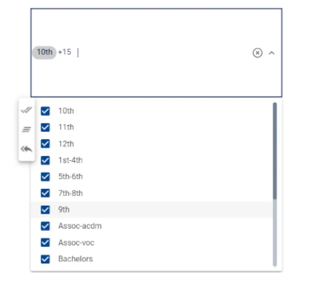
The Filter autocomplete action has the graphical aspect of a drop-down menu containing a list of values which can be checked or unchecked at any time. To use the Filter autocomplete, you need to drag it onto the stage, and drag an attribute onto it. Once the widget is created, all the values are selected, so all values are displayed. The first value in alphabetical order is displayed in the field, along with a number +x, indicating all the other values of the attribute.
This action can be used with nominal values only. When the attribute is dragged on it, a drop-down list made of all the attribute’s values is created. Using this widget allows users to filter multiple values easily and to optionally define each single filter.
To select the values which will be filtered, open the drop-down list by clicking on the arrow on the right of the widget and checking or unchecking the value which will be filtered. The Check All, Uncheck All, Invert buttons are available to help the user in selecting attributes.
If all values of the selected attribute cannot fit in the selection list, a scrollbar appears to help the user browse through the values. Users can also type the first letter of the desired value on the keyboard, and the list will update to show matching options.
In the table below users can find the detailed description of the Filter autocomplete configuration options their corresponding GOLD references.
Note
The event triggers available for the Filter autocomplete widget are:
onMouseEnter
onMouseLeave
onFocus
onType
onChange
Subsection |
Option |
Description |
GOLD ref |
|---|---|---|---|
Input Options |
Table |
It displays the table containing the attribute to be filtered. It is possible to change it from the drop-down menu and choosing one of the tables which have been imported in the Datasets tab. |
input |
Attribute |
It displays the attribute dragged onto the widget, which will be filtered according to the rules set in the Filter area. It is possible to change it from the attribute drop-down list by typing its name or by scrolling in the list. |
input |
|
Action type |
Select whether the operation performed by the widget is Selection or Filter. |
||
Scope Options |
Scope |
Here, users will select the widgets to which the filter will be applied. More information on the Scope field can be found in the corresponding page. |
input |
Subsection |
Option |
Description |
GOLD ref |
|---|---|---|---|
Dropdown |
Dropdown variant |
Here users can define the dropdown general graphical aspect, which can be Outlined (default) Standard, or Filled. |
|
Hide clear icon |
If selected, the clear icon will be hidden. |
||
Placeholder |
Type a placeholder, which will be displayed when the filter is not active. |
||
Adornments color |
It defines the color of the clear icon and of the arrow to open the drop-down menu. By clicking it, users can select Standard colors and generated color palettes, otherwise they can use the color picker or choose the color code, which can be: Hex, Rgb, Hsl, Hsv. The default color is grey. An Eye dropper is also available to work as a color picker. |
||
Text |
Text style |
It defines the font style of the widget’s placeholder, which can be bold, italic or underlined, |
|
Font family |
Choose from the drop-down list the font family of the widget’s placeholder. |
||
Font size (px) |
It defines the placeholder’s text font size. |
||
Text transform |
It defines the letter case. The possible values are: Capitalize, Uppercase, Lowercase. |
||
Text color |
It defines the color of the widget’s placeholder text. By clicking it, users can select Standard colors and generated color palettes, otherwise they can use the color picker or choose the color code, which can be: Hex, Rgb, Hsl, Hsv. The default color is dark blue. An Eye dropper is also available to work as a color picker. |
||
Background color |
It defines the color of the widget’s background. By clicking it, users can select Standard colors and generated color palettes, otherwise they can use the color picker or choose the color code, which can be: Hex, Rgb, Hsl, Hsv. The default color is white. An Eye dropper is also available to work as a color picker. |
||
Border |
Border radius (px) |
It defines the action border radius, which is the rounding of the widget’s corners. |
|
Border size (px) |
It defines the action’s border size. |
||
Border color |
It defines the color of the widget’s background. By clicking it, users can select Standard colors and generated color palettes, otherwise they can use the color picker or choose the color code, which can be: Hex, Rgb, Hsl, Hsv. The default color is light blue. |
||
Border color hover |
It defines the color of the widget’s background. By clicking it, users can select Standard colors and generated color palettes, otherwise they can use the color picker or choose the color code, which can be: Hex, Rgb, Hsl, Hsv. The default color is black. |
||
Border color focus |
It defines the color of the widget’s background. By clicking it, users can select Standard colors and generated color palettes, otherwise they can use the color picker or choose the color code, which can be: Hex, Rgb, Hsl, Hsv. The default color is blue. |
||
Label |
Label style |
It defines the font style and alignment of the widget label, which can be bold, italic or underlined, and text left, text center, text right. |
|
Label |
Label text |
Here users can type the action label. |
layout |
Font family |
Choose from the drop-down list the font family of the widget’s label. |
||
Font size (px) |
It defines the label’s font size. |
||
Text transform |
It defines the letter case. The possible values are: Capitalize, Uppercase, Lowercase. |
||
Label placement |
It defines the label placement. The possible options are: Top (by default), End, Bottom, Start. |
layout |
|
Label color |
It defines the color of the label. By clicking it, users can select Standard colors and generated color palettes, otherwise they can use the color picker or choose the color code, which can be: Hex, Rgb, Hsl, Hsv. The default color is light blue. |
||
Menu |
Menu style |
It defines the font style of the widget’s values in the drop-down list, which can be bold, italic or underlined. |
|
Font family |
Choose from the drop-down list the font family of the widget’s values in the drop-down list. |
||
Font size (px) |
It defines the widget’s values font size. |
||
Text transform |
It defines the letter case. The possible values are: Capitalize, Uppercase, Lowercase. |
||
Menu text color |
It defines the color of the widget’s values. By clicking it, users can select Standard colors and generated color palettes, otherwise they can use the color picker or choose the color code, which can be: Hex, Rgb, Hsl, Hsv. The default color is dark blue. An Eye dropper is also available to work as a color picker. |
Filter Radio Button
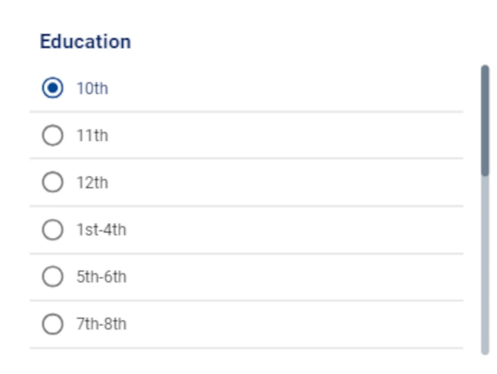
The Filter radio button action has the graphical aspect of a bullet list, where only one value at a time can be selected.
It is possible to set filters to all the attribute types.
If a nominal attribute is dragged on the Filter radio button, it automatically creates a drop-down menu containing the values to filter (a message is also displayed on the bottom part of the stage).
While if an ordered attribute has been dragged onto the widget, it provides an additional section to manually create filters. However, it is possible to customize nominal filters as well, by working in the Filter Options area.
If there are more values than the ones which can be contained in the widget’s dimension, a scrollbar is present in the list, to help user browsing through the values.
In the table below users can find the detailed description of the Filter radio button configuration options, along with their corresponding GOLD references.
Note
The event triggers available for the Filter radio button widget are:
onMouseEnter
onMouseLeave
onChange
Subsection |
Option |
Description |
GOLD ref |
|---|---|---|---|
Input Options |
Table |
It displays the table containing the attribute to be filtered. It is possible to change it from the drop-down menu and choosing one of the tables which have been imported in the Datasets tab. |
input |
Attribute |
It displays the attribute dragged onto the widget, which will be filtered according to the rules set in the Filter area. It is possible to change it from the attribute drop-down list by typing its name or by scrolling in the list. |
input |
|
Action type |
Select whether the operation performed by the widget is Selection or Filter. |
||
Scope Options |
Scope |
Here, users will select the widgets to which the filter will be applied. More information on the Scope field can be found in the corresponding page. |
input |
Default settings |
Set a default value |
Here, users can choose whether the filter will be automatically filled with a specific value or not. If selected, users can type the default value in the text box located next to the checkbox. |
input |
Filter options |
Filter |
Here, users can choose whether the filters are created automatically (Auto, default value when nominal attributes are dragged onto the widget) or with a Custom (default value when ordered attributes are dragged onto the widget)procedure. |
Subsection |
Option |
Description |
GOLD ref |
|---|---|---|---|
Radio |
Radio orientation |
Select the radio orientation, that is the way values are displayed. The possible values are Vertical (default), or Horizontal. |
|
Text |
Font style |
It defines the font style of the widget’s values, which can be bold, italic or underlined. |
|
Font family |
Choose from the drop-down list the font family of the widget’s values. |
||
Font size (px) |
It defines the font size of the widget’s values. |
||
Text transform |
It defines the letter case. The possible values are: Capitalize, Uppercase, Lowercase. |
||
Text placement |
It defines the text placement, considering the value’s bullet point as the main reference. The possible options are: Top, End, Bottom, Start. |
||
Text color |
It defines the color of the text which is currently visualized in the filter’s text field. By clicking it, users can select Standard colors and generated color palettes, otherwise they can use the color picker or choose the color code, which can be: Hex, Rgb, Hsl, Hsv. |
||
Icon |
Icon size (px) |
The size of the bullet icon associated to the corresponding filter label. |
|
Unchecked color |
The color of the icon when the filter is not selected. By clicking it, users can select Standard colors and generated color palettes, otherwise they can use the color picker or choose the color code, which can be: Hex, Rgb, Hsl, Hsv. |
||
Checked color |
The color of the icon when the filter is selected and active. By clicking it, users can select Standard colors and generated color palettes, otherwise they can use the color picker or choose the color code, which can be: Hex, Rgb, Hsl, Hsv. |
||
Label |
Label style |
Here users can define the label text style, which can be bold, italic or underlined and the text alignment, which can be: text left, text center or text right. |
layout |
Label text |
Here users can type the action label. |
||
Font family |
Here users can define the label font from the drop-down menu. |
layout |
|
Font size (px) |
It defines the font size of the label. |
layout |
|
Text transform |
It defines the letter case. The possible values are: Capitalize, Uppercase, Lowercase. |
layout |
|
Label placement |
It defines the label placement. The possible options are: Top, End, Bottom, Start. |
layout |
|
Label color |
It defines the color of the label. By clicking it, users can select Standard colors and generated color palettes, otherwise they can use the color picker or choose the color code, which can be: Hex, Rgb, Hsl, Hsv. The default color is dark blue. |
layout |
Filter Values
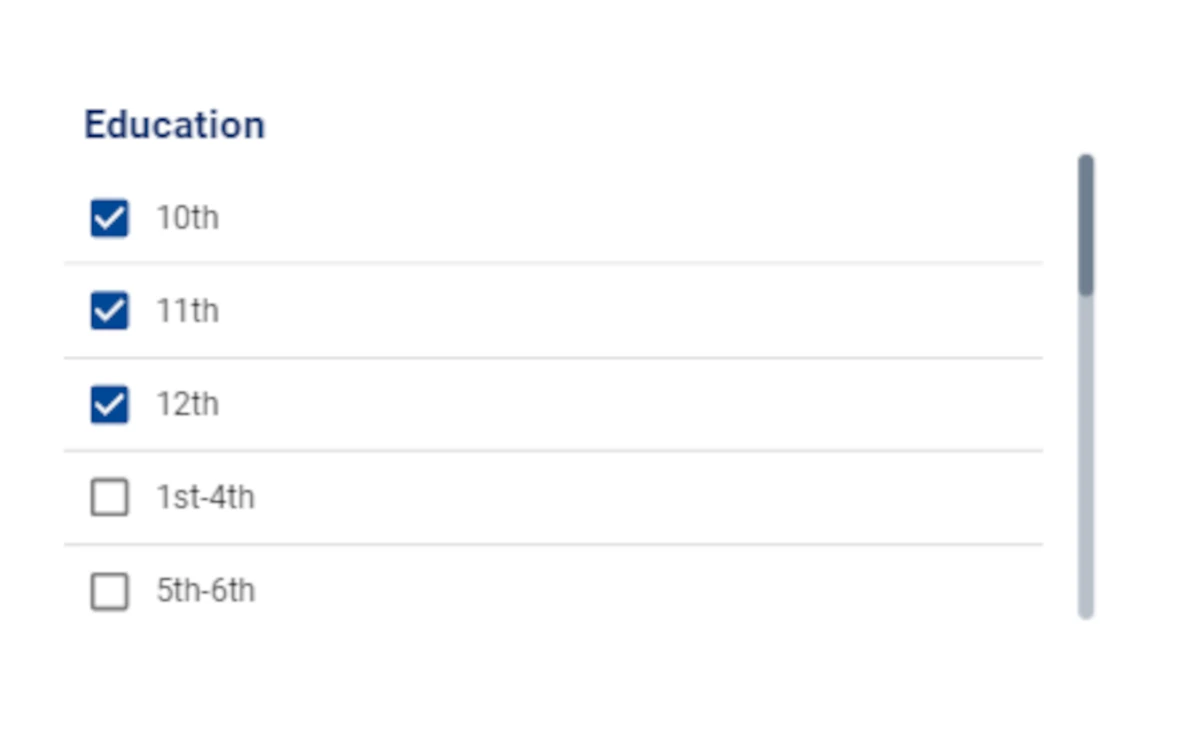
The Filter values action has the graphical aspect of a checklist, where users can select one or more values to be filtered at the same time.
It is possible to set filters to all the attribute types.
If a nominal attribute is dragged on the Filter values, it automatically creates a drop-down menu containing the values to filter (a message is also displayed on the bottom part of the stage).
While if an ordered attribute has been dragged onto the widget, it provides an additional section to manually create filters. However, it is possible to customize nominal filters as well, by working in the Filter Options area.
If there are more values than the ones which can be contained in the widget’s dimension, a scrollbar is present in the list, to help user browsing through the values.
In the table below users can find the detailed description of the Filter values widget configuration options, along with their corresponding GOLD references.
Note
The event triggers available for the Filter values widget are:
onMouseEnter
onMouseLeave
onChange
Subsection |
Option |
Description |
GOLD ref |
|---|---|---|---|
Input Options |
Table |
It displays the table containing the attribute to be filtered. It is possible to change it from the drop-down menu and choosing one of the tables which have been imported in the Datasets tab. |
input |
Attribute |
It displays the attribute dragged onto the widget, which will be filtered according to the rules set in the Filter area. It is possible to change it from the attribute drop-down list by typing its name or by scrolling in the list. |
input |
|
Action type |
Select whether the operation performed by the widget is Selection or Filter. |
||
Scope Options |
Scope |
Here, users will select the widgets to which the filter will be applied. More information on the Scope field can be found in the corresponding page. |
input |
Filter options |
Filter |
Here, users can choose whether the filters are created automatically (Auto, default value when nominal attributes are dragged onto the widget) or with a Custom (default value when ordered attributes are dragged onto the widget)procedure. |
|
Include missing values (only if Auto has been selected as Filter) |
If selected, rows containing missing values will be filtered. |
Subsection |
Option |
Description |
GOLDref |
|---|---|---|---|
Checkbox |
Checkbox orientation |
Select the checkbox orientation, that is the way values are displayed. The possible values are Vertical (default), or Horizontal. |
|
Text |
Font style |
It defines the font style of the widget’s values, which can be bold, italic or underlined. |
|
Font family |
Choose from the drop-down list the font family of the widget’s values. |
||
Font size (px) |
It defines the font size of the widget’s values. |
||
Text transform |
It defines the letter case. The possible values are: Capitalize, Uppercase, Lowercase. |
||
Text placement |
It defines the text placement, considering the value’s checkbox as the main reference. The possible options are: Top, End, Bottom, Start. |
||
Text color |
It defines the color of the text which is currently visualized in the filter’s text field. By clicking it, users can select Standard colors and generated color palettes, otherwise they can use the color picker or choose the color code, which can be: Hex, Rgb, Hsl, Hsv. |
||
Icon |
Icon size (px) |
The size of the bullet icon associated to the corresponding filter label. |
|
Unchecked color |
The color of the icon when the filter is not selected. By clicking it, users can select Standard colors and generated color palettes, otherwise they can use the color picker or choose the color code, which can be: Hex, Rgb, Hsl, Hsv. |
||
Checked color |
The color of the icon when the filter is selected and active. By clicking it, users can select Standard colors and generated color palettes, otherwise they can use the color picker or choose the color code, which can be: Hex, Rgb, Hsl, Hsv. |
||
Label |
Text style |
Here users can define the text style, which can be bold, italic or underlined and the text alignment, which can be: text left, text center or text right. |
layout |
Label text |
Here users can type the action label. |
||
Font family |
Here users can define the label font in the drop-down menu. |
layout |
|
Font size (px) |
It defines the font size of the label. |
layout |
|
Text transform |
It defines the letter case. The possible values are: Capitalize, Uppercase, Lowercase. |
layout |
|
Label placement |
It defines the label placement. The possible options are: Top (default), End, Bottom, Start. |
layout |
Filter Slider
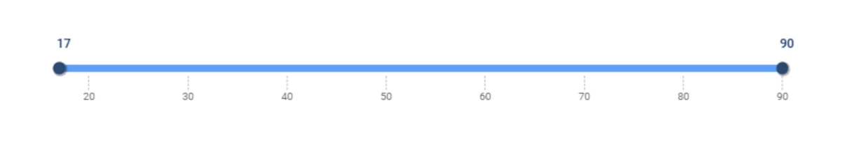
The Filter slider action has the graphical aspect of a range slider, whose values are included into two thresholds, which are by default the minimum and the maximum value of the attribute which has been dragged onto the widget. It is possible to modify the threshold in the INPUT tab of the layout menu.
It is possible to set filters to all attributes, except nominal and binary ones.
As soon as a suitable attribute is dragged onto the widget, the minimum and maximum value are located, respectively, on the left and on the right edges of the slider.
Then, the slider is populated with a series of ticks, whose quantity and values can be customized in the layout menu. When hovering over the slider with the pointer, the corresponding value is displayed.
In the table below users can find the detailed description of the Filter slider configuration options along with their corresponding GOLD references.
Note
The event triggers available for the Filter slider widget are:
onMouseEnter
onMouseLeave
onChange
Subsection |
Option |
Description |
GOLDref |
|---|---|---|---|
Input Options |
Table |
It displays the table containing the attribute to be filtered. It is possible to change it from the drop-down menu and choosing one of the tables which have been imported in the Datasets tab. |
input |
Attribute |
It displays the attribute dragged onto the widget, which will be filtered according to the rules set in the Filter area. It is possible to change it from the attribute drop-down list by typing its name or by scrolling in the list. |
input |
|
Action type |
Select whether the operation performed by the widget is Selection or Filter. |
||
Scope Options |
Scope |
Here, users will select the widgets to which the filter will be applied. More information on the Scope field can be found in the corresponding page. |
input |
Filter options |
Filter |
Here, users can choose whether the filters are created automatically (Auto, default value when nominal attributes are dragged onto the widget) or with a Custom (default value when ordered attributes are dragged onto the widget)procedure. |
|
Include missing values (only if Auto has been selected as Filter) |
If selected, rows containing missing values will be filtered. |
Subsection |
Option |
Description |
GOLDref |
|---|---|---|---|
Track |
Track color |
It defines the track color. By clicking it, users can select Standard colors and generated color palettes, otherwise they can use the color picker or choose the color code, which can be: Hex, Rgb, Hsl, Hsv. The default color is light blue. |
|
Tick |
Tick style |
Here users can define the text style, which can be bold, italic or underlined. |
|
Font family |
Here users can define the font of the ticks from the drop-down menu. |
||
Font size (px) |
It defines the ticks’ font size. |
||
Tick color |
The color of the ticks on the slider. By clicking it, users can select Standard colors and generated color palettes, otherwise they can use the color picker or choose the color code, which can be: Hex, Rgb, Hsl, Hsv. The default color is black. |
||
Number color |
The color of the numbers . By clicking it, users can select Standard colors and generated color palettes, otherwise they can use the color picker or choose the color code, which can be: Hex, Rgb, Hsl, Hsv. The default color is gray. |
||
Label |
Label style |
Here users can define the text style, which can be bold, italic or underlined and the text alignment, which can be: text left, text center or text right. |
|
Label text |
Here users can type the action label. |
||
Font family |
Here users can define the font of the label from the drop-down menu. |
||
Font size (px) |
It defines the label’s font size. |
||
Text transform |
It defines the letter case. The possible values are: Capitalize, Uppercase, Lowercase. |
||
Label placement |
It defines the label placement. The possible options are: Top (by default), End, Bottom, Start. |
layout |
|
Label color |
It defines the color of the label. By clicking it, users can select Standard colors and generated color palettes, otherwise they can use the color picker or choose the color code, which can be: Hex, Rgb, Hsl, Hsv. The default color is blue. |
Filter Calendar
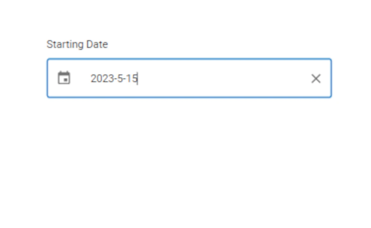
The Filter Calendar action has the graphical aspect of a calendar, which defines a filtering threshold.
It is possible to set filters to the following attribute types: date, week, month, quarter or datetime.
To actively use the filter, it is possible to type the desired date in the corresponding text field in the following formats:
yyyy/mm/dd if the attribute dragged on the action is a date attribute.
yyyy/ww if the attribute dragged on the action is a week attribute.
yyyy/mm if the attribute dragged on the action is a month attribute.
yyyy/qq if the attribute dragged on the action is a quarter attribute.
yyyy/mm/dd hh:mm:ss if the attribute dragged on the action is a datetime attribute.
Alternatively, it is possible to set up the threshold by clicking on the calendar icon next to the text field.
In the table below users can find the detailed description of the Filter Calendar configuration options their corresponding GOLD references.
Note
The event triggers available for the Filter Calendar widget are:
onMouseEnter
onMouseLeave
onFocus
onType
onChange
Subsection |
Option |
Description |
GOLDref |
|---|---|---|---|
Input Options |
Table |
It displays the table containing the attribute to be filtered. It is possible to change it from the drop-down menu and choosing one of the tables which have been imported in the Datasets tab. |
input |
Attribute |
It displays the attribute dragged onto the widget, which will be filtered according to the rules set in the Filter area. It is possible to change it from the attribute drop-down list by typing its name or by scrolling in the list. |
input |
|
Function |
It defines the date/time characteristics in the threshold. It basically defines if the value will be filtered according to its value, or according to specific characteristics. The values in this drop-down menu change according to the data type of the attribute which has been dragged on it. |
||
Action type |
Select whether the operation performed by the widget is Selection or Filter. |
||
Scope Options |
Scope |
Here, users will select the widgets to which the filter will be applied. More information on the Scope field can be found in the corresponding page. |
input |
Filter Options |
Add starting date |
If selected, the widget filter is filled with a selector which sets the starting value of the filter. |
|
Label |
Type a label for the starting date filter. The default value is Starting Date. |
||
Add ending date |
If selected, the widget filter is filled with a selector which sets the ending value of the filter. |
||
Label |
Type a label for the ending date filter. The default value is Ending Date. |
||
Set current date as default |
If selected, the current date is the default filter in the action. |
Subsection |
Option |
Description |
GOLDref |
|---|---|---|---|
Calendar |
Calendar orientation |
It defines the calendar orientation when opening it, which can be Vertical (default) or Horizontal. |
|
Background |
Outer background color |
It defines the background color of the area surrounding the calendar button and text field. By clicking it, users can select Standard colors, otherwise they can use the color picker or choose the color code, which can be: Hex, Rgb, Hsl, Hsv. The default color is white. |
layout |
Inner background color |
It defines the values box background color. By clicking it, users can select Standard colors and generated color palettes, otherwise they can use the color picker or choose the color code, which can be: Hex, Rgb, Hsl, Hsv. The default color is white. |
layout |
|
Border |
Border size (px) |
It defines the size of the value box border. |
layout |
Border style |
It defines the value box border style. The possible values are: Solid (default) Dotted, Dashed, Double, 3D Ridge, 3D Inset, 3D Outset, None, Hidden. |
layout |
|
Border color |
It defines the action border color. By clicking it, users can select Standard colors and generated color palettes, otherwise they can use the color picker or choose the color code, which can be: Hex, Rgb, Hsl, Hsv. The default color is black. |
layout |
|
Icon |
Icon color |
It defines the color of calendar icon in the value box. By clicking it, users can select Standard colors and generated color palettes, otherwise they can use the color picker or choose the color code, which can be: Hex, Rgb, Hsl, Hsv. The default color is black. |
layout |
Date |
Text style options |
Here users can define the date text style, which can be: bold, italic or underlined. |
layout |
Font family |
Here users can define the date font from the drop-down menu. |
layout |
|
Font size (px) |
It defines the date font size. |
layout |
|
Date color |
It defines the date color. By clicking it, users can select Standard colors and generated color palettes, otherwise they can use the color picker or choose the color code, which can be: Hex, Rgb, Hsl, Hsv. The default color is black. |
layout |
|
Label |
Text style options |
Here users can define the label(s) text style, which can be: bold, italic or underlined. The label(s) text has been specified in the INPUT tab. |
layout |
Font family |
Here users can define the label font in the drop-down menu. |
layout |
|
Font size (px) |
It defines the label font size. |
layout |
|
Label placement |
It defines the label placement. The possible options are: Top (by default), End, Bottom, Start. |
layout |
|
Label color |
It defines the color of the label. By clicking it, users can select Standard colors and generated color palettes, otherwise they can use the color picker or choose the color code, which can be: Hex, Rgb, Hsl, Hsv. The default color is black. |
layout |
Action Schema
An action is completely described through a JSON object composed by 3 different areas:
input, retaining the information about the linked attributes.
options, retaining all the graphical and functional options which requires a re-evaluation of the action filter effect.
layout, the rest of the graphical options which do not require a re-evaluation of the action filter effect.
The whole JSON object is saved as a GOLD dictionary in the layout field of the Action class.
The schema of the JSON object is presented in YAML format commented. The name of the action on the external level means the part contained is custom for the current plot type.
filterbutton:
  layout:
    exclusive: #only one button can be selected, the others become unselected
    color:
      auto: #sets the general colors of the widget automatically or makes them customizable
      color: #set the general color of the widget when auto is true and affects the titles, the backgrounds, the borders and their hover effects
    background:
      backgroundColor: #sets the custom background color of the button when auto is false and when the button is active
      hoverBackgroundColor: #sets the custom change of the background color when the mouse hovers over it when auto is false and when the button is active
    orientation: #set the orientation of the widget when there are more than one filters(vertical/horizontal)
    title:
      fontWeight: #set the font thickness(bold/normal)
      fontStyle: #set the style of the font(normal/italic)
      textDecoration: #set the underlining of the font(none/underlined)
      fontFamily: #set the font family
      textTransform: #set the capitalization or case of the full text (none,capitalize,uppercase,lowercase)
      fontSize: #set the font size in px
      color: #sets the custom title color of the buttons when auto is false
    border:
      borderRadius: #set the roundness of the corners
      borderWidth: #set the thickness of the border
      borderColor: #sets the custom border color of the buttons when auto is false  and when the button is not active
      hoverBorderColor: #sets the custom change of the border color when the mouse hovers over it when auto is false and when the button is not active
    label:
      fontWeight: #set the font thickness(normal/bold)
      fontStyle: #set the style of the font(normal/italic)
      textDecoration: #set the underlining of the font(none/underlined)
      textAlign: #set the horizontal alignment of text, if the key placement is set as end/start, textAlign works vertically
      text: #set the actual text
      fontSize: #set the font size in px
      fontFamily: #set the font family
      textTransform: #set the capitalization or case of the full text (none,capitalize,uppercase,lowercase)
      placement: #set the positioning of the text relative to the widget(top/end/bottom/start), start place the text on the left and end to the right
      color: #set the text color
  input:
    table: #table of the attribute used
    attr: #name of the attribute used
    type: #type of the attribute used
    scope: #sets on which widgets in the view, the triggered action will take effect if all the widgets are selected the value of scope is null, if no widgets are selected the value will be an empty object {}, if just some widget are selected the value will be an object that has as keys the family of the widget and as value a list of names corresponding to the selected widgets
    filter: #list that contains all the custom filter
      - label: #set a label for the button
        filter: #set the filter rule
        isActive: #set if the button is active, if it si the button becomes contained otherwise it remains outlined
filterformfield:
  layout:
    variant: #sets the appearance of the widget (outlined/standard/filled)
    type: #set the form field type(number/text)
    step: #ONLY TYPE NUMBER manage the step when the numberfield is changed with arrowup and arrowdown("1", "0.1", "0.001", "0.000001")
    min: #ONLY TYPE NUMBER sets the minimun value
    max: #ONLY TYPE NUMBER sets the max value
    text:
      fontWeight: #set the font thickness(bold/normal)
      fontStyle: #set the style of the font(normal/italic)
      textDecoration: #set the underlining of the font(none/underlined)
      fontFamily: #set the font family
      textTransform: #set the capitalization or case of the full text (none,capitalize,uppercase,lowercase)
      fontSize: #set the font size in px
      color: #sets the custom title color of the buttons when auto is false
      backgroundColor: #sets the background color behind the text
    border:
      borderRadius: #set the roundness of the corners ONLY WHEN VARIANT IS OUTLINED
      borderWidth: #set the thickness of the border
      borderColor: #sets the custom border color of the buttons when auto is false  and when the button is not active
      hoverBorderColor: #sets the custom change of the border color when the mouse hovers over it
      focusBorderColor: #sets the custom change of the border color when menu is opened
    label:
      fontWeight: #set the font thickness(normal/bold)
      fontStyle: #set the style of the font(normal/italic)
      textDecoration: #set the underlining of the font(none/underlined)
      textAlign: #set the horizontal alignment of text, if the key placement is set as end/start, textAlign works vertically
      text: #set the actual text
      fontFamily: #set the font family
      fontSize: #set the font size in px
      textTransform: #set the capitalization or case of the full text (none,capitalize,uppercase,lowercase)
      placement: #set the positioning of the text relative to the widget(top/end/bottom/start), start place the text on the left and end to the right
      color: #set the text color
  input:
    table: #table of the attribute used
    attr: #name of the attribute used
    type: #type of the attribute used
    scope: #sets on which widgets in the view, the triggered action will take effect if all the widgets are selected the value of scope is null, if no widgets are selected the value will be an empty object {}, if just some widget are selected the value will be an object that has as keys the family of the widget and as value a list of names corresponding to the selected widgets
    value: #set the value of the widget
    defaultValue: #set the default value to show on the widget
filterdropdown:
  layout:
    variant: #sets the appearance of the widget (outlined/standard/filled)
    placeholder: #sets the placeholder
    adornmentsColor: #sets the color of adornment icons
    isAutocomplete: #rendered as autocomplete
    disableClearable: #disable clear icon
    addNull: #show null value
    text:
      fontWeight: #set the font thickness(bold/normal)
      fontStyle: #set the style of the font(normal/italic)
      textDecoration: #set the underlining of the font(none/underlined)
      fontFamily: #set the font family
      textTransform: #set the capitalization or case of the full text (none,capitalize,uppercase,lowercase)
      fontSize: #set the font size in px
      color: #sets the custom title color of the buttons when auto is false
      backgroundColor: #sets the background color behind the text
    border:
      borderRadius: #set the roundness of the corners ONLY WHEN VARIANT IS OUTLINED
      borderWidth: #set the thickness of the border
      borderColor: #sets the custom border color of the buttons when auto is false  and when the button is not active
      hoverBorderColor: #sets the custom change of the border color when the mouse hovers over it
      focusBorderColor: #sets the custom change of the border color when menu is opened
    label:
      fontWeight: #set the font thickness(normal/bold)
      fontStyle: #set the style of the font(normal/italic)
      textDecoration: #set the underlining of the font(none/underlined)
      textAlign: #set the horizontal alignment of text, if the key placement is set as end/start, textAlign works vertically
      text: #set the actual text
      fontFamily: #set the font family
      fontSize: #set the font size in px
      textTransform: #set the capitalization or case of the full text (none,capitalize,uppercase,lowercase)
      placement: #set the positioning of the text relative to the widget(top/end/bottom/start), start place the text on the left and end to the right
      color: #set the text color
    menu: #affects the text of all menu items
      fontWeight: #set the font thickness(normal/bold)
      fontStyle: #set the style of the font(normal/italic)
      textDecoration: #set the underlining of the font(none/underlined)
      fontFamily: #set the font family
      fontSize: #set the font size in px
      textTransform: #set the capitalization or case of the full text (none,capitalize,uppercase,lowercase)
      color: #set the text color
  input:
    table: #table of the attribute used
    attr: #name of the attribute used
    type: #type of the attribute used
    scope: #sets on which widgets in the view, the triggered action will take effect if all the widgets are selected the value of scope is null, if no widgets are selected the value will be an empty object {}, if just some widget are selected the value will be an object that has as keys the family of the widget and as value a list of names corresponding to the selected widgets
    auto: #if true show the list of values of the attribute else it allows to create custom filter. If the attribute is not nominal or the amount of values of a nominal is over a certain quantity, auto can't be set
    filter: #list that contains all the custom filter
      - label: #set a label for the button
        filter: #set the filter rule
        isActive: #set if the button is active, if it si the button becomes contained otherwise it remains outlined
    list: #list that contain all the values of the attribute
    defaultValue: #set the default value to show on the widget
    active: #identifies the filter set by its name. This is accessible when auto is false
    selected: #identifies the value via its index in the corresponding list. This is accessible when auto is true
  options:
    inheritFilters: #if the action inherit the slide filters
filterautocomplete:
  layout:
    variant: #sets the appearance of the widget (outlined/standard/filled)
    placeholder: #sets the placeholder
    adornmentsColor: #sets the color of adornment icons
    text:
      fontWeight: #set the font thickness(bold/normal)
      fontStyle: #set the style of the font(normal/italic)
      textDecoration: #set the underlining of the font(none/underlined)
      fontFamily: #set the font family
      textTransform: #set the capitalization or case of the full text (none,capitalize,uppercase,lowercase)
      fontSize: #set the font size in px
      color: #sets the custom title color of the buttons when auto is false
      backgroundColor: #sets the background color behind the text
    border:
      borderRadius: #set the roundness of the corners ONLY WHEN VARIANT IS OUTLINED
      borderWidth: #set the thickness of the border
      borderColor: #sets the custom border color of the buttons when auto is false  and when the button is not active
      hoverBorderColor: #sets the custom change of the border color when the mouse hovers over it
      focusBorderColor: #sets the custom change of the border color when menu is opened
    label:
      fontWeight: #set the font thickness(normal/bold)
      fontStyle: #set the style of the font(normal/italic)
      textDecoration: #set the underlining of the font(none/underlined)
      textAlign: #set the horizontal alignment of text, if the key placement is set as end/start, textAlign works vertically
      text: #set the actual text
      fontFamily: #set the font family
      fontSize: #set the font size in px
      textTransform: #set the capitalization or case of the full text (none,capitalize,uppercase,lowercase)
      placement: #set the positioning of the text relative to the widget(top/end/bottom/start), start place the text on the left and end to the right
      color: #set the text color
    menu: #affects the text of all menu items
      fontWeight: #set the font thickness(normal/bold)
      fontStyle: #set the style of the font(normal/italic)
      textDecoration: #set the underlining of the font(none/underlined)
      fontFamily: #set the font family
      fontSize: #set the font size in px
      textTransform: #set the capitalization or case of the full text (none,capitalize,uppercase,lowercase)
      color: #set the text color
  input:
    table: #table of the attribute used
    attr: #name of the attribute used
    type: #type of the attribute used
    scope: #sets on which widgets in the view, the triggered action will take effect if all the widgets are selected the value of scope is null, if no widgets are selected the value will be an empty object {}, if just some widget are selected the value will be an object that has as keys the family of the widget and as value a list of names corresponding to the selected widgets
    filtercode: #gold formula that filters the values of the attribute
  options:
    inheritFilters: #if the action inherit the slide filters
filterradio:
  layout:
    orientation: #modify the orientation of the radio buttons (vertical/horizontal)
    text:
      fontWeight: #set the font thickness(bold/normal)
      fontStyle: #set the style of the font(normal/italic)
      textDecoration: #set the underlining of the font(none/underlined)
      fontFamily: #set the font family
      fontSize: #set the font size in px
      textTransform: #set the capitalization or case of the full text (none,capitalize,uppercase,lowercase)
      placement: #set the position of the text relative to the radio button icon(top/end/bottom/start), start place the text on the left and end to the right
      color: #sets the text color
    icon:
      fontSize: #set the size of the radio button icon
      colorUnchecked: #set the radio button color when unchecked
      colorChecked: #set the radio button color when checked
    label:
      fontWeight: #set the font thickness(normal/bold)
      fontStyle: #set the style of the font(normal/italic)
      textDecoration: #set the underlining of the font(none/underlined)
      textAlign: #set the horizontal alignment of text, if the key placement is set as end/start, textAlign works vertically
      text: #set the actual text
      fontFamily: #set the font family
      fontSize: #set the font size in px
      textTransform: #set the capitalization or case of the full text (none,capitalize,uppercase,lowercase)
      placement: #set the positioning of the text relative to the widget(top/end/bottom/start), start place the text on the left and end to the right
      color: #set the text color
  input:
    table: #table of the attribute used
    attr: #name of the attribute used
    type: #type of the attribute used
    scope: #sets on which widgets in the view, the triggered action will take effect if all the widgets are selected the value of scope is null, if no widgets are selected the value will be an empty object {}, if just some widget are selected the value will be an object that has as keys the family of the widget and as value a list of names corresponding to the selected widgets
    auto: #if true show the list of values of the attribute else it allows to create custom filter. If the attribute is not nominal or the amount of values of a nominal is over a certain quantity, auto can't be set
    filter: #list that contains all the custom filter
      - label: #set a label for the button
        filter: #set the filter rule
        isActive: #set if the radio button is active, if it is the radio button becomes checked otherwise it remains unchecked
    list: #list that contain all the values of the attribute
    defaultValue: #set the default value to show on the widget
    active: #identifies the filter set by its name. This is accessible when auto is false
    selected: #identifies the value via its index in the corresponding list. This is accessible when auto is true
  options:
    inheritFilters: #if the action inherit the slide filters
filtervalues:
  layout:
    orientation: #modify the orientation of the checkboxes (vertical/horizontal)
    text:
      fontWeight: #set the font thickness(bold/normal)
      fontStyle: #set the style of the font(normal/italic)
      textDecoration: #set the underlining of the font(none/underlined)
      fontFamily: #set the font family
      fontSize: #set the font size in px
      textTransform: #set the capitalization or case of the full text (none,capitalize,uppercase,lowercase)
      placement: #set the position of the text relative to the checkbox icon(top/end/bottom/start), start place the text on the left and end to the right
      color: #sets the text color
    icon:
      fontSize: #set the size of the checkbox icon
      colorUnchecked: #set the checkbox color when unchecked
      colorChecked: #set the checkbox color when checked
    label:
      fontWeight: #set the font thickness(normal/bold)
      fontStyle: #set the style of the font(normal/italic)
      textDecoration: #set the underlining of the font(none/underlined)
      textAlign: #set the horizontal alignment of text, if the key placement is set as end/start, textAlign works vertically
      text: #set the actual text
      fontFamily: #set the font family
      fontSize: #set the font size in px
      textTransform: #set the capitalization or case of the full text (none,capitalize,uppercase,lowercase)
      placement: #set the positioning of the text relative to the widget(top/end/bottom/start), start place the text on the left and end to the right
      color: #set the text color
  input:
    table: #table of the attribute used
    attr: #name of the attribute used
    type: #type of the attribute used
    scope: #sets on which widgets in the view, the triggered action will take effect if all the widgets are selected the value of scope is null, if no widgets are selected the value will be an empty object {}, if just some widget are selected the value will be an object that has as keys the family of the widget and as value a list of names corresponding to the selected widgets
    auto: #if true show the list of values of the attribute else it allows to create custom filter. If the attribute is not nominal or the amount of values of a nominal is over a certain quantity, auto can't be set
    filter: #list that contains all the custom filter
      - label: #set a label for the button
        filter: #set the filter rule
        isActive: #set if the checkbox is active, if it is the checkbox becomes checked otherwise it remains unchecked
    list: #list that contain all the values of the attribute
    selected: #is a list whit the same lenght of the list key and it identifies which checkbox is checked or not via boolean value
  options:
    inheritFilters: #if the action inherit the slide filters
filterslider:
  layout:
    includeNone: #allows to include none value
    track:
      color: #set the color of the track that indicate the range on the slider
    tick:
      fontWeight: #set the font thickness of the value below the ticks(normal/bold)
      fontStyle: #set the font style of the value below the ticks(normal/italic)
      textDecoration:  #set the font underlining of the value below the ticks(none/underlined)
      fontFamily: #set the font family of the value below the ticks
      fontSize: #set the font size in px of the value below the ticks
      tickColor: #set the color of the ticks
      color: #set the text color of the value below the ticks
    label:
      fontWeight: #set the font thickness(normal/bold)
      fontStyle: #set the style of the font(normal/italic)
      textDecoration: #set the underlining of the font(none/underlined)
      textAlign: #set the horizontal alignment of text
      text: #set the actual text
      fontFamily: #set the font family
      fontSize: #set the font size in px
      textTransform: #set the capitalization or case of the full text (none,capitalize,uppercase,lowercase)
      placement: #set the positioning of the text relative to the calendar(top/end/bottom/start), start place the text on the left and end to the right
      color: #set the text color
  input:
    table: #table of the attribute used
    attr: #name of the attribute used
    type: #type of the attribute used
    scope: #sets on which widgets in the view, the triggered action will take effect if all the widgets are selected the value of scope is null, if no widgets are selected the value will be an empty object {}, if just some widget are selected the value will be an object that has as keys the family of the widget and as value a list of names corresponding to the selected widgets
    auto: #if true shows all the range from the minimum value to the maximum value(original domain) otherwise if false it allows to set the minimum and maximus values of the domain
    includeNone: #allows to include none value
    domain: #custom list that contains the maximum and minimum value within which range can be set
    interval: #custom list containing the maximum and minimum value that sets range taking into account the chosen operator
    operators: #sets the operator that affect the slider range ("<=_<=", "<_<=", "<=_<" , "<_<")
    func: #allow you to change format of the current attribute. It can be done only for these types: DATE, WEEK, MONTH, QUARTER, DATETIME. The respective cast options available for each attribute are as follows: DATE => [null, 'year', 'quarter', 'month', 'week', 'day'],  WEEK, MONTH, QUARTER => [null, 'year', 'date', 'week'], MONTH=> [null, 'year', 'date', 'month'], QUARTER => [null, 'year', 'date', 'quarter'], DATETIME => [null, 'date', 'year', 'quarter', 'month', 'week', 'day', 'time', 'hour', 'minute', 'second']
  options:
    domain: #original list that contains the maximum and minimum value within which range can be set
    inheritFilters: #if the action inherit the slide filters
filtercalendar:
  layout:
    orientation: #modify the orientation when the end period calendar is present (vertical/horizontal)
    background:
      backgroundColor: #sets the color of the background outside both calendars
    border:
      borderWidth: #sets the thickness of the borders of both calendars
      borderStyle: #sets the style of the borders of both calendars
      borderColor: #sets the color of the borders of both calendars
      backgroundColor: #sets the color of the background inside both calendars
    icon:
      color: #sets the color of the icon of both calendars
    text: #affects the text that displays the value inside both calendars
      fontWeight: #set the font thickness(bold/normal)
      fontStyle: #set the style of the font(normal/italic)
      textDecoration: #set the underlining of the font(none/underlined)
      fontFamily: #set the font family
      fontSize: #set the font size in px
      color: #sets the text color
    label: #affects the text that displays the label outside both calendars
      fontWeight: #set the font thickness(bold/normal)
      fontStyle: #set the style of the font(normal/italic)
      textDecoration: #set the underlining of the font(none/underlined)
      fontFamily: #set the font family
      fontSize: #set the font size in px
      placement: #set the positioning of the text relative to the calendar(top/end/bottom/start), start place the text on the left and end to the right
      color: #set the text color
  input:
    table: #table of the attribute used
    attr: #name of the attribute used
    type: #type of the attribute used
    scope: #sets on which widgets in the view, the triggered action will take effect if all the widgets are selected the value of scope is null, if no widgets are selected the value will be an empty object {}, if just some widget are selected the value will be an object that has as keys the family of the widget and as value a list of names corresponding to the selected widgets
    function: #allow you to change format of the current attribute. It can be done only for these types: DATE, WEEK, MONTH, QUARTER, DATETIME. The respective cast options available for each attribute are as follows: DATE => [null, 'year', 'quarter', 'month', 'week', 'day'],  WEEK, MONTH, QUARTER => [null, 'year', 'date', 'week'], MONTH=> [null, 'year', 'date', 'month'], QUARTER => [null, 'year', 'date', 'quarter'], DATETIME => [null, 'date', 'year', 'quarter', 'month', 'week', 'day', 'time', 'hour', 'minute', 'second']
    hasStartingPeriod: #show the starting period calendar
    hasEndingPeriod: #show the ending period calendar
    startingLabel: #set the label of the starting period calendar
    endingLabel: #set the label of the ending period calendar
    value: #is a list that with two values which indicate the starting period and ending period date. The value must be appropriate to the type of attribute or function set
options:
  type: #the action type
  actionSelection: #if the action is a filter or a selection action
                    # "date": ['', 'Year', 'Quarter', 'Month', 'Week', 'Day'],
                    # "month" : ['', 'Date', 'Year', 'Month'],
                    # "quarter" : ['', 'Date', 'Year', 'Quarter'],
                    # "week" : ['', 'Date', 'Year', 'Week'],
                    # "datetime" : ['', 'Date', 'Year', 'Quarter', 'Month', 'Week', 'Day', 'Time', 'Hour', 'Minute', 'Second'],