Connections
The Connections tab allows users to create, visualize, edit and delete connections. These operations link components between them, creating a set of interconnected operations that define the functional logic of a business-specific interface.
Connections allow performing three operations:
Making organizers visible/invisible on the interface.
Disabling editing of organizers.
Changing other options values.
To create or edit a connection, click on the pencil icon in the top-right corner of the tab, and the Connections Manager window opens.
Connections can be set up not only in this tab, but also through the components’ context menu, via the Create Connection and the Set connection options.
When the Connections Manager window is first opened, no connections are set, and this window is completely empty. To generate the first connection, users need to click on the Plus button in the top-left corner of the window.
Each generated connection is assigned its own tab in the Connections Manager window, allowing users to easily navigate among existing connections.
Connections’ names can be edited by clicking on the pencil icon next to each connection’s name.
Once a connection has been added, the Connections Manager window is divided in two areas: the origin area, and the Destinations area.
In the origin area, users select which controller verifies the condition and activates the options set in the Destinations area. The following options are available:
Origin: select from the drop-down list the controller which will trigger the connection. As the Origin component must belong to the Controllers family, only the controllers are displayed in the list.
Code: the condition which must be satisfied in order to activate the connection.
Warning
Each condition written in the Code field must be preceded by the prefix
__code__and must be written using the gold code.The controller specified in the Origin drop-down menu must be associated to an option.
In the Destinations area, located at the bottom of the window, users can add components to be linked to the controller specified in the origin area and define the effect they will receive from the connection.
By default, this area is empty, and no maximum number of destinations is defined. Users need to click on the Add destination box to add a destination for their connection.
Once a destination has been added, the Destinations area is populated with the Destination drop-down menu, where users can choose the component which will be affected by the connection.
After selecting the Destination component, a series of options appears in the Destinations area, which vary according to the sub-family the component belongs to.
The options available in the Connections Manager window when a component is defined as the Destination vary according to the selected component.
Only one option is shared among all components which have been defined as the Destination, below you’ll find its features.
Negate: selecting this option performs the opposite operation specified in the destination area.
The paragraphs below list the options available for each components’ subfamily when defined as the Destination.
In the Connections Manager window, users can save the changes made and close the window by clicking the APPLY button, or they can simply close the window by clicking on the CANCEL button to discard the changes. If users need to delete one specific connection, they can click the X icon in the top-right corner of the corresponding tab.
Each existing connection is displayed in this tab, where a summary of its characteristics is displayed, and organized in the following columns:
Name: the name of the connection.
Origin: the controller which activates the connection when a specific condition is set.
Destinations: it contains the list of the controllers affected by the connection.
Tip
If the same component is defined as the destination in multiple connections that are triggered by the same controller, the system automatically executes those connections in the order of the tabs in the Connections Manager.
Organizers
When a component belonging to the Organizers sub-family is selected from the Destination drop-down menu, the Destinations area is populated accordingly.
The shared options are listed above. Instead, to know more about Organizers specific options browse the tabs below.
Option |
Description |
|---|---|
Action |
Select from the drop-down list the operation that will affect the component when the conditions set in the origin area are verified. (if the Negate option is selected, the opposite action is performed) The possible values are:
|
Option |
Description |
|---|---|
Tab/Step to be focused |
Type the step number of the tab/step which will be visualized when the conditions set in the origin area are verified (if the Negate option is selected, the opposite action is performed). |
Enable visible |
If selected, the Visible tabs/steps option is activated. |
Visible tabs/steps |
Select from the drop-down list the tabs/steps which will be visible when the conditions set in the origin area are verified (if the Negate option is selected, the opposite action is performed). By default, all the tabs/steps are selected. This option is active only when the Enable visible checkbox has been selected. |
Disabled tabs/steps |
Select from the drop-down list the tabs/steps which will be disabled when the conditions set in the origin area are verified (if the Negate option is selected, the opposite action is performed). By default, no tabs/steps are selected. This option is active only when the Enable visible checkbox has been selected. |
Visualizers
In the Visualizers subfamily, when a Label is selected in the Destination drop-down menu, only the Negate checkbox and the Action drop-down are displayed: their characteristics are explained, respectively, in the introduction and in the container/collapse section.
Controllers
As previously said, Controllers are the only Components which can be specified both as an Origin and as a Destination.
Once they have been selected as the Destination, the following options are displayed:
Negate: the shared option among all components, the description can be found here.
Value: type the value of the controller when the condition specified in the origin area will be verified (if the Negate option is selected, the opposite action is performed).
Example
In this section, an example on how to set up a connection is provided.
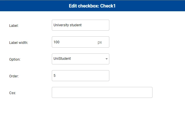
Specifically, we want to set up a Carousel where users enter personal information. If the checkbox “University Student” is checked, the carousel will automatically move to a specific page with additional questions about educational background.
The user will not be allowed to browse through the pages manually, so as explained below, we will configure a connection in the carousel.
Follow the steps below:
After having created a View, add a General Button, right-click on it and select Set Event> OnClick (to know more about events, go to the corresponding page).
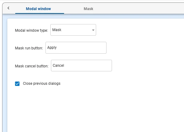
Choose the event type: as we need to build a Mask, a Modal Window or a Compute Flow event is required. In this example, we chose a Modal Window event.
Set up the Modal window type as Mask in the Modal window tab in the event window.
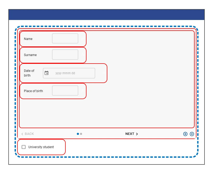
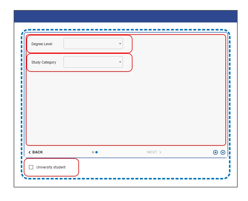
Start building your interface, in the Mask tab. In this case, we added a Carousel containing Text fields and Calendar fields in first page, while two Combobox have been added to the second page.
Add a Checkbox outside the carousel. It is important to place it outside the carousel because it will act as the controller triggering the connection.
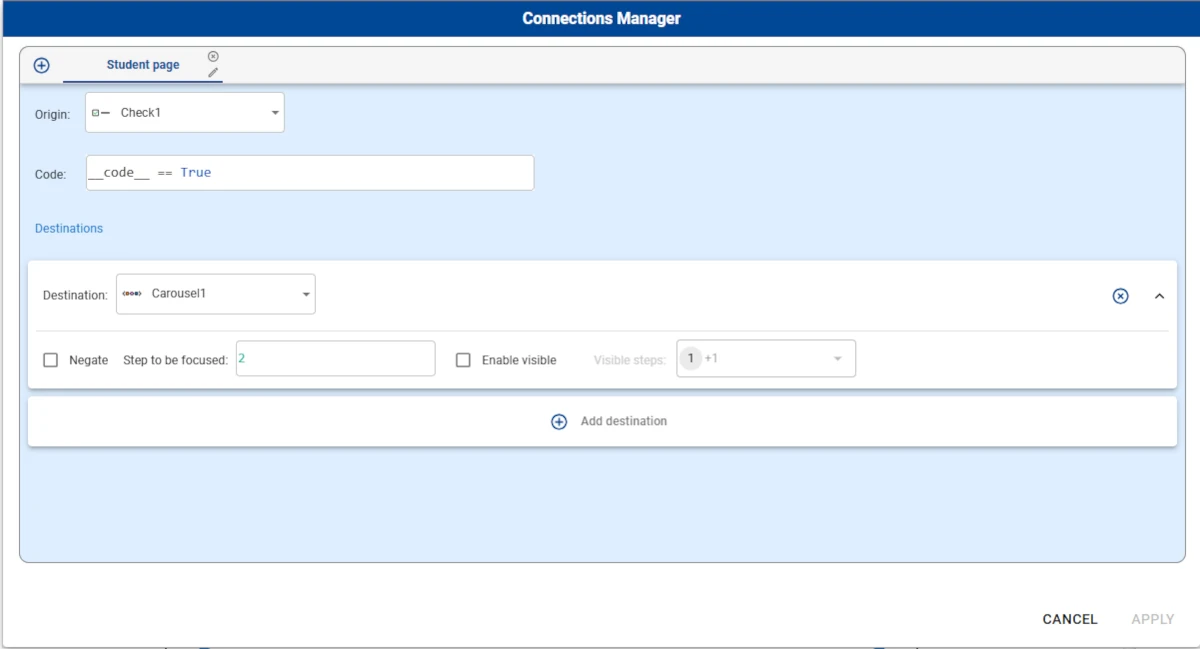
- Click the pencil icon, in the Connections tab, to open the Connections Manager. Add a new connection, and configure it as follows:
Choose Check1 as the Origin.
Type
__code__ == Truein the Code field.Click on the Add destination button.
Choose Carousel1 as the Destination.
Specify 2 as the Step to be focused.
Leave the other settings unchanged.
Click Apply to make the connection effective.
Drag the corresponding option from the Options tab or set it up using the Options drop-down menu in the component layout menu, since a Connection works on a Controller linked to an Option. The Option must be a variable with the value
False.
Save the event and save the view.
As you can see, when the checkbox is selected, the mask automatically moves to page 2.