Styling dataset columns
Dataset column style can now be changed and customized by the user; any changes are then saved in the history tab and made persistent along with the underlying dataset. This implies that any subsequent child task will display the dataset together with its embedded style.
Style can be changed for the whole column; however, Rulex Factory offers two different customization tools:
Column default style: it allows users to change the default style for the entire column i.e. its width, background color, text color or font etc.
Column conditional formatting: it allows users to configure formatting rules for the whole column. These rules will change the style of the single cells according to their internal values.
You can change the styling of a set of columns by using Set column style and Set conditional formatting entries in the header context menu from the main spreadsheet on the Data tab of the Data Manager task. By clicking on these context menu entries, dedicated panels will open, which will be described in detail in the dedicated sections.
Column style panel
In this panel you can customize the default style for a set of selected columns. The panel is divided into five different areas:
Size and Background
Text font
Border Bottom
Border Right
Additional Style
In the Size and background area, you can customize:
Width: it changes the default column width by fixing the inserted value in px.
Background color: it changes the background color for all the cells of the column.
In the Text font area, you can change the text style for the entire column:
Text styling options: it controls text style, weight, decoration and alignment.
Text font family: it changes the font family of the cell text.
Text font size: it changes the font size of the cell text.
Text font color: it changes the font color of the cell text.
In the Border bottom and Border right area, you can change the cell border style for the whole column:
Border style: it controls the dash style of the borderline.
Border width: it controls the width of the borderline.
Border color: it controls the color of the borderline.
In the Additional Style area, you can define your custom CSS code to be added as it is to any cell style for the selected columns.
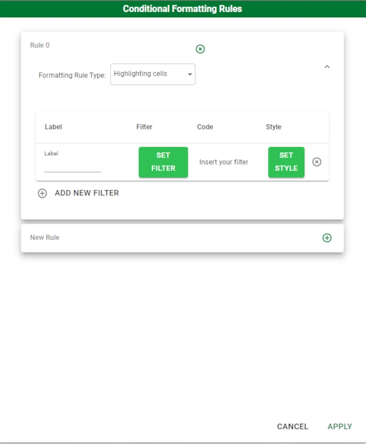
Conditional formatting panel
In this panel you can add and delete formatting rules for the selected columns. The panel shows you a list of rules in separate and collapsible panes.
You can add a new rule by clicking on the plus icon in the line located at the bottom of the whole rule list.
Note
If you are selecting more than one column, only common rules are shown in this panel.
An already added rule can then be deleted by clicking on the cross icon located at the right end of the selected rule.
A single rule is first specified by its Formatting Rule Type. Available formatting rule types are:
Highlighting cells rule
A formatting Highlighting cells rule applies a series of defined styles to a subset of rows fulfilling an associated filter.
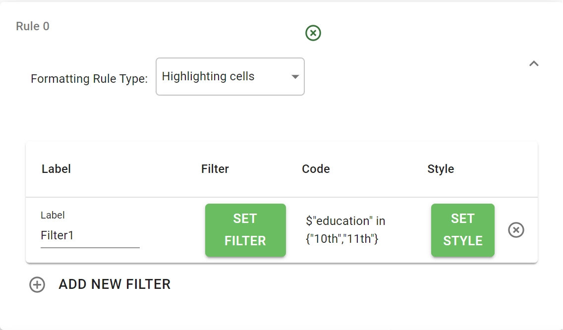
The dedicated collapsible pane is filled in this case with a table which can be expanded by adding a new filter condition through the ADD NEW FILTER button located at the bottom of the table.
In any table line you can specify:
A label which is used only for documentation purposes.
A condition filter; once the SET FILTER button is selected the condition panel associated with the chosen attribute is shown. A more detailed description of these panels is presented in the subsection: Condition panels.
An associated style; once the SET STYLE button is selected a panel equal to the just presented column style panel is shown. Refer to the previous section for a more complete description.
Once the condition filter has been defined for a row, its created code is visualized in the Code column of the table.
Top/Bottom rule
A formatting Top/Bottom rule applies a defined style to the top/bottom sector of your dataset.
Warning
This rule is not available for nominal or binary columns.
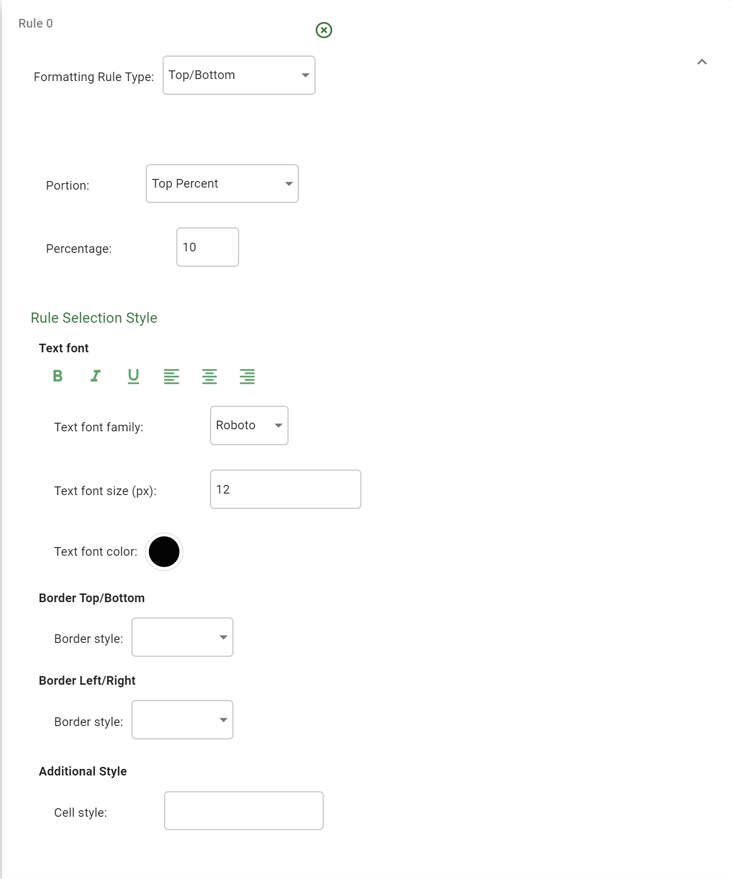
You can define the top/bottom sector as a percentage or a fixed number of lines:
By defining a percentage the style will be applied to the first/last
xrow percent of the whole column.By defining a fixed number of rows the style will be applied to the first/last
xrows of the whole column.
The just exposed division type is controlled by the Portion drop down menu where you have to choose among:
Top percent
Bottom percent
Top lines
Bottom lines
In the Top percent or Bottom percent case, the desired percentage can be specified as a number between 0 and 100 in the Percentage field.
In the Top lines or Bottom lines case, the number of considered rows can be configured in the Number of lines field.
Below this row selection criteria, you can specify the applied style in the Rule Selection Style area. This area is perfectly equal to the column style panel presented before. Refer to the previous section for a complete description.
Color scale rule
A formatting Color scale rule colors the cell background of the whole column using a defined colorscale.
Warning
This rule is not available for nominal or binary columns.

The panel is filled with a Color scale selector which allows the user to change the applied colorscale (Viridis colorscale is the default).
For a complete description about the Color scale selector interaction, please refer to this section.
Data bar rule
A formatting Data bar rule fills the cell background with a graphical horizontal bar with a width proportional to the value contained in the cell itself.
Warning
This rule is not available for nominal or binary columns.
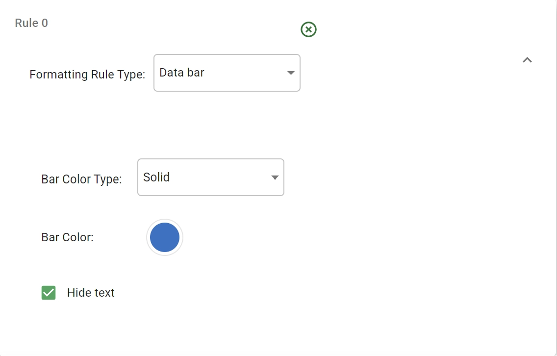
The graphical bar can be further specified as:
Bar Color Type: the bar can have a Solid color background or a Gradient color one. Pick the desired value from the dropdown menu.
Bar Color: it specifies the solid background or the color used to construct the gradient background for the bar.
Hide text: checkbox to control if you want to hide the text in the various cells and leave only the bars to represent the whole column.
Icon set rule
A formatting Icon set rule associates to any cell a particular icon based on the value contained in the cell itself. The icon is by default shown at the left of the already present text.
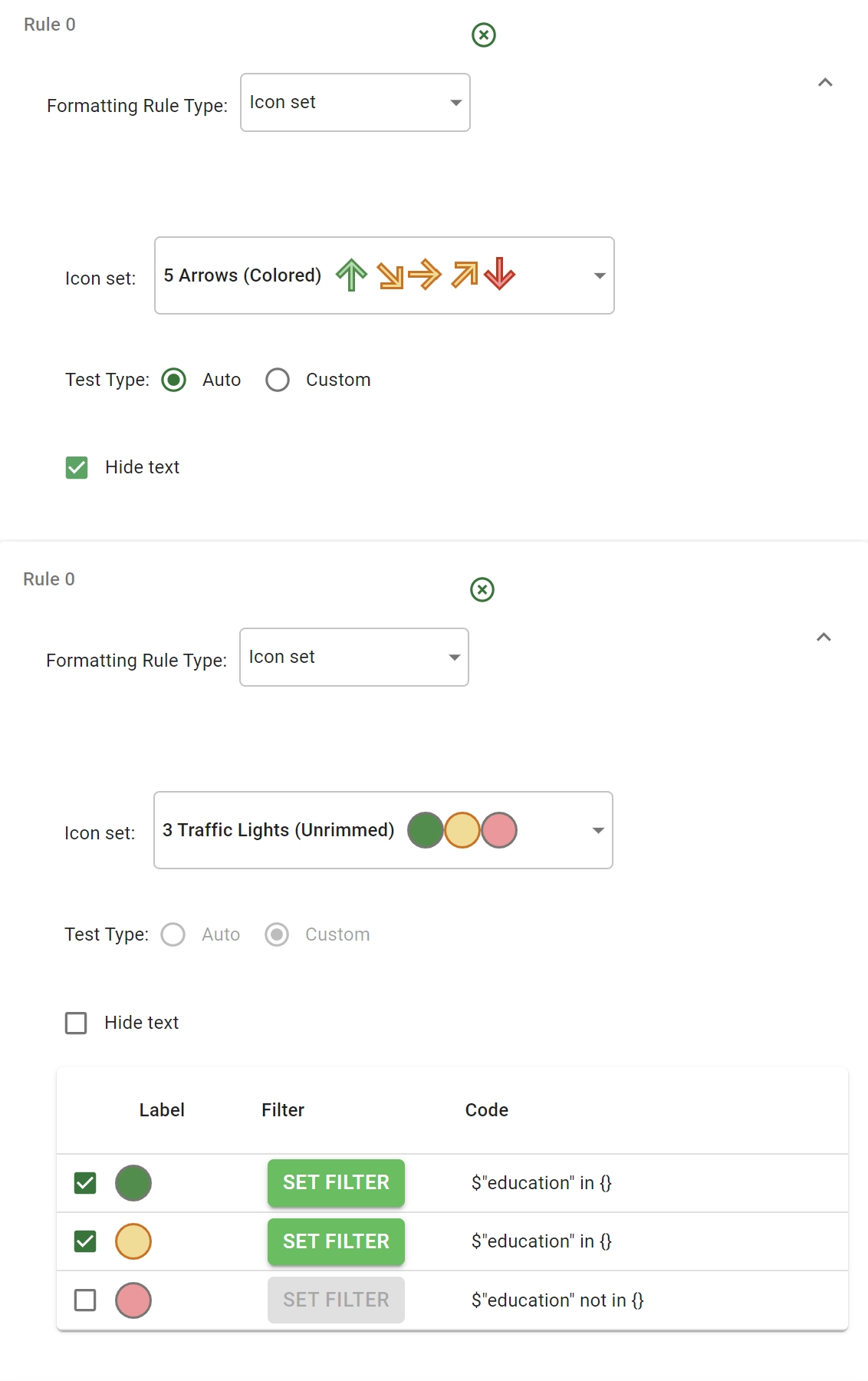
Icon associations can be defined to be Automatic or Custom. To select one of the two, use the Test type radio button. The operating mode of the two buttons will be as follows:
In the Auto case, the whole range of values from
maximumtominimumis divided innranges withnequal to the number of different icons for the selected iconset. Each interval is then associated with the corresponding icon.In the Custom case, it is necessary to associate
n-1icons (withnequal to the number of different icons for the selected iconset) with a dedicated filter condition. The last remaining icon will be associated with any line that does not fulfill any of the previous conditions.
Warning
For nominal or binary columns, only the Custom behavior is available.
In the Custom scenario a dedicated filter table is added at the bottom of the panel. In any row a particular icon is presented. To the left of any icon a checkbox is placed to allow the user to define the icon default. The single line, which is not checked, represents the default operating mode associated with any line that does not fulfill any of the previous conditions.
To configure the filter associated to a single icon, you need to click the SET FILTER button of the corresponding line. This will open the condition panel associated with the selected attribute. A more detailed description of these panels can be found in the subsection: Condition panels. Once the condition has been created the corresponding condition code will appear in the Code column of the table.
Tip
In addition to this configuration, users can also select the Hide text option to hide the text in the cells of the column. If checked, the associated icon will be placed at center of the cell.
Procedure
Right-click on the chosen column(s) to open the context menu.
Select Set conditional formatting.
In the Conditional Formatting Rules window, click on the plus button, located next to the New Rule section, to add a new formatting rule.
Specify the rule name, along with the Formatting Rule Type.
Click on the plus button located next to the Add new filter message to add a filter to the current rule.
Add a Label and click on Set filter to specify the filter conditions. To know more about the panel and how to set filters, go to the corresponding page.
Click on Set style to customize the cells’ layout.
Click on the plus button located next to the Add new filter message, if required, to add other filters to the current rule.
Click on the plus button located in the top right corner of the New Rule panel, if required, to add a new rule.
Once all the rules and filters are set, click Apply.