Editing your Data
In many applications where a custom interface is used, the user needs to insert some input information through dedicated forms provided by the interface itself.
In other situations, the user needs to modify existing data to apply business decisions or to react to some external occurrences.
Generally, therefore, in a custom interface the ability to edit and modify the underlying data is of primary importance. In standard dashboarding software programs, this functionality is either omitted or handled in preliminary steps using separate tools.
The innovative approach of Rulex Studio is to provide editing capabilities in a unique framework with its existing dashboarding possibilities, enhancing the scope of the created custom interfaces.
Data editing is carried on in Rulex Studio mainly by the following two families:
Before analyzing these two families details and characteristics, it is necessary to provide some general information about editing operations in Rulex Studio.
When talking about data editing, there are two main possible operations:
Adding a new row to a specific Dataset.
Modifying the value of one or more cells of a specific Dataset.
If for the first operation the only information required is the name of the dataset we want to consider, for the second one users need the possibility to select the cells which will be considered in the edit operation.
Therefore, to properly understand the scope of any edit operation in Rulex Studio, it is necessary to highlight all the possibilities the same component offers you to properly select a subset of an imported Dataset.
We are going to call this operation a selection, and the section below is dedicated to this topic.
See also
Even if the selection is mainly performed to correctly trigger an editing operation, its definition is general and its effect can lead to graphical modifications even in widget families not described in this page, as for example here.
Data Selection
Data selection is essentially the labeling of rows in a provided Dataset with a binary flag: True if the row is selected, False otherwise.
The meaning of this selection is both graphical and functional:
From the graphical point of view, any widget can use this information to modify its graphical behavior accordingly: the simplest example is the Table widget where selected rows are colored with a different layout, or the Bar plot widget where bins constructed by only unselected rows are greyed out.
From the functional point of view, any editing operation performed on a Dataset will affect only selected rows leaving the rest of the dataset untouched.
See also
Selecting rows is different from filtering them: read this section for more information about Data filtering.
In Rulex Studio a Data selection can be triggered in different ways from different widget types. However, in any of them Data selection is activated by default and it can be configured in a dedicated panel of their Widget menu layout.
If activated, a Data selection can be triggered in the following ways:
In Table widget by selecting any of the table rows.
In Row Selector widget by changing the selected row.
In Plot widgets by selecting part of the data bar/point/sectors or part of the traces from the legend.
In Action widgets by modifying their considered values.
One of these triggers creates a Data selection on the Dataset table associated to the attributes used in the considered trigger widget.
Attention
In all the listed widgets Data selection is available only if attributes considered in the selection belong all to the same original dataset, otherwise this possibility is disabled.
Therefore, any other widget getting attributes from the same dataset can graphically be affected by the provided selection. To avoid that, it is possible to set up a scope in the INPUT tab in each widget to trigger the Data selection operation.
The scope is a list of widget names of the same slide or dialog which will see the effect of the triggered operation. The default value is the whole slide which is also the largest scope available. If the scope is empty, the Data selection does not produce any direct graphical effects, but it can still be useful to exploit its functional aspect for editing operation.
Once a Data selection is activated on a dataset, its effect is then propagated to the other datasets for which is active a dataset relation with the dataset on which the data selection is performed. Propagation for Data selection works the same as Data filtering: further information can be found here.
Example
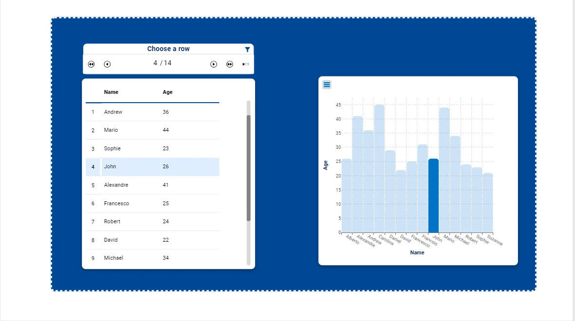
In this example, the graphical effects of data selection will be explored by using a Row Selector widget to trigger a data selection operation that will modify the selected row in a Table and the selected bar in a Vertical Bar chart on the same slide.
Import the Selection_Example_Graphical view along with the Personal details dataset.
Enter 4 in the Row Selector widget to highlight the row with index 4 in the Table widget, corresponding to John, and the bar representing John in the Vertical Bar chart.

Click on the filter icon in the top-right corner of the Row Selector to clear the current data selection.
Right-click on the Row Selector and choose the Open widget layout entry.
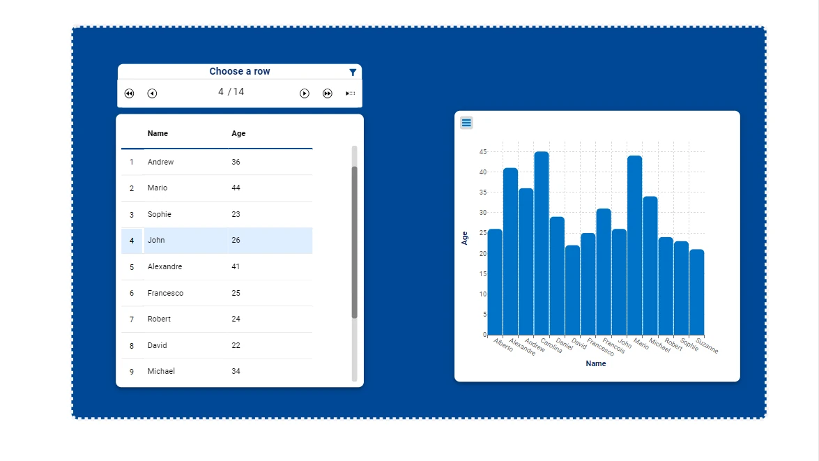
Remove barplot1 from the Scope field of the Layout options window.
Click APPLY to update the settings.
Enter again 4 in the Row Selector widget. Notice how the selection for John’s bar is no longer active; all bars now appear blue colored, as the Vertical Bar chart is no longer within the Row Selector’s scope.

Example
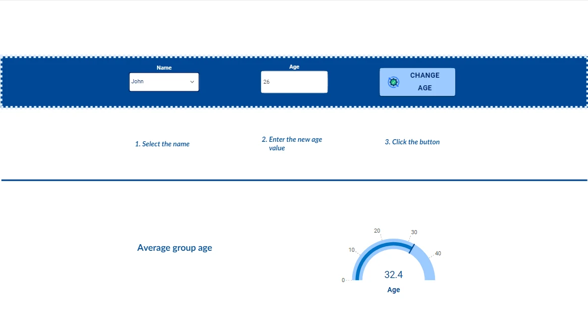
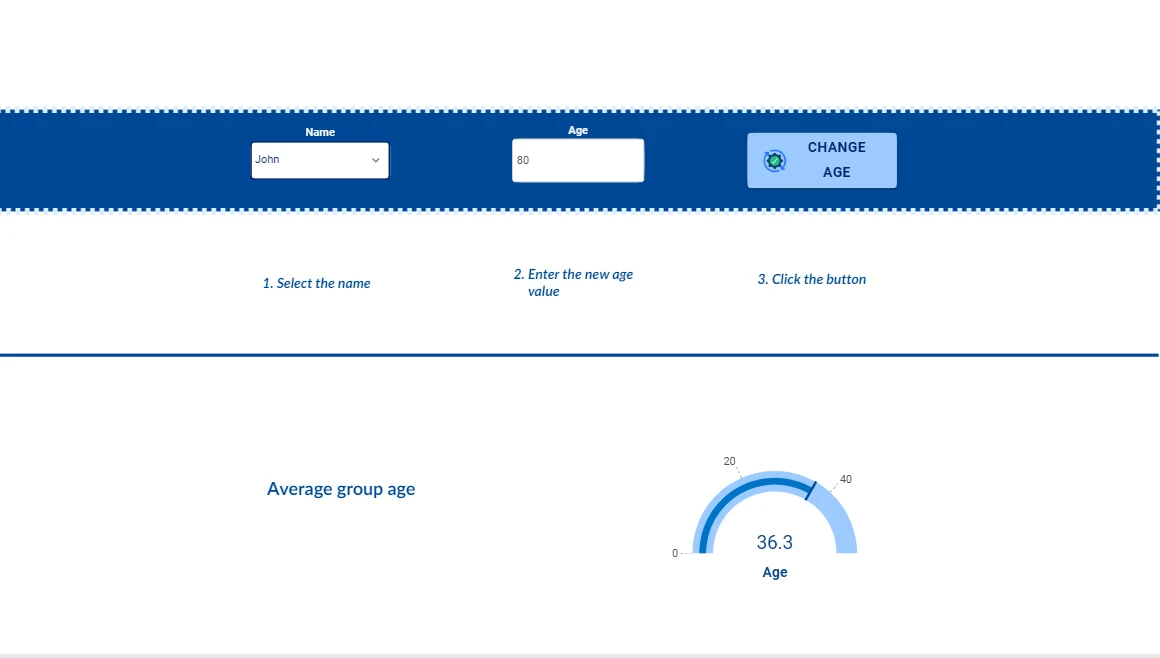
In this last example, the functional effects of data selection will be explored by using a Filter drop down menu widget to trigger a data selection operation, by filling an Input Field widget. Then, we will modify the value in the Input Field and press the CHANGE AGE General button to edit the associated value displayed on the Radial Gauge.
Import the Selection_Example_Functional view along with the Personal details dataset.
Select John from the Filter drop down menu widget. The Input Field will populate with John’s current age.

Edit the age in the Input Field to 80.
Click the CHANGE AGE button to apply the changes. Notice how the mean age displayed in the Radial gauge changes.

Tables
The Tables family includes all the widgets with a tabular or pseudo-tabular visualization format with editing properties.
These widgets are useful when the user needs to visualize multiple rows in the same slide/dialog or report page and possibly to modify multiple rows at the same time.
Note
In report pages, Tables editing operations cannot be performed. Tables can be dragged onto report pages to visualize data in a tabular form, but editing operations are not available.
Tip
If the desired editing is row by row, we strongly suggest using the Inputs family which is designed to perform this task.
Members of this family are:
Table: standard tabular form.
The Table displays in a grid table specific attributes or an entire dataset, which have been previously imported in the Dataset left panel. It can also automatically merge attributes coming from different Dataset. If an attribute from a different table from the one already present in a Table widget is dropped, a join dialog is shown to the user to establish the joining mechanism to perform the evaluation of the final grid.
The dialog shows a subset of the options of a standard Join task. In particular, it always performs an Inner Join with key conditions to be set. To add a new key condition the user can press the plus button located at the center of the dialog.
Each key condition is formed by:
A left attribute, chosen among the attributes of the dataset already present in the Table widget.
A comparison operator.
A weight parameter, used in some operator to slightly tune the comparison.
A right attribute, chosen among the attributes of the dataset of the new dropped parameter.
Hint
Attributes can be chosen even if they are not added to the Table widget itself; they only need to belong to one of the two involved datasets.
Warning
The editing feature is disabled if the Table widget contains attributes from more than one dataset.
Configuration and customization of the Table widget is performed through its Widget menu and through several context menus available on the most important part of the grid (header rows, index columns or table cells). A detailed presentation about all its customizations and about all its editing properties is contained in this dedicated page.
Inputs
The Inputs family includes all the widgets with an input edit box with editing properties.
These widgets are useful when the user needs to browse through its data in the same slide/dialog and to modify or add a single row at the same time.
Members of this family are:
Note
The event triggers available for the Inputs widgets change according to the action type. A box with a list of the event triggers available for each Inputs widget is available in the corresponding page.
In the Input Field widget users need to drag a single attribute from the Datasets panel onto the widget, and it allows to insert a new value to a specific attribute.
By default, when you drag the Input Field widget onto the stage, it initially appears with a central edit box. However, when you drag an attribute onto it, its graphical appearance changes. The graphical appearance of an Input Field depends on the data type of the attribute being dragged onto it, more information in the corresponding page.
When an Input Field is filled, the value layout is displayed in bold, and the widget’s label will have a *, meaning that the value has not been overwritten yet.
Configuration and customization of the Input Field widget are performed through its corresponding layout menu, which can be opened by double-clicking on the widget.
To start using the Row Selector widget, users need to drag an entire dataset from the Datasets panel onto the widget. The Row Selector allows to select a specific row in a dataset or add a new one.
Configuration and customization of the Row Selector widget are performed through its corresponding layout menu which can be opened by double-clicking on the widget.
GOLD References
Here is the description of the GOLD class Gridtable representing the widgets of the Tables family:
Here is the description of the GOLD class Input: