Scatter Plot
Through Scatter Plots you can display two or more variables’ values using a collection of points in Cartesian coordinates.
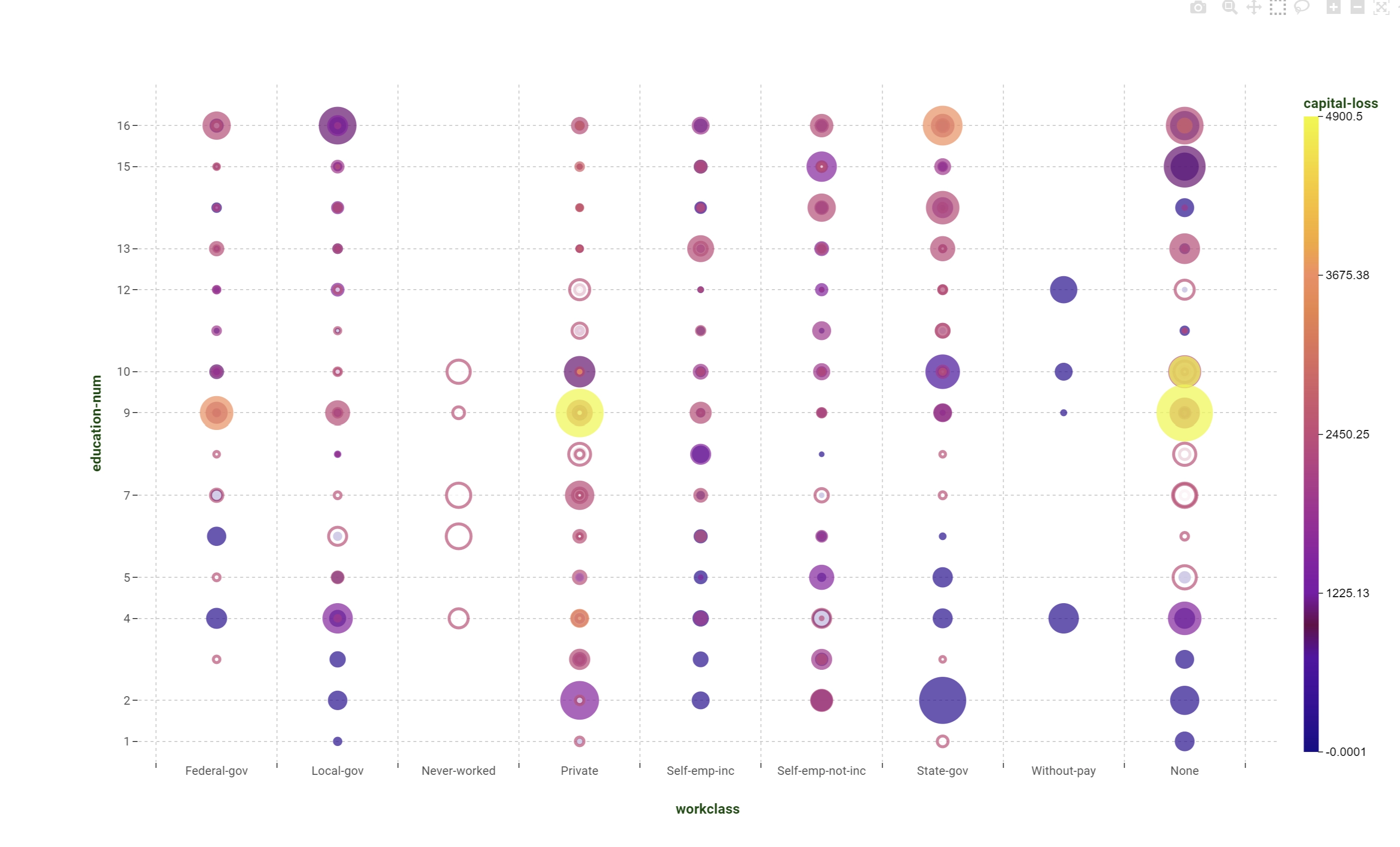
The position where a point is placed corresponds to a value: the size of each circle is proportional as a default to the frequency of the values in the dataset. They are used for plotting quantifiable relationships between values in order to identify anomalies, data variance, groups. They are very useful if you wish to understand if there are any general relationships within the data.
Dimension (mandatory field are bold) |
Type |
Description |
|---|---|---|
X |
axis/grid |
It controls the coordinate used on the x-axis. |
Y |
axis/grid |
It controls the coordinates used on the y-axis. |
Color |
target |
It controls the marker color of the various created traces. |
Style |
target |
It controls the marker style of the various created traces. |
Size |
output |
It uses the linked attributes as a weight operator to evaluate the size of each circle. |
Note
Marker color is also used to show negative value for the output attributes given in the Size dimension. If the evaluated output value for a particular point is negative, the marker is going to be colored only on the border. Otherwise, for standard positive value for the output, the marker will be colored in the middle and left white on the border.