Curve Plot#

Curve plots are one of the plots available on the Data Manager. Their name comes from the way data are represented: a curve.

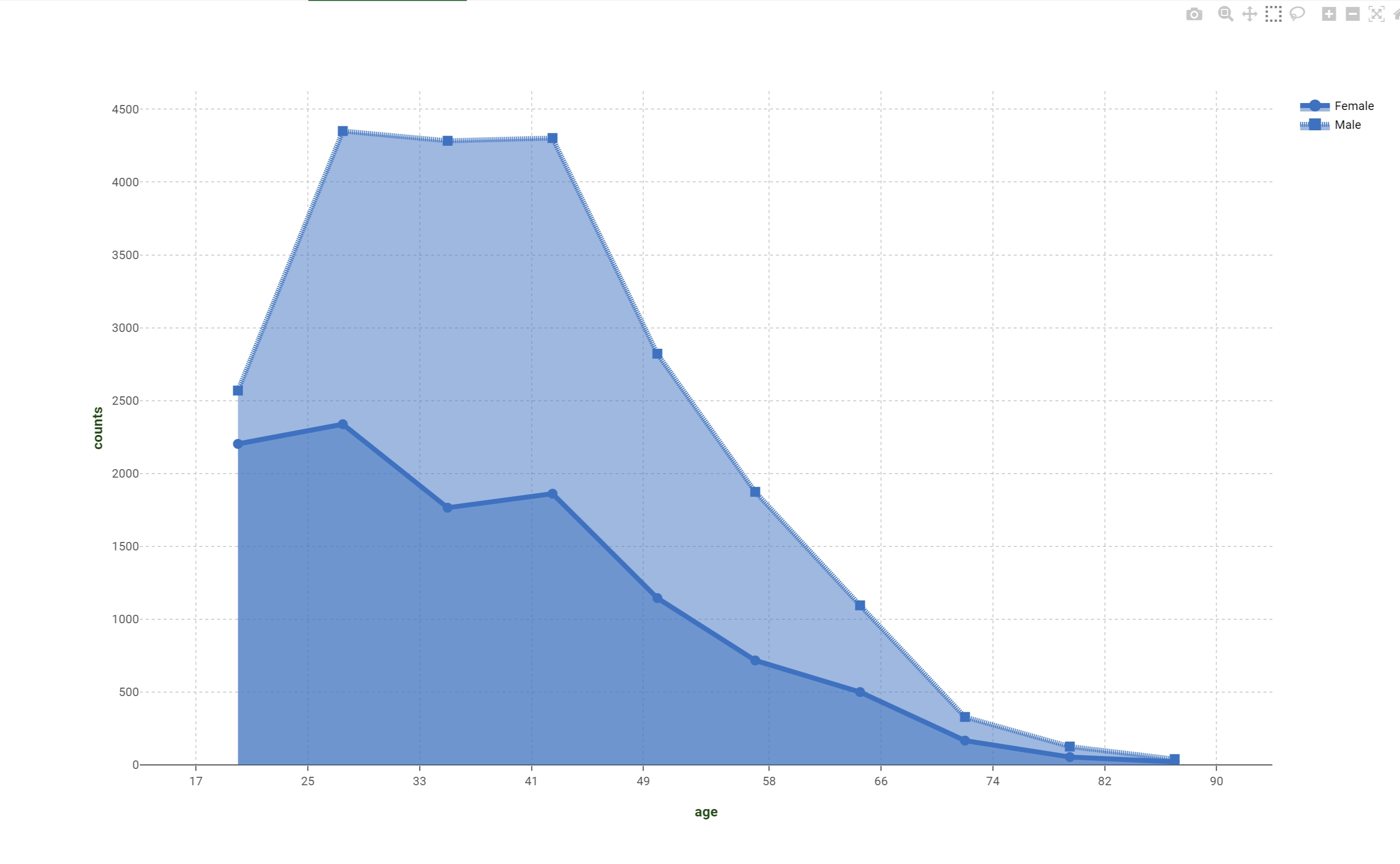
Dimension (mandatory field are bold)

Type

Description

X

axis/grid

It controls the coordinate used on the x-axis.

Y

output

It controls the associated y output value for any dataset point.

Color

target

It controls the marker or line color of the various created traces.

Style

target

It controls the marker style or the line dashing of the various created traces.

Size

target

It controls the marker size or the line width of the various created traces.


Plot option menu add-ons#

In the Plot option menu, in the case of curve plot you can find some extra options:

  • Curve display: it establishes if lines or markers should be drawn on the plot; possible values are:

    • lines: only lines are drawn

    • markers: only markers are drawn

    • lines + markers: both are drawn

  • Filling area: it establishes if a colored area should be drawn below the curve; possible values are

    • none: no area is colored

    • vertical: area between the curve and the x-axis are colored

    • horizontal: area between the curve and the y-axis are colored


Y dimension menu add-ons#

Since Y dimension is an output dimension and since this plot presents more than one target dimension a dedicated entry in the Dimension option menu is added to allow you to customize the target attribute to be used in case of multiple output attributes. The option is Target ignored due to the fact the used attribute will become disabled and its content ignored until there will be no longer a multiple output attribute definition.