Task options controllers
This page provides a detailed explanation of the commands available on the tasks’ interface to set specific options.
These commands, also known as controllers, are part of the user interface allowing the interaction between the user and the software itself.
In any task belonging to the Standard task class, users can configure the task by properly editing the option through dedicated controllers.
Note
There are specific commands which are proper to certain tasks only, and they will be described in the corresponding task page. This page contains only the graphical solutions which are shared among more than one task category.
Standard task working modes
Each task command, as mentioned in the introductory page, has two working modes:
Standard mode
Parametric mode
Standard mode
The Standard mode’s behavior may differ based on the controller being used.
By default, users see the Standard mode as their initial view mode.
If a user modifies an option through the Standard mode, the system checks if the option can be parameterized. If the current value isn’t included in the list of acceptable values in the standard display, the option is classified as parameterized.
Parametric mode
The parametric mode is the second working mode available, which can be accessed by clicking on the fx button in the top right corner of the task interface.
All the Parametrization code begins with the = symbol, indicating that a formula is being introduced to the system. This is simply a graphical placeholder to immediately separate the GOLD code text box from a generic text box. If you delete the = symbol, you will go back to the standard working mode. If this is not possible, the = symbol will be added again.
- Text field parametrization: when using this type of parametrization, the code must be written on a single line.
The applied change will be made persistent after one of the following actions: pressing the Enter key,
clicking away from the field and removing the focus (blurring action),
clicking on the cross icon to close the parametric mode.
- Text field parametrization: when using this type of parametrization, the code must be written on a single line.
- Text area parametrization: the code can be written on several numbered lines. Editing will be made permanent after one of these two actions:
clicking away from the field and removing the focus (blur action),
clicking on the cross icon to close the parametric mode.
Tip
The success of the edit operations can be easily noticed by looking at the Save icon on the task toolbar: if it turns from being greyed out to green and clickable, it means that the changes have been accepted, but they haven’t been saved. To save the changes, click on the Save icon.
All the Parametrization codes start with the = symbol, which warns the system that a formula has been introduced.
It is only a graphical placeholder to distinguish immediately the GOLD code text field from a generic text field.
If users erase the = symbol they are forced to leave the Parametric mode; if this is not possible, the = sign is added again.
Note
When the option has been modified using the Standard mode, the system analyzes the possibility that the option was parameterized.
It considers the option as parameterized if the value which was present before the editing does not match with the list of possible values to be inserted directly from the Standard mode.
If the option value present before the editing is evaluated as parameterized, a blue alert of confirmation warns the user about the code it is going to overwrite.
Control elements in standard tasks
These controllers modify standard strings, numbers or boolean options. They are widely used, and they are the basic elements of all the standard tasks interfaces.
Checkbox
Controller:

Option type: boolean
Parametrization type: text field
Description
It controls a boolean option containing the value True/False. The two statuses of the checkbox checked/unchecked are linked to the two option’s values.
Drop-down menu
Controller:

Option type: string
Parametrization type: text field
Description
It allows the user to select the string value from a list of options.
The range of values can be fixed or evaluated at runtime using GOLD metadata <metadata> (i.e. the input tasks, the column values…).
An empty field may be present or not.
Number field
Controller:

Option type: integer or float
Parametrization type: text field
Description
It can be filled with integer or float numbers, and is used to configure integer, float or percentage values in tasks. The task option specifies if the number refers to a percentage.
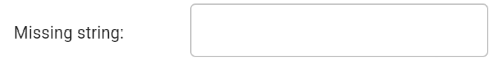
Text field
Controller:
Option type: string
Parametrization type: text field
Description
It allows users to type a free string with no carriage return.
Text area
Controller:

Option type: string or vector of string
Parametrization type: text area
Description
Users can type a free text string that can be structured on multiple lines. An enforced format can be used to extract specific information, such as email addresses.
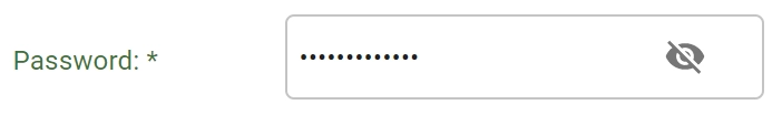
Password field
Controller:
Option type: string
Parametrization type: text field
Description
It enables users to type sensitive values which will always be hidden and encrypted.
Controller:

Option type: string
Parametrization type: text field
Description
It allows users to select only one item at a time. Additionally, the “Other” option allows users to type the desired value, if it is not present in the default ones.
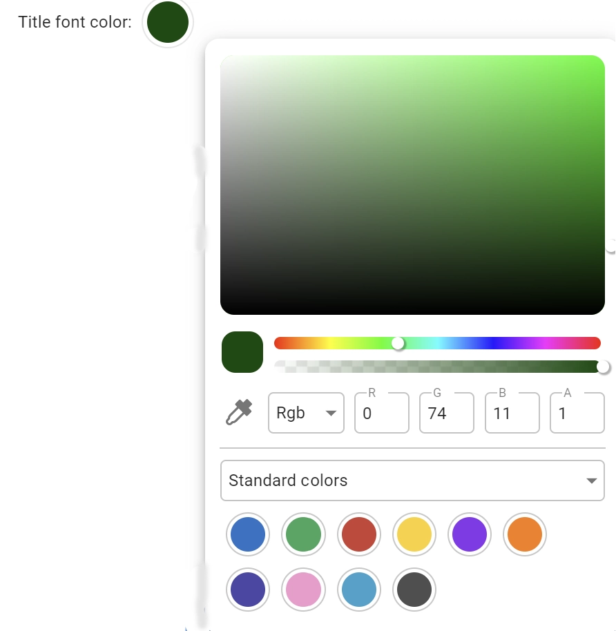
Color picker
Controller:
Option type: color string
Parametrization type: text field
Description
It allows users to customize a color using a personalized color picker.
Attribute interface interactions
The list provided below shows all the commands which allow changing options related to data structure attributes. The displayed values can be a name or a list of names, which can be the input datasets’ attributes headers. The following list is divided into two sections, according to the available parametrization types: text area and text field.
Text area
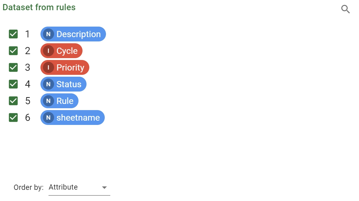
Attribute list
Controller:
Option type: vector of attribute names
Description
The attribute list includes standard attributes and their corresponding results within a specific data structure, for example a dataset. The results are highlighted with a greyed background, making them easily detectable in the spreadsheet layout. The Attributes list is a source to perform drag-and-drop operations (e.g. in the attribute drop area). Within the attributes list panel, users can carry out various operations:
searching for a specific attribute by clicking on the magnifier icon next to the attribute list header and using the search and filter mechanism.
- at the bottom of the list, users can order the attributes according to their preferences by:
Attribute
Name
Type
Ignored
Role
The operations listed above are possible only in specific tasks: when they are allowed a set of checkboxes is displayed next to each attribute header.
The option will be filled with:
None: if all the checkboxes are ticked,[]: an empty list if all the checkboxes are uncheckedthe list of checked attributes and results otherwise.
Note
The operations can be filled with the above-mentioned options when working in a parametric working mode.
Users can change the state of the checkboxes by clicking on them or using the line selection:
Hold Ctrl or Shift to select multiple or range lines. The selected lines will be highlighted with a darker gray background. Once you have chosen a set of lines, you can perform bulk operations on them using the right-click context menu.
The context menu presents the following entries:
Invert: corresponds to the click operation on the checkbox of all the selected lines
Check: all the checkboxes of the selected lines will be checked.
Uncheck: all the checkboxes of the selected lines will be unchecked.
Check all: all the checkboxes will be checked.
Uncheck all: all the checkboxes will be unchecked
Attribute drop area controller
Controller:

Option type: vector of attribute names
Description
The list of attribute or result names can be created manually or by using selection rules.
To automatically select the attributes or results to be considered as values for the underlying option, switch to the Filtered List option.
The Filtered List panel contains a series of selection rules in And or in Or format; these options can be set from the dedicated drop-drown menu.
To set up a selection rule, start by choosing the operator from the options provided below:
Include
Match
Start with
End with
Do not include
Do not match
Do not start with
Do not end with
and then type the value meant to be used in the selection rule.
The checkbox Exclude attributes instead of selecting them enables users to select the values they don’t want to be included in the filter operation.
A helpful trick is to go back to the Manual list panel after you have configured the selection rules; users should be able to see a list of all the attributes that the selection filter actually applies to.
Warning
Please note that modifying the list through the Manual list will erase the configured selection rules. A blue warning bar will show a warning and ask for confirmation before deleting your previous work.
Text field
Attribute drop-down menu
Controller:

Option type: attribute name
Description
This is a drop-down menu filled with the attribute and result names of a specific underlying data structure, typically the dataset.
Available names may additionally be filtered taking into account their types, roles or attribute/result.
By writing into the drop-down menu field, the list of the available values varies according to the typed string.
The option will be set to the selected attribute or result name.
Attribute filter controller
Controller:

Option type: condition string
Description
This is a field able to build a filter condition code on a selected attribute and to store it in the underlying option.
See also
Further information about GOLD syntax for Rulex Platform conditions are available in this section.
The first operation to perform is the definition of the attribute or result for which the condition needs to be established.
The selected attribute or result can be associated to the controller through a simple drag-and-drop action or by clicking the pencil icon, visible on the right of the controller and then selecting the desired attribute.
Once the attribute is selected, the condition panel appears, according to the attribute’s type, and allows users to configure the condition.
The detailed description about how to configure a condition for the different type of attributes is available:
for date attributes here.
for time attributes here.
Once the condition panel is correctly configured, users can click Apply to generate the condition code and to store it in the underlying option.
By clicking Cancel, instead, users can close the condition panel, discarding the editing performed.
At any time users can erase a particular filter set in an attribute filter controller by clicking on the cross icon at the right end of the controller itself.