Pie and Doughnut Charts
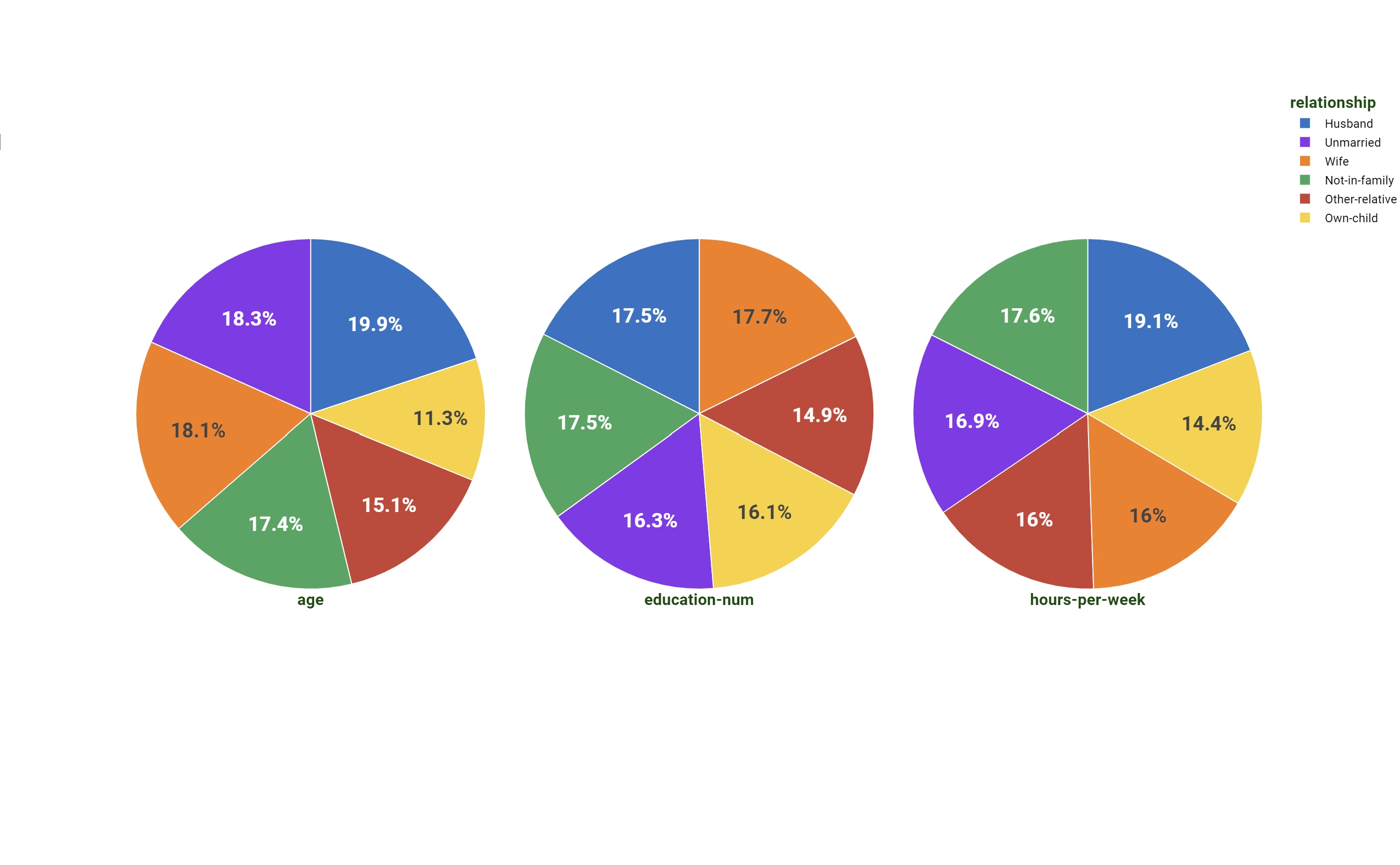
A Pie chart is a circular chart divided into sectors, illustrating numerical proportion. The size of each slice is proportional to the frequency of the values in the dataset or to the output value used as a weight operator.

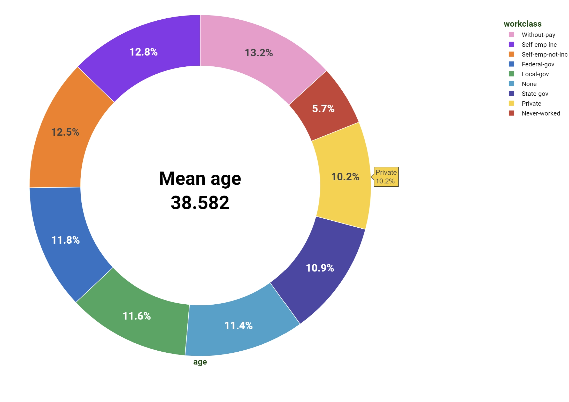
The Doughnut chart is a modification of the Pie chart, presenting an extra hole in the middle with a configurable central value. Its properties are described in the last paragraph of this page.
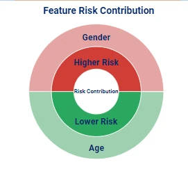
The Sunburst chart is a modification of the Pie chart, normally used to display hierarchical data.
The dimensions of the Pie chart are:
Dimension (mandatory fields are in bold) |
Type |
Description |
|---|---|---|
Y |
output |
Attributes on this dimension are used as weight operator. |
Color |
axis/grid |
It controls the labels and the sectors’ division of the pie. |
Note
Since no target dimensions are present in the Pie chart, maximum one attribute per group can be dropped at any time on the output dimension.
Sunburst chart
In the Sunburst chart, the top of the hierarchy is displayed at the center of the plot, while the deeper levels are displayed in the outer rings of the chart. The colors of the chart help understanding the parent-child link: the color of the parent and of the children is the same, but the shade changes according to the level: deeper levels have a brighter shade than the higher ones.

To create a Sunburst chart, users need to start from a Pie chart, where two or more attributes must be part of the same group into the Color dimension. To do so, it is possible to drag the second attribute onto the Color while keeping the SHIFT command pressed.
To understand and define the hierarchy on the Color dimension, the top attribute of the hierarchy is located on top of the list of attributes, while the deepest level is the last attribute of the list. The first dragged attribute is the highest in the hierarchy.
To define the colors of the traces, it is possible to right-click on the Color dimension: as the color is associated to the label, it is possible to change the color of the highest label of the hierarchy to change the colors of the associated values.
Warning
If the labels are changed after having defined the chart’s colors, the color setting will be lost, so the plot needs to be configured again.
Doughnut chart
In the Doughnut chart, the main difference is the presence of the central hole and the possibility to place a configurable value in it.

The dimensions are:
Dimension (mandatory fields are in bold) |
Type |
Description |
|---|---|---|
Y |
output |
Attributes on this dimension are used as weight operators. |
Color |
axis/grid |
It controls the labels and the sectors’ division of the doughnut. |
Note
Since no target dimensions are present in Doughnut chart, maximum one attribute per group can be dropped at any time on the output dimension.
To configure the central value, users have to open the Plot option menu and fill the Doughnut Text field. If they want to fill the hole with a value evaluated from the data, users need to provide it in parametric format, by using the Parametric Option icon located at the right end of the Doughnut Text field. Text in Parametric Option should be filled following the same rules of a general GOLD code or of option parametric visualization.