Single Plot Configuration
Rulex Factory gives you complete control over the layout and configuration of every single plot.
Plot definition may be complicated and cumbersome, since configurations in a plot are almost endless. For this reason, Rulex Platform plot interface guides the user by separating plot information into different menus, each of them controlling a graphical characteristic of the selected plot.
A single plot therefore is divided into different sections, each of them controlling a characteristic of the plot’s representation:
Plot input menu: located as a vertical button bar at the left of the plot, it controls the plot input definition and all the related options which lead to a modification of plot points or bars.
Plot modebar: located in the upper right corner of the plot area, it controls graphical interaction with the created plot such as zooming operations, selecting operations or single plot export.
Plot context menu: opened by right-clicking on any point of the plot area, it controls basic operations on the entire plot such as its deletion or its refresh.
Plot layout menu: opened through the Plot context menu, it contains all the plot graphical configurations which do not require any point or bar re-evaluation. It is completely described in the dedicated page.
In this page we are going to concentrate on the general characteristic of these areas which are in common between all the plots. Specific options or configurations valid only for some supported plots are postponed in the single plot type dedicated page.
Plot input menu
Plot input menu is represented as a vertical button bar located on the left of the plot itself. In Rulex Platform, the plot input definition is linked to graphical dimensions offered by the single plot type. For each graphical dimension available on the selected plot, a dedicated button will be enabled to allow the user to drop new attributes on the considered dimension.
Tip
You can drag and drop attributes directly on the plot area. They will be associated to the first empty not disabled dimension button available from the top.
You can drop more than one attribute on each dimension, meaning the single dimension will be controlled by a set of values, rather than a single one. Moreover, Rulex Platform enables the definition of a subplot structure inside the single plot itself.
Input definition and configuration, as well as their internal separation into plot subplots, is completely described here.
The graphical dimensions available in Rulex Platform are:
Button |
Name |
Description |
|---|---|---|

|
Plot type |
Button related to the overall plot configurations. From this button users can modify the type of plot considered, as well as configure options used for the whole plot evaluation. |

|
X |
Button related to the x-axis or column grid graphical dimension. |

|
Y |
Button related to the y-axis or row grid graphical dimension. |

|
Color |
Button related to the color component of bars or points or curves. This allows users to display multiple tracks on the same graph, each one different from the other by the color. |

|
Style |
Button related to the dashing or marker shape of curves or points. This allows users to display multiple tracks on the same graph, each one different from the other in marker shape or in curve dashing. |

|
Size |
Button related to the size or the thickness of markers and lines. This allows users to display multiple tracks on the same graph, each one different from the other in marker size or in curve thickness. |
See also
Box plots and Statistical plots own a slightly different definition of the last graphical dimensions since they need to define even some functional dimension. With functional dimension we mean input attributes which are used only in plot points evaluation, they are not directly related to some graphical characteristic. Detailed description of these custom buttons is present in the single plot dedicated pages.
Plot input menu is not only controlling input definition and link with plot graphical dimension, but it enables the user to modify a full set of plot configurations which are strictly related to data, since their modification triggers automatically a plot re-evaluation. All these options are divided according to the graphical dimension they affect. You can change them by using the Dimension option menu opened by right-clicking on the corresponding dimension button.
This page is dedicated to the general presentation of all the different Dimension option menus.
See also
Further customizations of these menus which are plot specific are described in the single plot pages.
Plot dimension type
The Plot dimensions described in previous section are not completely equivalent. They control a graphical characteristic, but from the functional point of view they act differently during the plot drawing operation.
Dimensions can be classified, based on their functional behavior, into three different categories:
Axis/grid dimension: it controls the spacial location of the various points/bars of the plots. If a coordinate system is used, they often control the axis properties. By using more than one attribute in one of these dimensions, users are going to define a multi value axis where a single point is described by more than one value.
Target dimension: it controls the number of different traces of points or bars are drawn on the plot. If more than one attribute is drop on a target dimension, the single trace will be associated to a multiple list of values rather than a single one.
Output/weight dimension: it controls the mechanism evaluating the output value for each point/bar location for each target. There is always a unique output dimension for each plot type. If no attribute is linked to the output dimension, output value will be evaluated as the total number of rows present in the considered axis range for the considered target.
Their functional activity varies according to the plot type. If in a bar plot the Y dimension is classified as an output dimension, in a scatter plot the same dimension acts as an axis/grid dimension. Specific type for each dimension in each different plot is reported in the single plot pages.
Note
If more than one attribute is associated in the same group to an output dimension, the system will differentiate among the various attribute outputs by using one of the target dimension available for the considered plot. The corresponding target dimension will be disabled since their content will no longer be used for plot re-draw. If more than one target dimension is available for the considered plot, users can decide which target dimension to use from the option Target output present in the Dimension menu of the considered output dimension.
Plot modebar
Each plot has a modebar where users can change the display options of a plot, such as zooming in/out, selecting certain elements to highlight them, or panning in on specific areas.
To view the modebar buttons in the top-right hand corner, hover the mouse over the plot.
Button |
Name |
Description |
|---|---|---|

|
Download plot as PNG |
To download a PNG of the single plot. |

|
Zoom |
To zoom customized areas of the plot. Draw the area you want to zoom with your mouse. |

|
Pan |
To move the plot within the frame. |

|
Box select |
To select a specific part of the plot and to highlight it by drawing a square over it. |

|
Lasso select |
To select a specific part of the plot and to highlight it by drawing an irregular shape over it. |

|
Zoom in |
To zoom in on the plot. |

|
Zoom out |
To zoom out on the plot. |

|
Autoscale |
To go back to the plot’s original dimensions. |

|
Reset axes |
If the axes’ scale has been modified, this button allows users to go back to the original size of the plot. |

|
Toggle spike line |
In the curve plot, it allows users to visualize some outlined lines when the pointer is placed on one of the curve’s peaks. |

|
Show closest data on hover |
If this option is selected, users will be able to visualize the closest value to the hovered point. |

|
Compare data on hover |
If this option is selected, users will be able to visualize all the values corresponding to the value users are hovering over. This option is useful to make instant comparisons when dealing with presentations. |
Updating Plots after query operations
As previously said, the Plots tab of the Data Manager allows users to build multiple plots, which help to display graphically the dataset’s features.
Plots are saved upon Data Manager’s computation, and they don’t need to be built again after computation operations.
If users need to apply functions or to perform query operations on the dataset, and they want to update the plot, you have two options:
users can build a new plot with the updated attributes, so they can make comparisons with the previous data situation.
users can update the existing plot by right-clicking on the plot and selecting Refresh Plot.
Example 1 - building a new plot with updated results
The following steps were performed:
The dataset has been imported into the flow.
A Data Manager has been linked to the import task.
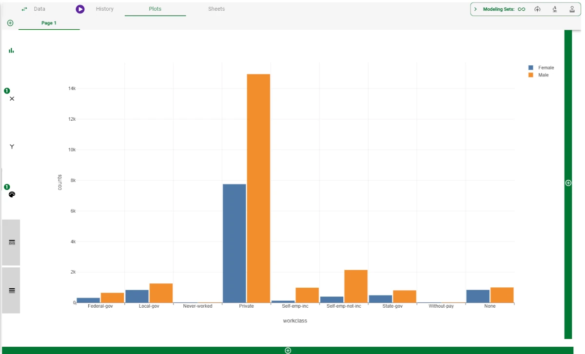
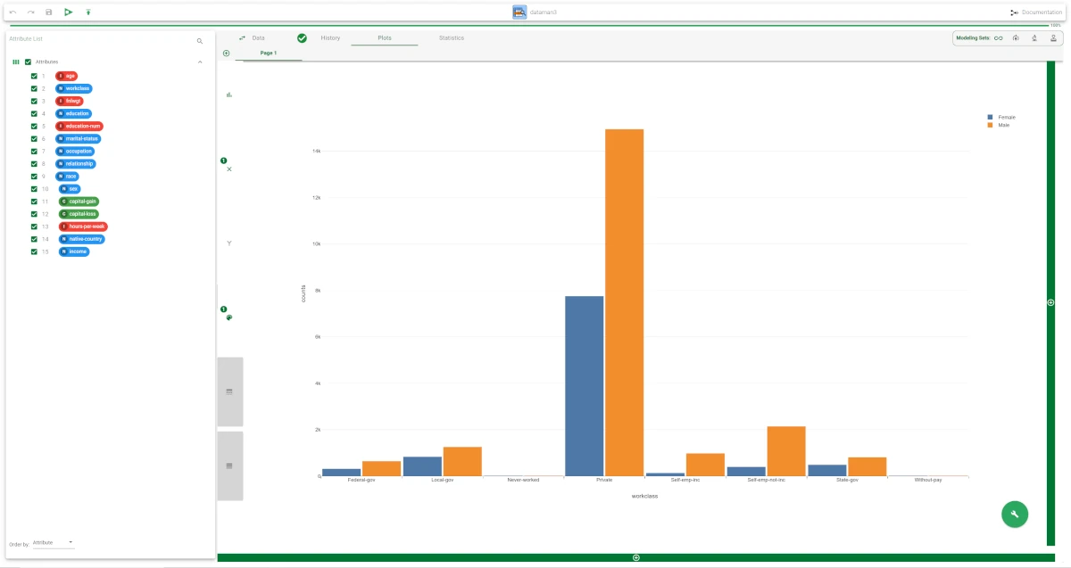
A bar plot with the workclass attribute on the X and the sex attribute on the color has been built.
The task has been saved and computed.
In the Data tab, drag the workclass attribute onto the Pre-filter area and uncheck the following values:
Never-worked
Private
Self-emp-inc
Self-emp-not-inc
Without-pay
Then, click Apply.
Then, drag the age attribute onto the Pre-filter area and filter all the values >45.
Click Apply.
Then, go to the Plots tab and add a new plot by clicking on the plus button under the existing plot, so that they are placed vertically. Alternatively, you can build it next to the existing plot by clicking on the plus button on the right of it.
Drag the workclass attribute on the X and the sex attribute on the color. Now the values are displayed, considering the filter operations performed.
Example 2 - the Refresh plot option
The following steps were performed:
The dataset has been imported into the flow.
A Data Manager has been linked to the import task.
A bar plot with the workclass attribute on the X and the sex attribute on the color has been built.
The task has been saved and computed.
In the Data tab, drag the workclass attribute onto the Pre-filter area and uncheck the following values:
Never-worked
Private
Self-emp-inc
Self-emp-not-inc
Without-pay
Then, click Apply.
Then, drag the age attribute onto the Pre-filter area and filter all the values >45.
Click Apply.
Then, go to the Plots tab. As in this case we don’t need the old plot, right-click onto the plot and click Refresh Plot. The plot is updated according to the dataset.