Statistical Plots
Statistical Plots set groups together 4 different type of plot normally used to analyze correlation and dependencies present in your dataset.
Differently by all the other plots offered by Rulex Platform, their graphical form is fixed by the definition itself of the statistical plot. Therefore, all the linked attributes are used only in a functional form, meaning they affect the way points are evaluated but not graphical structure of the chart.
Statistical Plots group contains the following subtypes:
To select the plot subtype, you need to open the Plot option menu and select from the Statistical Plot choice drop down menu the desired subtype. Default is Roc curve.
P-P plot
In statistics, a P-P plot (probability-probability plot or percent-percent plot or P value plot) is a probability plot for assessing how closely a dataset fits a particular model.
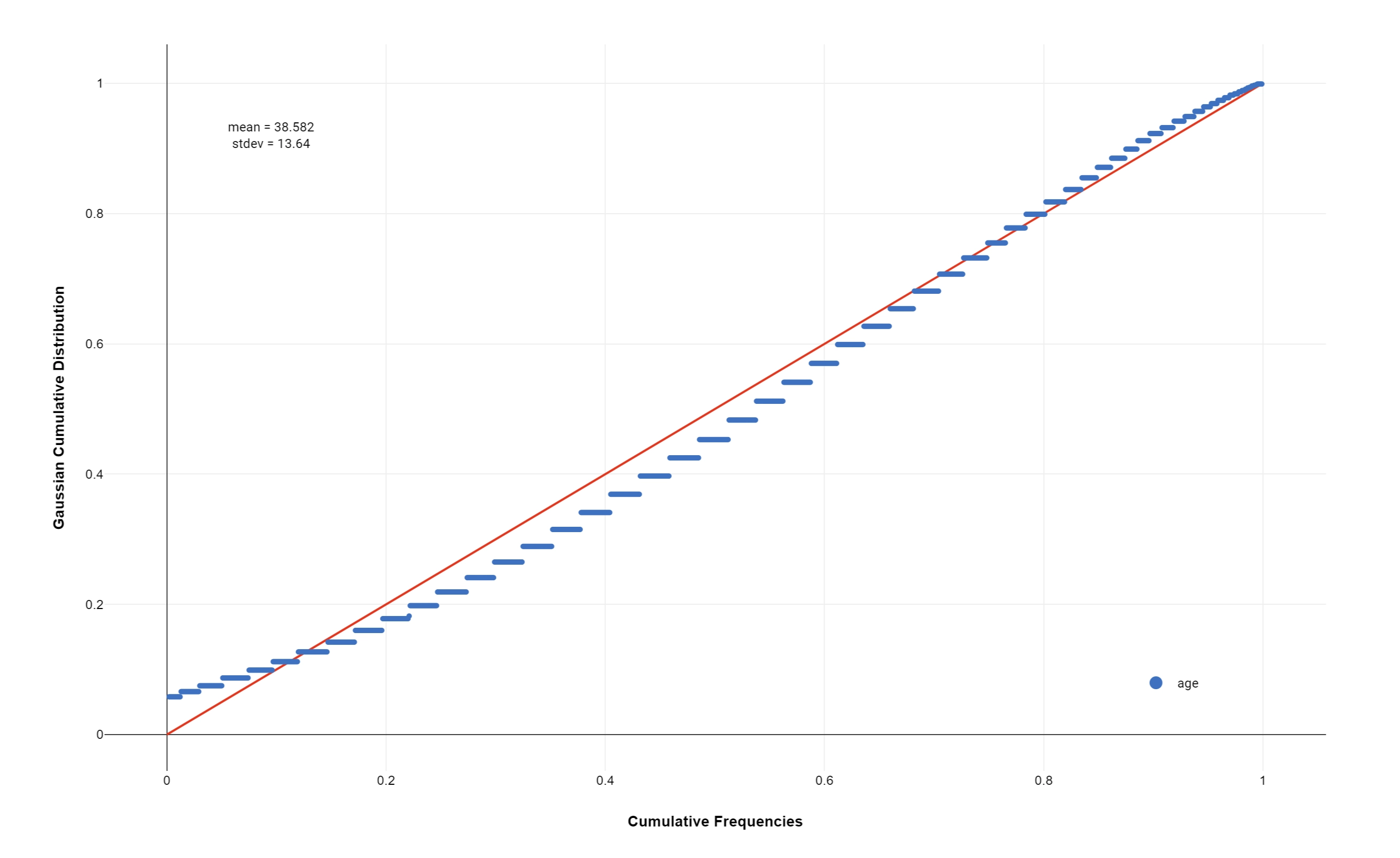
It works by plotting the two cumulative distribution functions against each other; if they are similar, the data will appear to be nearly a straight line.
Dimension (mandatory field are bold) |
Type |
Description |
|---|---|---|
X |
feature |
It controls the variable used to evaluate the cumulative distribution function originates from data. |
The model used for the comparison is established in the Plot option menu through the following options:
Number of quantiles: the number of quantiles used to discretize your data and your model before evaluating the cumulative distributions.
Compared distribution: the type of distribution to compare with your data. Available distributions are:
Normal
Exponential
Gamma
Beta
Cauchy
Logistic
Lognormal
Poisson
Note
Parameters of these distributions can be fixed from the same panel. If left blank they are inferred from the data. The inferred value will be displayed as an annotation on the plot itself.
Q-Q plot
In statistics, a Q-Q plot (quantile-quantile plot) is a probability plot, a graphical method for comparing two probability distributions by plotting their quantiles against each other.
A point (x, y) on the plot corresponds to one of the quantiles of the second distribution (y-coordinate) plotted against the same quantile of the first distribution (x-coordinate).
This defines a parametric curve where the parameter is the index of the quantile interval.
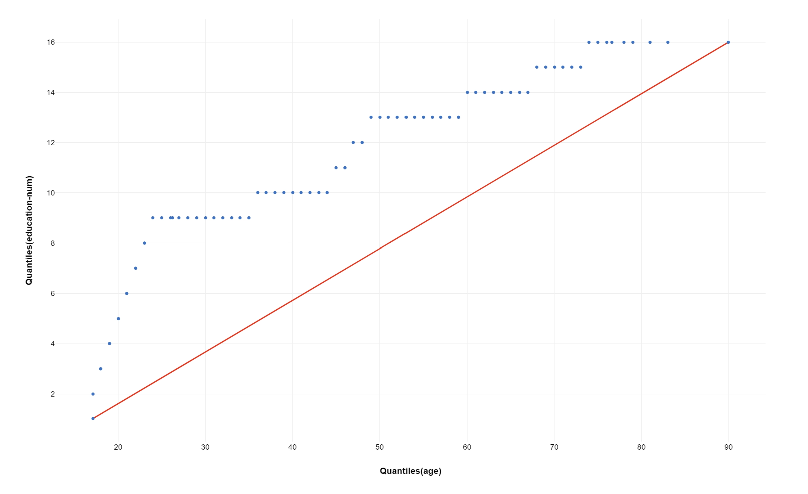
If the two distributions being compared are similar, the points in the Q-Q plot will approximately lie on the identity line.
Dimension (mandatory field are bold) |
Type |
Description |
|---|---|---|
X |
feature |
It controls the variable used to evaluate the first probability distribution function originates from data. |
Y |
feature |
It controls the variable used to evaluate the second probability distribution function originates from data. |
Note
Attribute on Y dimension is optional. In case it will be omitted a model statistical distribution is used. Configuration of the model statistical distribution is performed in the same way as P-P plot.
Lorenz Curve
The Lorenz curve is a graphical representation of the Lorenz distribution, which is often associated with the distribution of wealth among the population, according to the Gini Index.
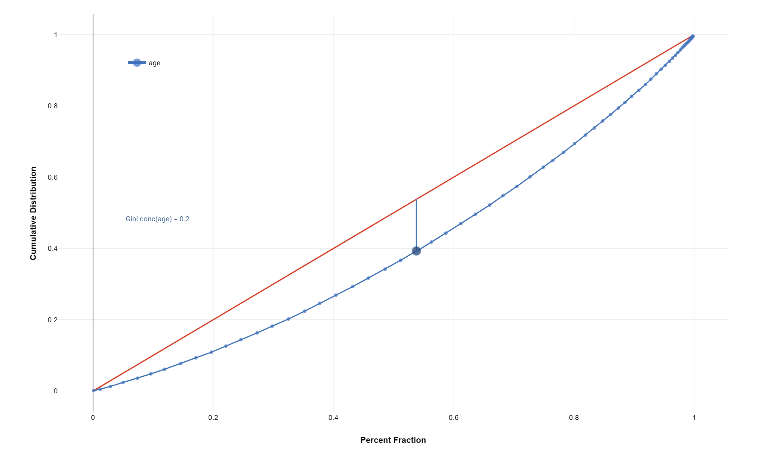
The more the curve sags below the straight diagonal line, the higher the degree of inequality of distribution.
Dimension (mandatory field are bold) |
Type |
Description |
|---|---|---|
X |
feature |
It controls the variable used to evaluate the Lorenz test. |
Note
Multiple attributes can be used on the X dimension resulting in multiple Lorenz Curves on the same plot.
ROC Curve
ROC analysis is a useful tool for evaluating the performance of tests and more generally for evaluating the accuracy of a statistical model (i.e. logistic regression, linear discriminant analysis) that classifies subjects into different categories.
A ROC curve is a plot of sensitivity on the y-axis against (1−specificity) on the x-axis for varying values of the threshold t. The 45° diagonal line connecting (0,0) to (1,1) is the ROC curve corresponding to random chance. The ROC curve for the gold standard is the line connecting (0,0) to (0,1) and (0,1) to (1,1). Generally, ROC curves lie between these 2 extremes.
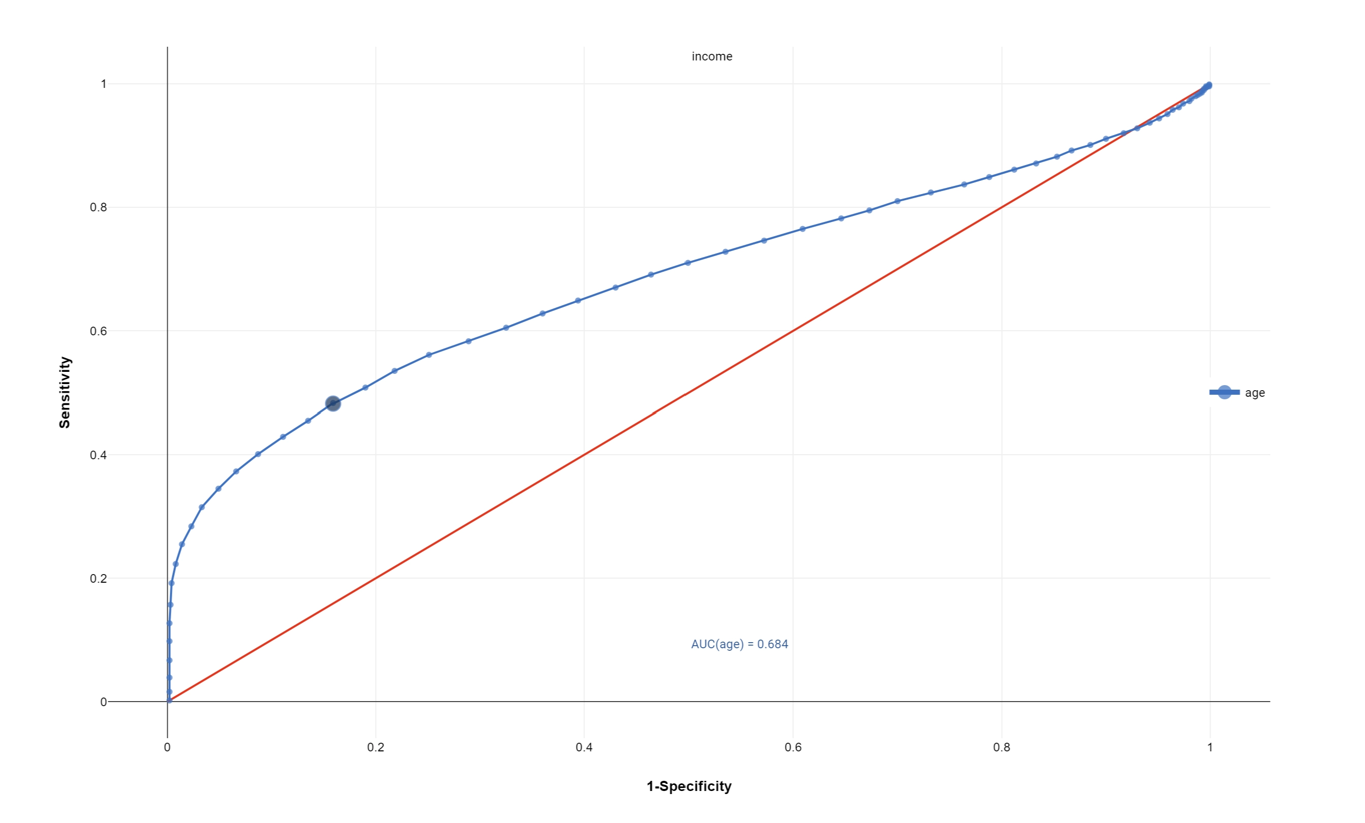
The area under the ROC curve is a summary measure that essentially averages diagnostic accuracy across the spectrum of test values
Dimension (mandatory field are bold) |
Type |
Description |
|---|---|---|
X |
feature |
It controls the variable used to evaluate the Lorenz test. |
Target |
target |
It is used as the classifier output for our test defining the final classes of our hypothetical classification. |
Note
Multiple attributes can be used on the X dimension resulting in multiple ROC Curves on the same plot. Name of the single used target is highlighted in the default title of the ROC plot.
You can customize the ROC analysis by configuring the range of values which leads to a Positive test. This can be done through the dedicated option in the Plot option menu. Available values are:
Lower values (default)
Greater values
Automatic selection