Input Family
In the Input category there are two different types of widgets: Input Field and Row Selector.
To know more about the general characteristics of the Input family click here.
In the current page users will find the description of the Layout options pane and the corresponding tabs available.
Input Field
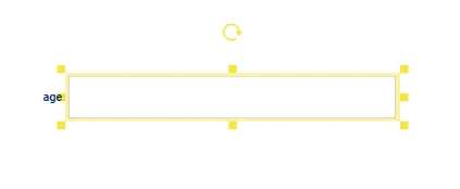
Users can drag only one attribute onto the Input Field widget. To change the current attribute, users need to drag the new attribute onto the Input Field widget and a pop-up message will inform users that an input attribute has already been set and will ask them if they want to overwrite it.
The graphical aspect of the Input Field widget varies according to the data type of the dragged attribute:
for nominal attributes - the left end displays the name of the dragged attribute; the central area features a drop-down menu. When opening the drop-down menu, users can scroll through the available values or start typing the desired value to reduce the entries in the list.
for ordered attributes - the left end displays the name of the dragged attribute; the central area features an edit box where users can type the desired value; the right end includes a spin box.
for date attributes - the left end displays the name of the dragged attribute; the central area features a calendar icon and an edit box where users can either click on the calendar icon to select the date or type it manually in the edit box; the right end includes a X icon to delete the inserted value.
The Input Field widget can be paired with other widgets (especially General button widgets) to propagate the effects of data selection, as explained in this data selection example.
Note
The event triggers available for the Input Field widget are:
onMouseEnter
onMouseLeave
onFocus
onChange
Once the widget has been dragged onto the slide or dialog and the required attribute has been dragged on it, users can double-click its frame or use the widgets context menu to open the Layout options pane.
The Layout options pane is made of three sections: INPUT, LAYOUT, and ERROR.
See also
In the INPUT tab, users can only parametrize the following options: Read only, Reset after insert, Enable auto insert, Check always value, Check value before inserting.
While in the LAYOUT and ERROR tabs, all the options can be parametrized.
Users can find all the available options and the corresponding GOLD references in the table below.
To know more about GOLD, go to the corresponding page.
Users need to click APPLY to finalize the operations, or click CANCEL to discard all the previous changes.
Subsection |
Option |
Description |
GOLDref |
|---|---|---|---|
Input options |
Table |
From this drop-down menu, users can select the dataset to which the input options will be applied. By default, it selects the dataset of the previously dragged attribute and when opened it displays all the datasets imported in the current view. |
|
Attribute |
From this drop-down menu, users can select the attribute to which the input options will be applied. By default, it selects the previously dragged attribute and when opened it displays all the attributes in the table selected. |
||
Read only |
If selected, editing operations in the Input Field widget are disabled. |
||
Input/Reset options |
Insert button |
From this drop-down menu, users can select any General button widget dragged onto the slide/dialog. Once a General button has been selected, users can type the value in the Input field edit box, then click on the selected General button to insert the value in the previously selected attribute. General buttons already selected in the Reset button drop-down menu, are greyed out and cannot be selected here. |
|
Reset button |
From this drop-down menu, users can select any General button widget dragged onto the slide/dialog. Once a General button has been selected, users can click on the selected General button to reset the previously inserted value in the selected attribute. General buttons already selected in the Insert button drop-down menu, are greyed out and cannot be selected here. |
||
Enable auto insert |
If selected, the value inserted in the edit field is automatically added to the dataset when the Input Field widget loses focus (e.g. clicking outside the widget). |
||
Reset after insert |
If selected, it resets from the dataset the previously inserted value. This option is selected by default. |
||
Insert a new row when no selection |
If selected (default), a new row is added to the dataset when no value is selected, but added manually in the field, which contains empty values only, except from the one specified in the input field. If this option is selected along with the Enable auto insert one, the Input field is inactive until a row in a Table widget is selected. This is valid also when a General button is linked to the Input Field through the Insert button option: both the Input Field and the General button will be inactive until a row is selected on the Table widget. |
||
Check options |
Check code |
Compliance checks can be configured by clicking on the SET CHECK button. Check the instructions to set check rules for the attribute type which has been dragged onto the input field here. Once the compliance check has been configured, it is displayed in the Check code field, and can be deleted by clicking on the X icon at the right end of the Check code field. |
|
Check value while writing |
If selected, it checks that the inserted value complies with the rule defined in the Check code edit box. |
||
Check value before inserting |
If selected (default), it verifies that the value in the Input field complies with the Check code rule before inserting it into the dataset. |
||
Formula options |
Formula |
Here you can insert a formula using the GOLD language. |
Subsection |
Option |
Description |
GOLDref |
|---|---|---|---|
Input |
Input variant |
It defines the layout of the input edit box. Possible values are: Outlined, Standard, Filled. |
|
Number format |
Only available when a continuous attribute is dragged onto the Input Field widget. |
||
Minimum value |
Only available when an ordered attribute is dragged onto the Input Field widget. |
||
Maximum value |
Only available when an ordered attribute is dragged onto the Input Field widget. |
||
Text |
Text style |
Here, users can define the title style, which can be bold, italic or underlined. |
|
Font family |
Here, users can choose from the drop-down list the font of the text itself. |
||
Font size (px) |
Here, users can type the desired size of the text. |
||
Text transform |
It defines how the text is transformed. It can be: None, Capitalize, Uppercase, Lowercase. |
||
Text color |
It defines the text’s color. By clicking on the color, which is dark gray by default, a popup opens, where Standard colors and generated custom color palettes can be used, as well as Rgb, Hex, Hsl and Hsv colors. An Eye dropper is also available to work as a color picker. |
||
Text color (if value present) |
It defines the value text’s color, if any. By clicking on the color, which is black by default, a popup opens, where Standard colors and generated custom color palettes can be used, as well as Rgb, Hex, Hsl and Hsv colors. An Eye dropper is also available to work as a color picker. |
||
Background color |
It defines the background color of the widget. By clicking on the color, which is white by default, a popup opens, where Standard colors and generated custom color palettes can be used, as well as Rgb, Hex, Hsl and Hsv colors. An Eye dropper is also available to work as a color picker. |
||
Border |
Border radius (px) |
Here, users can define the radius of the value box border in pixels. |
|
Border size (px) |
Here, users can insert the desired size of the border in pixels. |
||
Border color |
It defines the color of the border. By clicking it, users can select Standard colors and generated color palettes, otherwise they can use the color picker or choose the color code, which can be: Hex, Rgb, Hsl, Hsv. |
||
Border color hover |
It defines the color of the border when hovering. By clicking it, users can select Standard colors and generated color palettes, otherwise they can use the color picker or choose the color code, which can be: Hex, Rgb, Hsl, Hsv. |
||
Border color focus |
It defines the color of the border when the widget is selected to start editing. By clicking it, users can select Standard colors and generated color palettes, otherwise they can use the color picker or choose the color code, which can be: Hex, Rgb, Hsl, Hsv. |
||
Label |
Text style and alignment |
Here, users can define the title style, which can be bold, italic or underlined, as well as the title horizontal alignment, which can be right, center, left. |
|
Label text |
Here, users can type the text to display on the label located by default on the left side of the Input Field widget. |
||
Font family |
Here, users can choose from the drop-down list the font of the label itself. |
||
Font size (px) |
Here, users can type the desired size of the label text. |
||
Text transform |
It defines how the text is transformed. It can be: None, Capitalize, Uppercase, Lowercase. |
||
Label placement |
It defines the position of the label. Available options are: Top, End, Bottom, Start default value. |
||
Label color |
It defines the color of the label text. By clicking it, users can select Standard colors and generated color palettes, otherwise they can use the color picker or choose the color code, which can be: Hex, Rgb, Hsl, Hsv. |
Subsection |
Option |
Description |
GOLDref |
|---|---|---|---|
Input |
Input variant |
It defines the layout of the input edit box. Possible values are: Outlined, Standard, Filled. |
|
Number format |
Only available when a continuous attribute is dragged onto the Input Field widget. |
||
Minimum value |
Only available when an ordered attribute is dragged onto the Input Field widget. |
||
Maximum value |
Only available when an ordered attribute is dragged onto the Input Field widget. |
||
Text |
Text style |
Here, users can define the title style, which can be bold, italic or underlined. |
|
Font family |
Here, users can choose from the drop-down list the font of the text itself. |
||
Font size (px) |
Here, users can type the desired size of the text. |
||
Text transform |
It defines how the text is transformed. It can be: None, Capitalize, Uppercase, Lowercase. |
||
Text color |
It defines the text’s color. By clicking on the color, which is dark gray by default, a popup opens, where Standard colors and generated custom color palettes can be used, as well as Rgb, Hex, Hsl and Hsv colors. An Eye dropper is also available to work as a color picker. |
||
Text color (if value present) |
It defines the value text’s color, if any. By clicking on the color, which is red by default, a popup opens, where Standard colors and generated custom color palettes can be used, as well as Rgb, Hex, Hsl and Hsv colors. An Eye dropper is also available to work as a color picker. |
||
Background color |
It defines the background color of the widget. By clicking on the color, which is white by default, a popup opens, where Standard colors can be used and generated color palettes, as well as Rgb, Hex, Hsl and Hsv colors. An Eye dropper is also available to work as a color picker. |
||
Border |
Border radius (px) |
Here, users can define the radius of the value box border in pixels. |
|
Border size (px) |
Here, users can insert the desired size of the border in pixels. |
||
Border color |
It defines the color of the border. By clicking it, users can select Standard colors and generated custom color palettes, otherwise they can use the color picker or choose the color code, which can be: Hex, Rgb, Hsl, Hsv. |
||
Border color hover |
It defines the color of the border when hovering. By clicking it, users can select Standard colors and generated custom color palettes, otherwise they can use the color picker or choose the color code, which can be: Hex, Rgb, Hsl, Hsv. |
||
Border color focus |
It defines the color of the border when clicking of the widget to start editing. By clicking it, users can select Standard colors and generated custom color palettes, otherwise they can use the color picker or choose the color code, which can be: Hex, Rgb, Hsl, Hsv. |
||
Label |
Text style and alignment |
Here, users can define the title style, which can be bold, italic or underlined, as well as the title horizontal alignment, which can be right, center, left. |
|
Label text |
Here, users can type the text to display on the label located by default on the left side of the Input Field widget. |
||
Font family |
Here, users can choose from the drop-down list the font of the label itself. |
||
Font size (px) |
Here, users can type the desired size of the label text. |
||
Text transform |
It defines how the text is transformed. It can be: None, Capitalize, Uppercase, Lowercase. |
||
Label placement |
It defines the position of the label. Available options are: Top, End, Bottom, Start default value. |
||
Label color |
It defines the color of the label text. By clicking it, users can select Standard colors and generated custom color palettes, otherwise they can use the color picker or choose the color code, which can be: Hex, Rgb, Hsl, Hsv. |
Input Layout Schema
An input field is completely described through a JSON object composed by 3 different areas:
input, retaining the information about the linked attributes.
options, retaining all the functional options of the input field.
layout, the rest of the graphical options of the input field.
The whole JSON object is saved as a GOLD dictionary in the layout field of the Input class.
The schema of the JSON object is presented in YAML format commented.
layout:
  variant: #sets the appearance of the widget (outlined/standard/filled)
  asCheckbox: #changes the menu to a checkbox only when the attribute is of Binary type
  step: #ONLY TYPE NUMBER manage the number step ("1", "0.1", "0.001", "0.000001")
  min: #ONLY TYPE NUMBER sets the minimum value
  max: #ONLY TYPE NUMBER sets the max value
  freeSolo: #allows the text to contain an arbitrary value. Available when the attribute is Nominal
  text:
    fontWeight: #sets the font thickness (bold/normal)
    fontStyle: #sets the style of the font (normal/italic)
    textDecoration: #sets the underlining of the font (none/underlined)
    fontFamily: #sets the font family
    fontSize: #sets the font size in px
    textTransform: #sets the capitalization or case of the full text (none,capitalize,uppercase,lowercase)
    color: #sets the text color
    valueColor: #sets the text color when a value is inserted
    backgroundColor: #sets the background color behind the text
  label:
    fontWeight: #sets the font thickness (bold/normal)
    fontStyle: #sets the style of the font (normal/italic)
    textDecoration: #sets the underlining of the font (none/underlined)
    textAlign: #sets the horizontal alignment of text, if the placement is set as end/start, textAlign works vertically
    text: #sets the actual text
    fontFamily: #sets the font family
    fontSize: #sets the font size in px
    textTransform: #sets the capitalization or case of the full text (none,capitalize,uppercase,lowercase)
    placement: #sets the positioning of the text relative to the widget (top/end/bottom/start), starts placing the text on the left and end to the right
    color: #sets the text color
  border:
    borderRadius: #sets the rounding of the corners. Available only when variant is outlined
    borderWidth: #sets the thickness of the border
    borderColor: #sets the custom border color of the buttons when auto is false and when the button is not active
    hoverBorderColor: #sets the custom change of the border color when the mouse hovers over it
    focusBorderColor: #sets the custom change of the border color when menu is opened
  icon: #Available only when variant is asCheckbox is true
    fontSize: #sets the size of the checkbox icon
    colorUnchecked: #sets the color of the checkbox icon when it's not selected
    colorChecked: #sets the color of the checkbox icon when it's selected
  menu: #Not available only when asCheckbox is true or freeSolo is true or the attribute type isn't a Nominal/Binary
    fontWeight: #sets the font thickness (bold/normal)
    fontStyle: #sets the style of the font (normal/italic)
    textDecoration: #sets the underlining of the font (none/underlined)
    fontFamily: #sets the font family
    textTransform: #sets the capitalization or case of the full text (none,capitalize,uppercase,lowercase)
    color: #sets the text color
  error: #object containing all the keys to manage the widget style when it is in error mode
    variant: #sets the appearance of the widget (outlined/standard/filled)
    asCheckbox: #changes the menu to a checkbox only when the attribute is type Binary
    text:
      fontWeight: #sets the font thickness (bold/normal)
      fontStyle: #sets the style of the font (normal/italic)
      textDecoration: #sets the underlining of the font (none/underlined)
      fontFamily: #sets the font family
      fontSize: #sets the font size in px
      textTransform: #sets the capitalization or case of the full text (none,capitalize,uppercase,lowercase)
      color: #sets the text color
    label:
      fontWeight: #sets the font thickness (bold/normal)
      fontStyle: #sets the style of the font (normal/italic)
      textDecoration: #sets the underlining of the font (none/underlined)
      textAlign: #sets the horizontal alignment of text, if the placement is set as end/start, textAlign works vertically
      text: #sets the actual text
      fontFamily: #sets the font family
      fontSize: #sets the font size in px
      textTransform: #sets the capitalization or case of the full text (none,capitalize,uppercase,lowercase)
      placement: #sets the positioning of the text relative to the widget (top/end/bottom/start), start place the text on the left and end to the right
      color: #sets the text color
    border:
      borderRadius: #sets the roundness of the corners. Available only when variant is outlined
      borderWidth: #sets the thickness of the border
      borderColor: #sets the custom border color of the buttons when auto is false and when the button is not active
      hoverBorderColor: #sets the custom change of the border color when the mouse hovers over it
      focusBorderColor: #sets the custom change of the border color when menu is opened
    icon: #Available only when variant is asCheckbox is true
      fontSize: #sets the size of the checkbox icon
      colorUnchecked: #sets the color of the checkbox icon when it's not selected
      colorChecked: #sets the color of the checkbox icon when it's selected
    menu: #Not available only when asCheckbox is true or freeSolo is true or the attribute type isn't a Nominal/Binary
      fontWeight: #sets the font thickness (bold/normal)
      fontStyle: #sets the style of the font (normal/italic)
      textDecoration: #sets the underlining of the font (none/underlined)
      fontFamily: #sets the font family
      textTransform: #sets the capitalization or case of the full text (none,capitalize,uppercase,lowercase)
      color: #sets the text color
input:
  table: #table of the attribute used
  attr: #name of the attribute used
  type: #type of the attribute used
  values: #list containing all the values of the attribute
  error: #indicates whether the value selected for the save action doesn't follow the checkQuery
options:
  type: #the widget type
  checkQuery: #custom filter that checks whether the save action can be performed or not.
  hasCheck: #disables the custom filter.
  insertButton: #selects a General Button widget to trigger the save action of the Input Field.
  resetButton: #selects a General Button widget to trigger the reset action of the Input Field.
  insertOnBlur: #allows the input Field to trigger the save action removing the focus on it.
  resetAfterInsert: #allows to clear the value selected after the save action.
  currency: #indicates the type of currency ($/€/£)
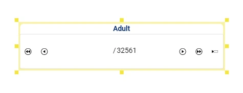
Row Selector
To interact with a dataset using the Row Selector widget, users can either drag a single attribute (and the corresponding dataset will be used) or the entire dataset onto the widget. To change the current dataset, users need to drag a new dataset or an attribute belonging to the desired dataset onto the Row Selector widget and a pop-up message will inform users that an input table has already been set and will ask them if they want to overwrite it.
In the Row Selector widget, users will find five icons allowing navigating through dataset rows:
First row, which goes to the very first row of the selected dataset. Once selected both the First row and Previous row icons are greyed out.
Previous row, which moves to the previous row.
Next row, which moves to the next row.
Last row, which goes to the very last row of the selected dataset. Once selected both the Last row and Next row icons are greyed out.
Add row, which displays the total number of rows plus one of the previously selected dataset (e.g., 61/60), indicating that any value entered in the Input Field widget will be added to a new row rather than modifying an existing one. You can click this button to force the addition of a new row, when an active selection is caused by other widgets.
The Row Selector widget can be paired with other widgets to propagate the effects of data selection, as explained in the data selection example.
Once the widget has been dragged onto the slide or dialog and the required dataset/attribute has been dragged on it, users can double-click its frame or use the widgets context menu to open the Layout options pane.
The Layout options pane is made of two sections: TABLE and LAYOUT.
See also
In the TABLE tab, users cannot parametrize any options.
While in the LAYOUT tab, all the options can be parametrized.
Users can find all the available options and the corresponding GOLD references in the table below.
To know more about GOLD, go to the corresponding page.
Users need to click APPLY to finalize the operations, or click CANCEL to discard all the previous changes.
Subsection |
Option |
Description |
GOLDref |
|---|---|---|---|
Input options |
Table |
From this drop-down menu, users can select the dataset to which the row selection options will be applied. By default, it selects the dataset of the previously dragged dataset/attribute and when opened it displays all the datasets imported in the current view. |
|
Scope options |
Scope |
To know more about how the Scope option works when performing a data selection operation, go to this page. In the Scope field, users can either manually enter the names of the widgets in the current slide/dialog (to visualize the widgets names, go to the Slide left-side tab), or click on the Show widgets list icon to visualize the list of widgets and select them to add them to the Scope edit box. |
Subsection |
Option |
Description |
GOLDref |
|---|---|---|---|
Selector |
Selector text color |
It defines the selector text’s color. By clicking on the color, which is black by default, a popup opens, where Standard colors and generated custom color palettes can be used, as well as Rgb, Hex, Hsl and Hsv colors. An Eye dropper is also available to work as a color picker. |
|
Selector background color |
It defines the selector background color. By clicking on the color, which is white by default, a popup opens, where Standard colors and generated custom color palettes can be used, as well as Rgb, Hex, Hsl and Hsv colors. An Eye dropper is also available to work as a color picker. |
||
Font size (px) |
Here, users can type the desired size of the selector text. |
||
Border |
Border radius (px) |
Here, users can define the radius of the value box border in pixels. |
|
Border size (px) |
Here, users can insert the desired size of the border in pixels. |
||
Border color |
It defines the color of the border. By clicking it, users can select Standard colors and generated custom color palettes, otherwise they can use the color picker or choose the color code, which can be: Hex, Rgb, Hsl, Hsv. |
||
Label |
Text style and alignment |
Here, users can define the title style, which can be bold, italic or underlined, as well as the title horizontal alignment, which can be right, center, left. |
|
Label text |
Here, users can type the text to display on the label located by default at the center of the Row Selector widget. |
||
Font family |
Here, users can choose from the drop-down list the font of the label itself. |
||
Text transform |
It defines how the text is transformed. It can be: None, Capitalize, Uppercase, Lowercase. |
||
Font size |
Here, users can type the desired size of the label text. |
||
Label placement |
It defines the position of the label. Available options are: Top default value, End, Bottom, Start. |
||
Label color |
It defines the color of the label. By clicking it, users can select Standard colors and generated custom color palettes, otherwise they can use the color picker or choose the color code, which can be: Hex, Rgb, Hsl, Hsv. |
Row selector Schema
An row selector is completely described through a JSON object composed by 3 different areas:
options, retaining all the functional options of the row selector.
layout, the rest of the graphical options of the row selector.
data, the output consisted in total number of rows and row selected.
The whole JSON object is saved as a GOLD dictionary in the layout field of the Input class.
The schema of the JSON object is presented in YAML format commented.
layout:
  color: #sets the color of the row selector text
  backgroundColor: #sets the background color of the row selector
  fontSize: #sets the font size of the row selector icons and text
  borderRadius: #sets the widget's border rounding
  borderWidth: #sets the border thickness of the widget
  borderColor: #sets the border color of the widget
  label:
    fontWeight: #sets the font thickness (normal/bold)
    fontStyle: #sets the style of the font (normal/italic)
    textDecoration: #sets the underlining of the font (none/underlined)
    textAlign: #sets the horizontal alignment of text, if the key placement is set as end/start, textAlign works vertically
    text: #sets the actual text
    fontSize: #sets the font size in px
    fontFamily: #sets the font family
    textTransform: #sets the capitalization or case of the full text (none,capitalize,uppercase,lowercase)
    placement: #sets the positioning of the text relative to the widget (top/end/bottom/start), start place the text on the left and end to the right
    color: #sets the text color
options:
  type: #the widget type
  table: #table of the attribute used
  scope: #sets on which widgets in the view, the triggered action will take effect if all the widgets are selected the value of scope is null, if no widgets are selected the value will be an empty object {}, if just some widgets are selected the value will be an object that has as keys the family of the widget and as value a list of names corresponding to the selected widgets
data:
  ndata: #number of total row of the dragged dataset
  row: #eventual row selected