
The Stage Window
The stage window is the landing page of the form once it is opened from the Explorer, if the user has Modify permissions on it. The stage window is dedicated to designing mask and task form types.
Forms are the primary resource of Rulex Designer, and the starting point to build customized masks and task, which can be then integrated in Rulex Factory and Rulex Studio. To know more about forms, go to the corresponding page.
In the stage window, users can configure their form (mask or task) and define its options by using the provided tools.
Attention
In this page, referring to a form means that the options and characteristics are the same for both the available types. It will be specified if some options or characteristics are valid for only one form type.
A screenshot of the stage window is available below. Here, a task form type is displayed, but the stage layout is the same for both form types.
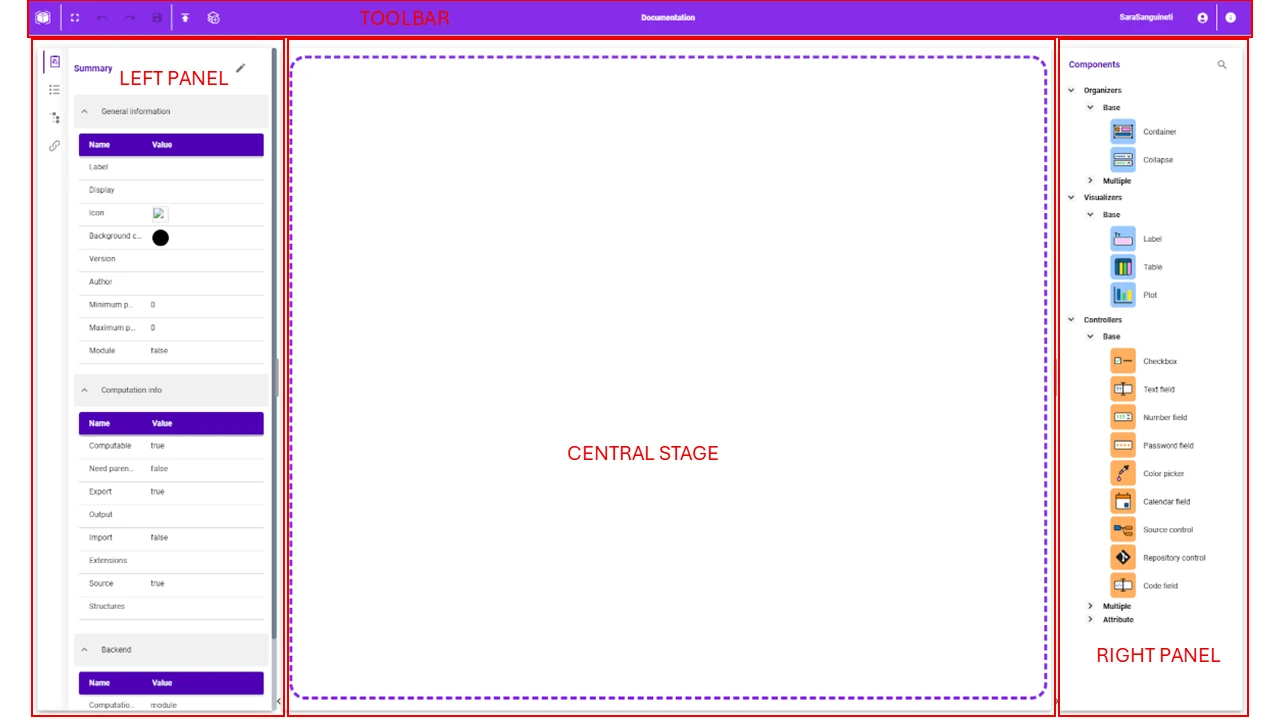
The stage window is divided into:
The toolbar, where users can find the buttons to perform general operations on the component itself.
The left panel, which contains settings and specific customization options: its layout changes according to the chosen form type, and it is described in the corresponding page.
The central stage, where users build and customize their form using the provided components from the Components panel located on the right of the stage window.
The Components panel, containing all the components users can drag onto the stage.
Both the width of the left panel and of the right panel can be enlarged/reduced using the handlebar located at the right/left of the panels. Panels can also be closed completely by clicking on the arrow located at the bottom of the stage.
The Stage
The central stage is the main area of the stage window, where users build their forms by dragging graphical controllers from the right panel and dropping them in this blank workspace. These controllers can be connected one to the other to create a set of interconnected operations, defining the functional logic of a business-specific interface.
This space is not infinite: according to the chosen form type, the available space changes.
In masks, the dimensions of the stage window are configured in the Summary tab.
In tasks, the dimensions of the stage window are automatically adapted to the display resolution of the device, opening in full-screen mode, and cannot be edited.
To edit the mask’s layout, users can type the desired dimensions in the corresponding fields in the Summary tab, by opening the Edit form window.
If users right-click on any point of the stage, a context menu opens, made of the Paste option only, allowing to paste components coming from a different form.
The Left Panel Tabs
The left panel contains a series of tabs whose aim is to configure the main characteristics of the current form.
It is possible to browse between each single tab by clicking on the corresponding icon.
The following tabs are available:
The Summary tab, where users can find the main characteristics of the current mask or task form type, which can be edited. More information on the available options in this tab and on how to customize them can be found in the corresponding page.
The Options tab, where users can work on the options which will be used in the components while setting up their layout. More information on this tab and on how to customize options can be found in the corresponding page.
The Graphics tab, where users can find a read-only list of the components used in the current form. More information on this tab can be found in the corresponding page.
The Connections tab, where users can set up the connections which can then be used between components in the current form. More information on this tab can be found in the corresponding page.
An overall description of all these tabs can be found in the corresponding page.
The Right Panel
On the right of the stage window, users can find the Components panel, which contains the complete list of the available graphical controllers of Rulex Designer.
Here, components are grouped in families according to their specific functionalities and features.
A detailed description of components can be found in the corresponding page.